The latest Google Slides themes and PowerPoint templates - Page 1712
Download our cool PowerPoint templates and Google Slides themes to create attractive designs for your presentations. Make the most of the beautiful backgrounds and take advantage of the easy-to-edit resources included.

It seems that you like this template!
Register for free and start downloading now
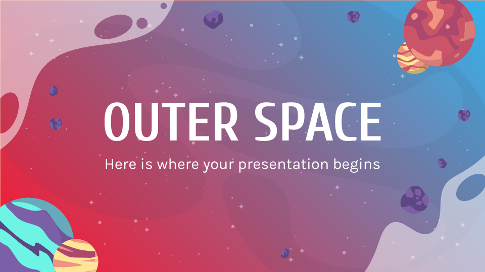
Take your audience to outer space—not literally—with this new template. There are timelines, graphs and mockups that can help you highlight essential data.

You have a lot of meetings, projects and deadlines and you’re looking for a way to organize all that data visually. There are slides with schedules, time plans, planners and agendas. Most of the designs are flat, but we’ve also added some hand-drawn elements here and there as a surprise.

This clinical case template has some geometrical aspects that help you organize your content, but what really helps is the inclusion of tables, infographics, maps and other slides to review the patient history, the case timeline and other essential data.

This cool template contains calendars, lists, timetables and graphs, so all your info will be in place and well organized. There are also tridimensional shapes on the backgrounds that will make your presentation look stunning.

Their designs are focused on various themes, such as recycling, ecology and sustainability. We have designed them taking into account variety and a wide choice of styles: flat, filled, circular, roadmaps…

This new template shines by itself: it has gradients, grainy textures, pictures with a gray filter and, of course, many slides with infographics, maps, tables, graphs and mockups. Go ahead and prepare your data!
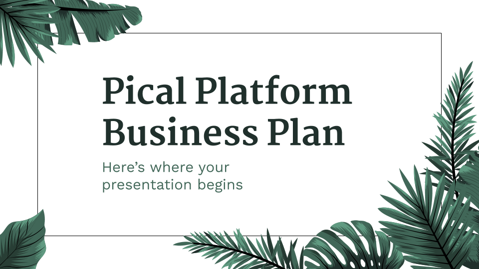
This business plan presentation has many different sections that are quite effective; talk about the market, your sales plan, promotion, members of the team, distribution channels… With this slide deck, it’s just natural that you succeed!

Use these slides to talk about future events, news or announcements. You can also welcome new teachers! The layouts, timelines and infographics are easy to modify and understand.

Let’s say you need to talk about five steps of your project or list exactly five elements in order of importance. Good, then use these infographics. They’re layered out in a sequence so you can describe a process over time, but there’s also some pyramids to sort things from the...

If you want to show your data effectively, use these doodle infographics. We have included steps, timelines, blocks, calendars… And many others. Go ahead and show your info in a cool way.

If your thesis deals with music and you are about to defend your dissertation, edit this presentation. It includes sections like objectives, results analysis, methodology and conclusions. Have you seen the infographics and tables? They are very adaptable.

They’ve been designed as timelines, steps or even circular. Every slide has a different number of elements, and the resources are also varied: flat, filled, linear, isometric… Choose the one that suits you best!

Create your own workshop and teach your students how to grow plants. This template includes many illustrations, slides about theory, features of the topic, tips and exercises. If you need timelines, tables or infographics, you can use them!

This consulting presentation template includes highly adaptable sections just for you. Make use of its infographics, graphs and maps to show your data in a visual way, and enjoy the wavy shapes on the backgrounds to have a little more dynamism in your speech!

Do you need some timelines to present the stages of a certain process or project? We have designed many of them. Have a look at the gradients and the different designs: flat, lineal, geometric or hand-drawn. We include 4 to 7 septions per timeline.

This presentation for the International Day of the Girl is colorful, cool and perfect to design your social media strategy. It includes many different infographics, icons, pictures, tables… Anything you may need for your project.

Do you need a presentation that is suitable for any topic and has gradients in the background? You can talk about your project with this template now. Support your data with maps, infographics and graphs.

Design the profile of your Music Production Company with this simple and elegant presentation in dark hues. Give some info about the enterprise, products, services, clients, projection and use timelines, maps and tables to support it.