
How to Create an Organizational Chart in PowerPoint

If you’re looking to help viewers visualize the structure of your company, an organizational chart will get the job done. Be it for a pitch deck, project proposal, or business presentation, organizational charts are extremely useful to help understand hierarchy and the relationship between the different entities.
With PowerPoint, there are two ways to create an organizational chart. The first (and simpler) way is to insert and edit one of their many templates available. This provides you with a base to work with that you can simply modify to your liking. You can also create and customize one from scratch if you prefer something different. We’ll provide you with step-by-step instructions on how you can do both in this tutorial.
Create an organizational chart with a built-in template
- In your PowerPoint presentation, select the slide you will be adding the organizational chart to.
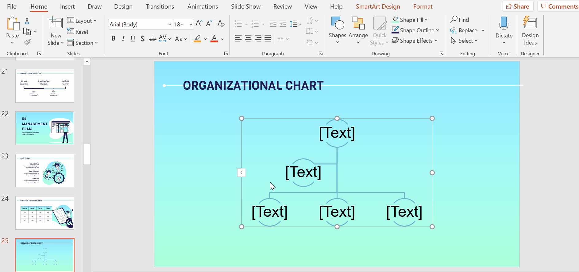
- Under Insert, select SmartArt → Hierarchy. Here, you’ll see many organizational chart templates. Select the one that matches your structure.
- Adjust the size of your organizational chart by dragging it inwards or outwards from any corner. Align it in the center of the slide by following PowerPoint’s visual guidelines.
- Click on Change Colors (under the SmartArt Design tab) to style it. You’ll see a range of colors and combinations based on your theme’s template. You may apply other colors, but we recommend sticking to your theme’s main palette.
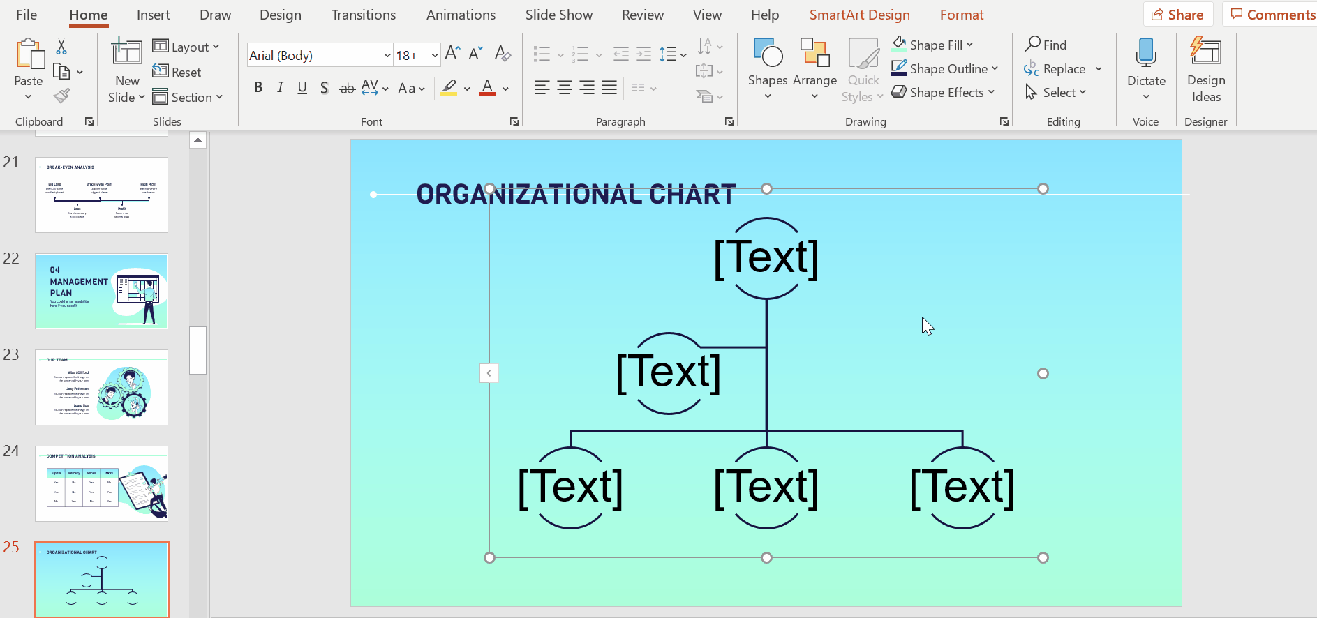
- To edit the text, open up Text Pane. This is done by clicking on the chart to bring up its outline and then clicking on the little arrow on its left border.
- If you want to add or remove elements from your organizational chart, you may do so from the Text Pane. To add an element to the layer you’re editing, simply hit enter and start typing
Designing an organizational chart from zero
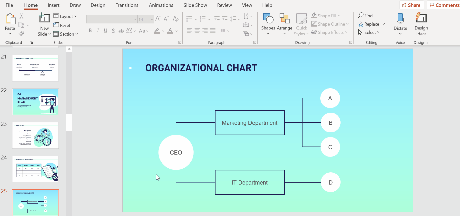
- If you prefer to create an organizational chart from scratch, you need to first define its structure and layers and decide on what shapes you will be using. Ideally, it should consist of simple shapes that you can later connect using lines or arrows. In our example, we will be creating an organizational chart with three layers and we will use circles and rectangles to represent our elements.
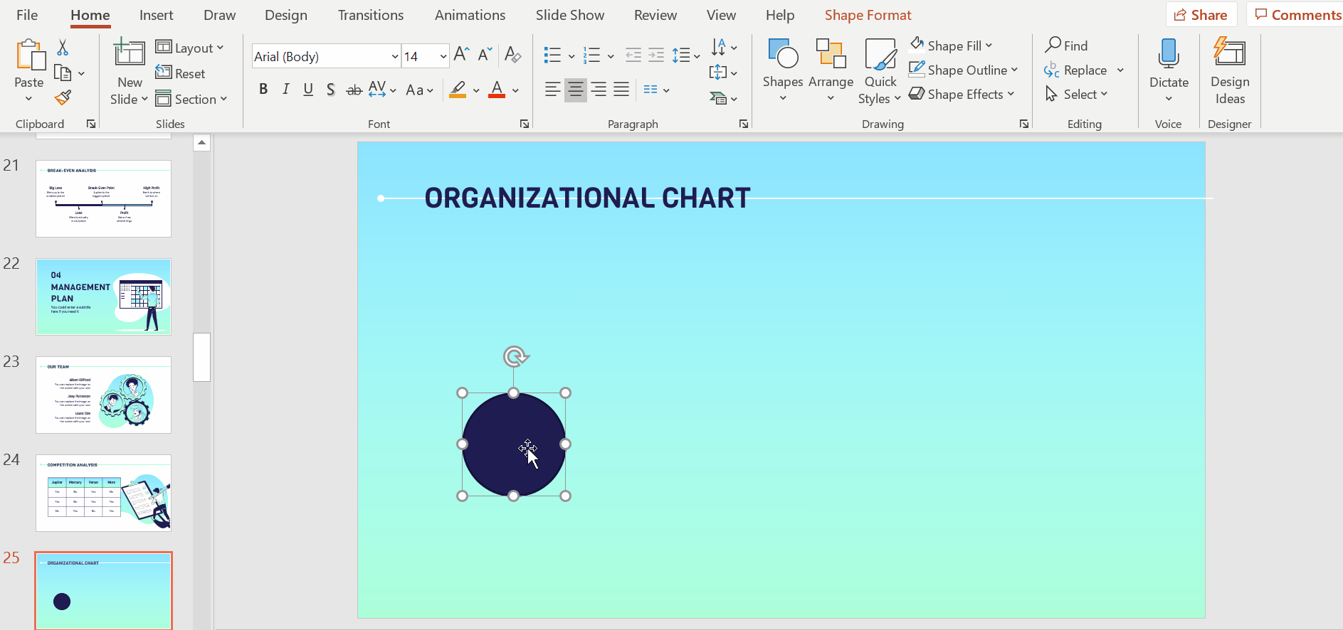
- In the Home tab, go to Drawing and select Oval. Click and drag to create a circle. This will represent the main layer of your organizational chart.
Pro tip: Make sure to hold down Shift as you drag out the oval to create a perfect circle.
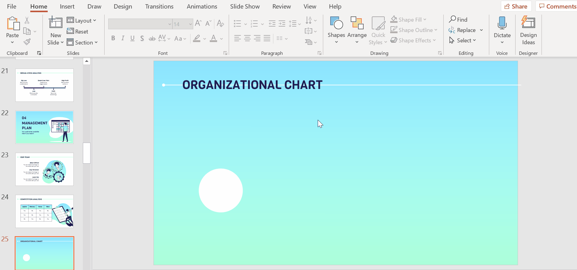
- Style with the options Shape Fill and Shape Outline. As always, maintain the theme’s main color scheme. In our chart, we’ll color this circle white and make its border transparent.
- Next, staying under Drawing, select Rectangle. We will use this to represent the second layer of your organizational chart. Click and drag out the first rectangle.
- Once you’ve positioned it, copy and paste it using Ctrl C + Ctrl V or Cmd C + Cmd V in Mac.
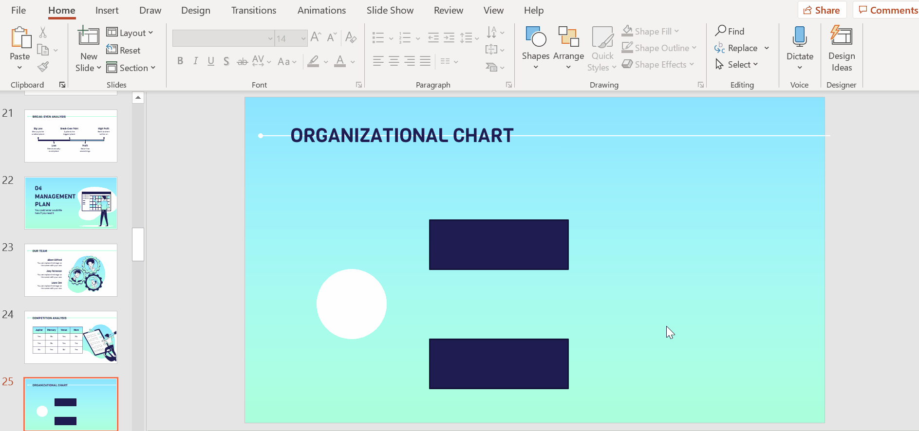
- Follow the visual guidelines to keep both elements aligned (to each other and to the main circle).
- Next, select both elements. You may either hold down Shift and click on each of them or simply select the area containing the two elements by clicking and dragging your cursor over the area.
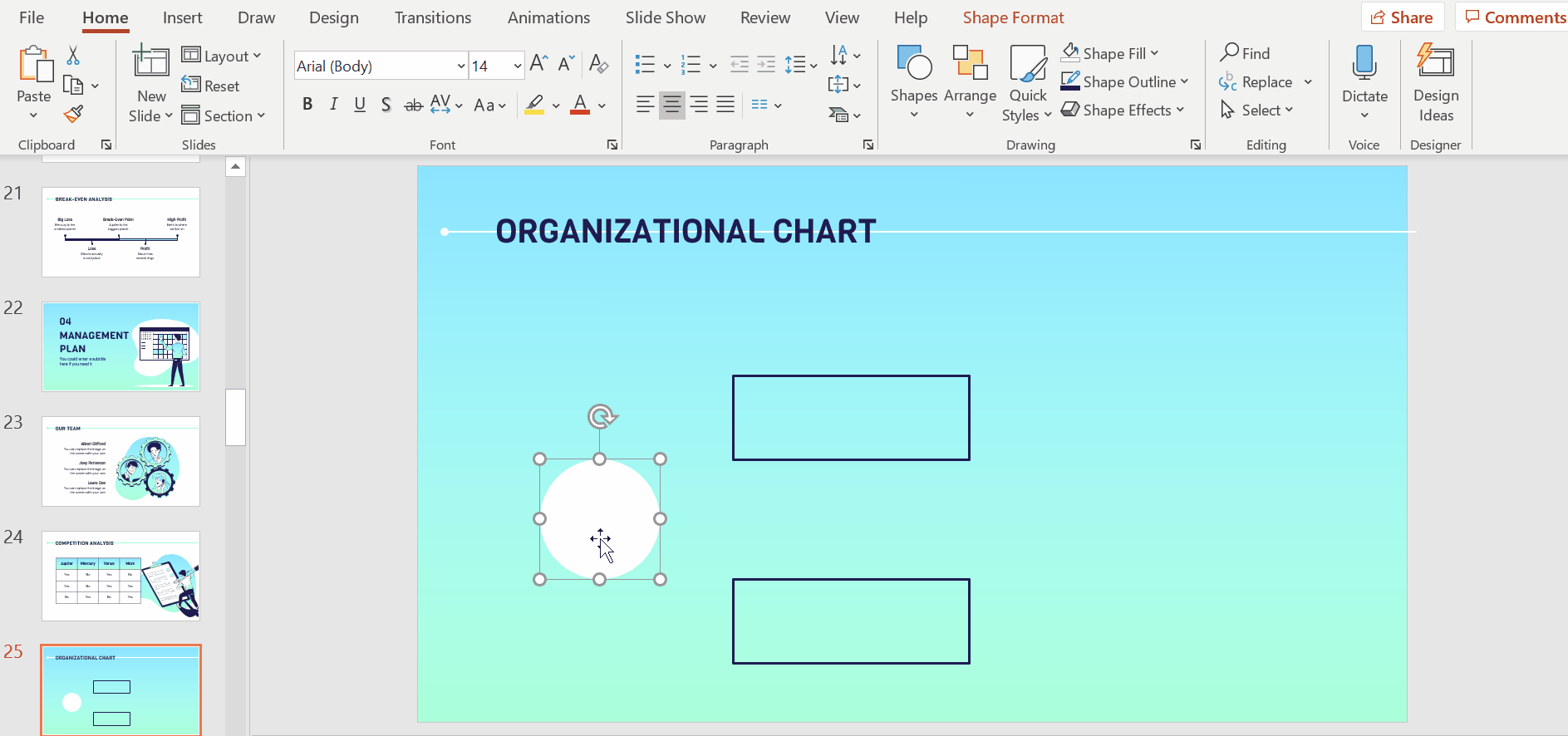
- Using Shape Fill and Shape Outline, we will now style the rectangles. For this second layer, we want only the outlines to be visible so we will select the No Fill option.
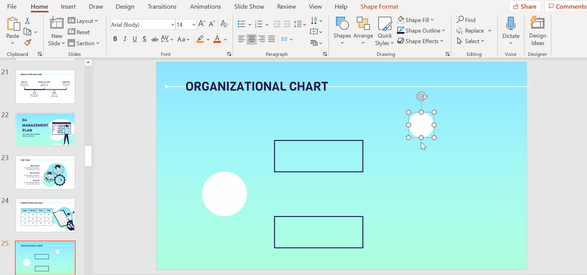
- For the third layer of the organizational chart, we’ll use circles. As a shortcut, you can just copy and paste the main circle (Ctrl C + Ctrl V or Cmd C + Cmd V in Mac).
- Next, click on the duplicated circle to bring up its outline and resize it by dragging any of the corner dots inwards. As always, hold Shift while doing so to maintain its dimension. This circle represents the first element of the organizational chart’s third layer
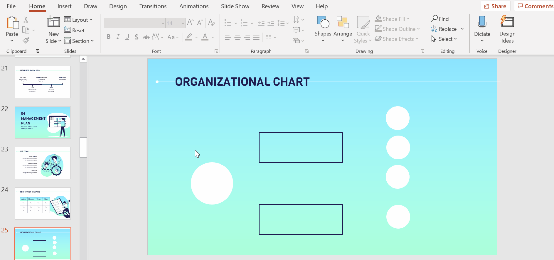
- We need three more circles to complete this third layer. Copy and paste the circle (Ctrl C + Ctrl V or Cmd C + Cmd V in Mac) three more times.
- To keep your chart neat, make sure the elements are aligned properly. That means both horizontally and vertically. PowerPoint will display visual guidelines in the form of red lines as you move the circles around. You’ll also see red little arrows that indicate when the circles are at an equal distance from each other.
Related tutorial: How to Arrange and Align Objects in PowerPoint
Pro tip (for Windows): Instead of duplicating each circle and having to position each one individually, there’s a quicker alternative. Select the first circle and with Ctrl selected or Cmd in Mac, drag it to create a copy and place it where you want it to be positioned. Once you have it in place, hit Ctrl + Y (or Cmd Y in Mac) to repeat the action. This helps to make sure that the duplicated elements are at the same distance from one another.
Pro tip (for MacOS): If you’re using MacOS, the faster way to duplicate the circle is to drag the first circle to where you’d like the duplicate to be placed while holding down Ctrl or Cmd in Mac. As you’ll see, this actually creates a copy of the first circle. Once positioned, hit Command + Y or Cmd + Y in Mac. This is a redo option that helps to ensure that distances between the new circles are the same.
Connecting elements in an organizational chart
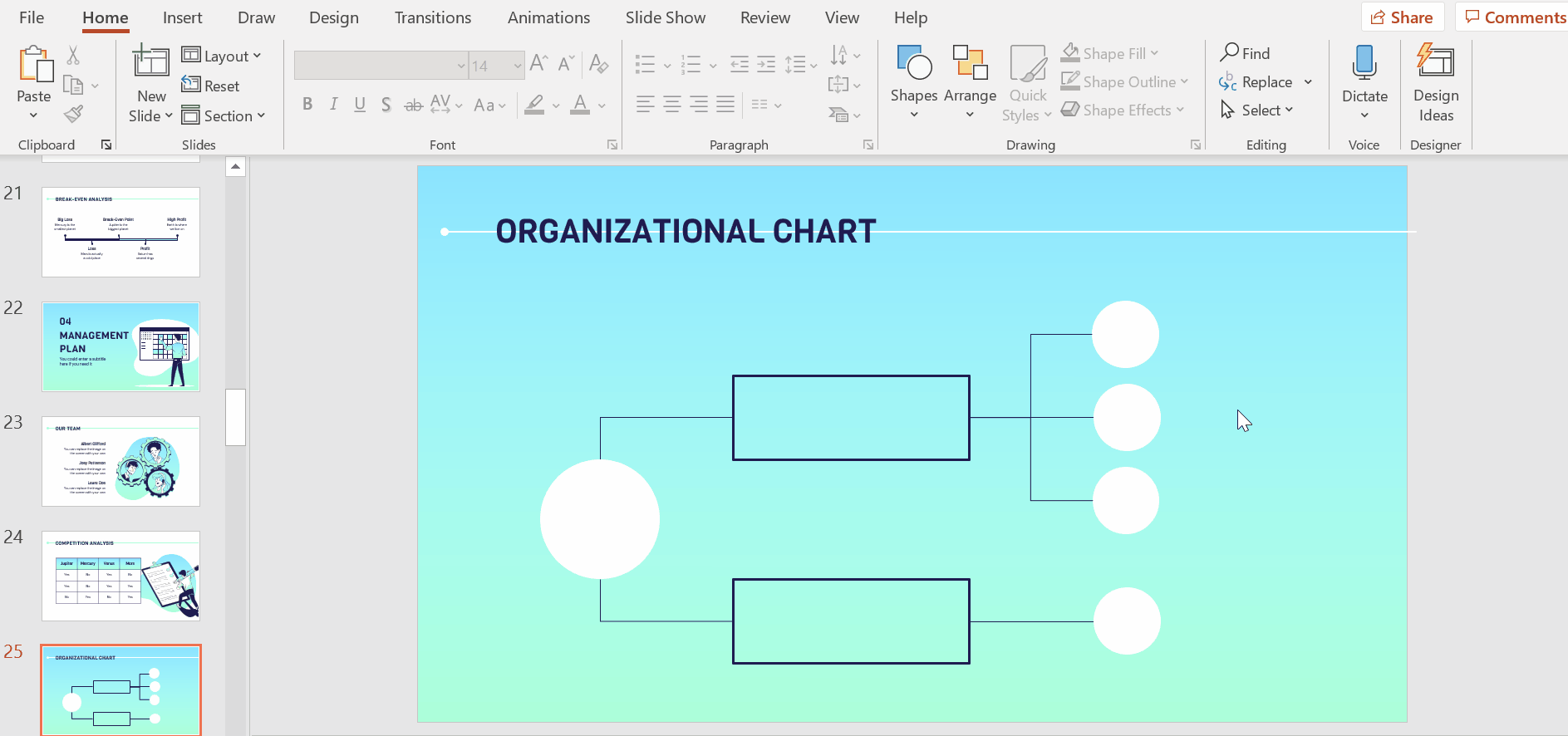
- Under Insert, select Shapes → Line → Connector: Elbow. This will help to establish the relationship between the elements by connecting them together.
- With Connector: Elbow selected, place your cursor over the main circle. You will see an outline with purple dots.
- Click on the dot to place the first end of the line. Then, bring your cursor over to the first rectangle and that will bring up its outline with purple dots. Click on the dot you want the line to be connected to and this creates the line that connects the two elements.
- Repeat the same action to connect the second rectangle. Instead of going to the Insert tab again, you can access the Connector: Elbow line directly from the quick menu on the top left corner.
- Now, connect the second layer’s elements to the third layer using the same line until all the connections of your organizational chart are represented.
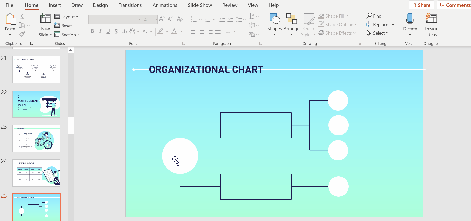
- Next, you will need to style the lines. To do so in one go, with Shift held down, click on the lines one by one and then use the options under Shape Outline to edit their colors and weights. For consistency, continue using the theme’s palette of colors.
Adding text to your elements
- To add text to your elements, simply double click on them or hit enter while they’re selected to create a text box within them. Fill the elements of the first and second layers with their corresponding titles. Because the circles of the third layer are too small, we will first use alphabets to represent their titles. (More on this in a later step.)
- Next, using Font, Font Size, Font Color, Alignment, etc., style your text.
- Make sure your text is centralized with the slides’ theme’s color and style applied.
- In this example, we’ll use a combination of Viga and DM Sans typefaces.
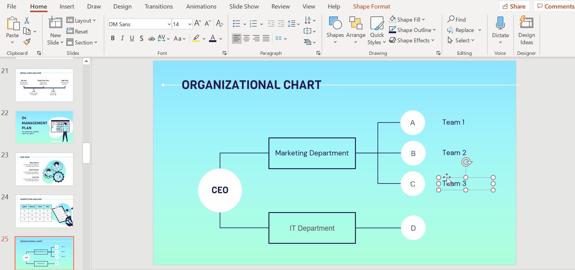
- We’ll now add short descriptions to each circle of the third layer. Under the Insert tab, select Text Box.
- Click and drag out a text box and fill it with a description.
- Style your text according to the slides’ main colors and fonts and place the text box so that it’s centrally aligned with the circle.
- To create descriptions for the remaining elements of the third layer, duplicate the text box (Ctrl C + Ctrl V or Cmd c + Cmd V) and place each one next to its corresponding circle.
- Well done! You successfully created a customized organizational chart in PowerPoint.
Looking for PowerPoint templates? Slidesgo has a wide selection of ready-made templates that you can download, edit, and customize for free! Hop over and check out our PowerPoint templates now!
Do you find this article useful?
Related tutorials

How Smart Template Matching Saves Hours on Your Next Presentation
Content Find your perfect template, automatically How it works Templates that match your topic Get better results FAQ Skip the Search, Start Creating Find your perfect template, automatically Great presentations look intentional—where the design supports the message. But finding a template that fits usually means scrolling through dozens of options....

Creative PowerPoint Night Ideas
Want to be the star of your next PowerPoint Night? With the right ideas and a spark of creativity, you can turn any theme into a show-stopping experience that keeps everyone laughing and engaged. Whether you’re planning a friendly game night, a classroom challenge, or a team-building session, this guide is your...

Smart Guide: Best AI Prompts for Powerful Presentations
Ever stared at a blank slide, knowing your message matters but not sure how to bring it to life? You’re not alone. With the rise of AI Presentation Maker, more creators, educators, and professionals are asking: What are the best AI prompts for presentations?This guide shows you exactly how to...

How to convert PDF to PPT online for free
Ever tried making a presentation from a PDF? It’s not exactly fun—copying, pasting, reformatting… plus, it takes forever. So, why do it? Instead convert your PDF to PPT in seconds through our new tool AI PDF to PPT converter.Whether you’re pitching an idea, designing tomorrow’s lesson plan, or presenting a report, this...