
Infographics & Charts Google Slides themes and Powerpoint templates
Learn more about how to deal with Infographics and charts with these tutorials for Google Slides and PowerPoint templates. Present your data and processes in a visual way!

How to present survey results in PowerPoint or Google Slides
A survey is a technique that is applied by conducting a questionnaire to a significant sample of a group of people. When we carry out the survey, we start from a hypothesis and it is this survey activity that will allow us to confirm the hypothesis or to see where...
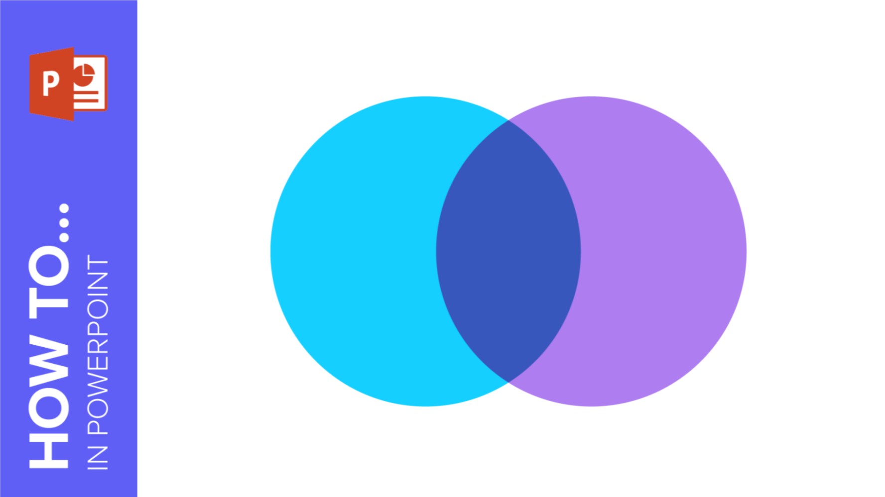
How to Create a Venn Diagram in PowerPoint
How many times did you have to explain your data with a PowerPoint presentation and you weren’t able to find the most visual way to do it? To help you with this matter easily and quickly, in this Slidesgo School post we will explain how to insert or create a...
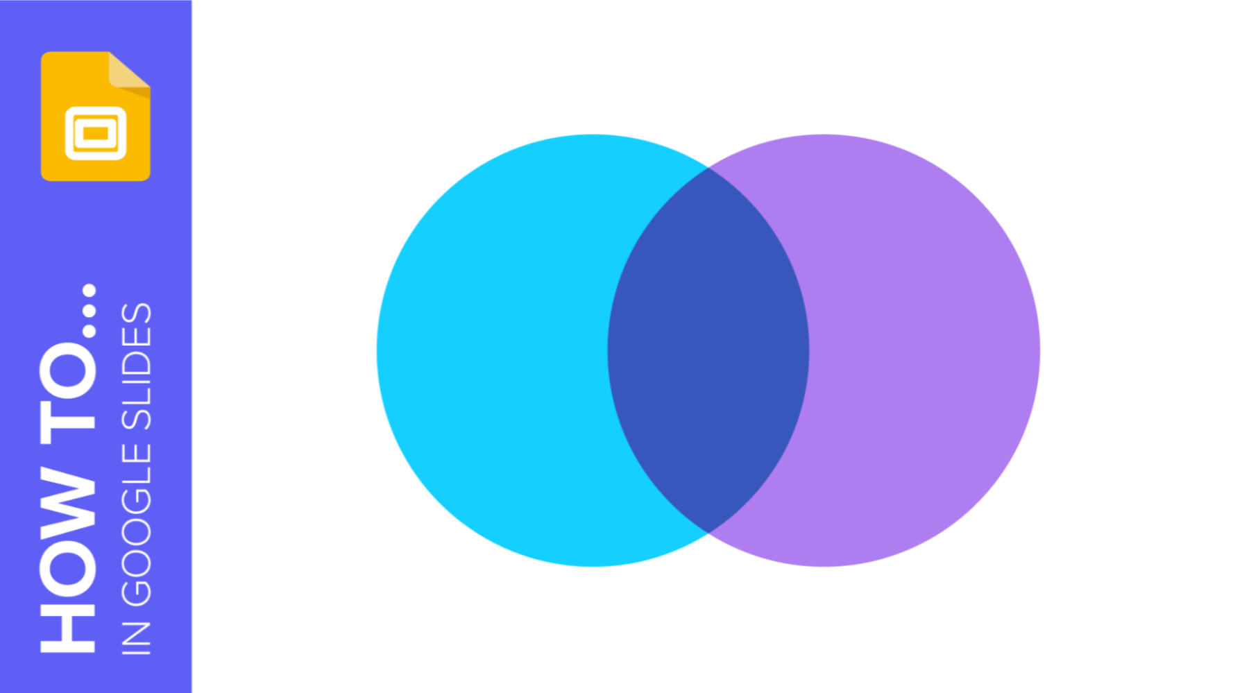
How to Create a Venn Diagram in Google Slides
If you wish to give an awesome presentation, using diagrams is great because they make your data look nicer and help your audience understand your points.In this Slidesgo School article, we’ll teach you how to create Venn diagrams in Google Slides so you can have them in your bag of...

How to create and format maps in PowerPoint
One of the biggest challenges when making a presentation is talking about data. To make it as less tedious as possible and easy to understand, it is preferable to use visual resources instead of text. Map infographics are representations that, at a glance, help us assimilate data better and faster.

How to add and edit maps in Google Slides
Map infographics are very useful for any presentation, as they allow you to transmit data quickly and easily. In this post we are going to explain how to include and edit maps in your Google Slides presentations.

Infographics: How Can They Improve Your Presentation?
What is an infographic presentation? Maybe the word “infographics” rings a bell. Indeed, companies make use of this sort of depiction, but what are they? To put it in a nutshell, they are visual representations of data, but made in an analytical and effective way. They need to be visually appealing,...

How to Add Infographics in PowerPoint
When trying to explain complicated topics or information, it’s worth using some visual aids. This way, the mind will quickly get the connections between ideas or the division of concepts. Have you ever tried using infographics? Infographics are diagrams that will help you present or show information. It doesn’t matter if...

How to Insert Infographics in Google Slides
Does the word “infographics” ring a bell? Those are diagrams that work as visual aids. You can present difficult concepts, processes, steps and the like in a very simple way. They can include texts, numbers or icons. Likewise, they can have different shapes and designs. Of course, there are different types...
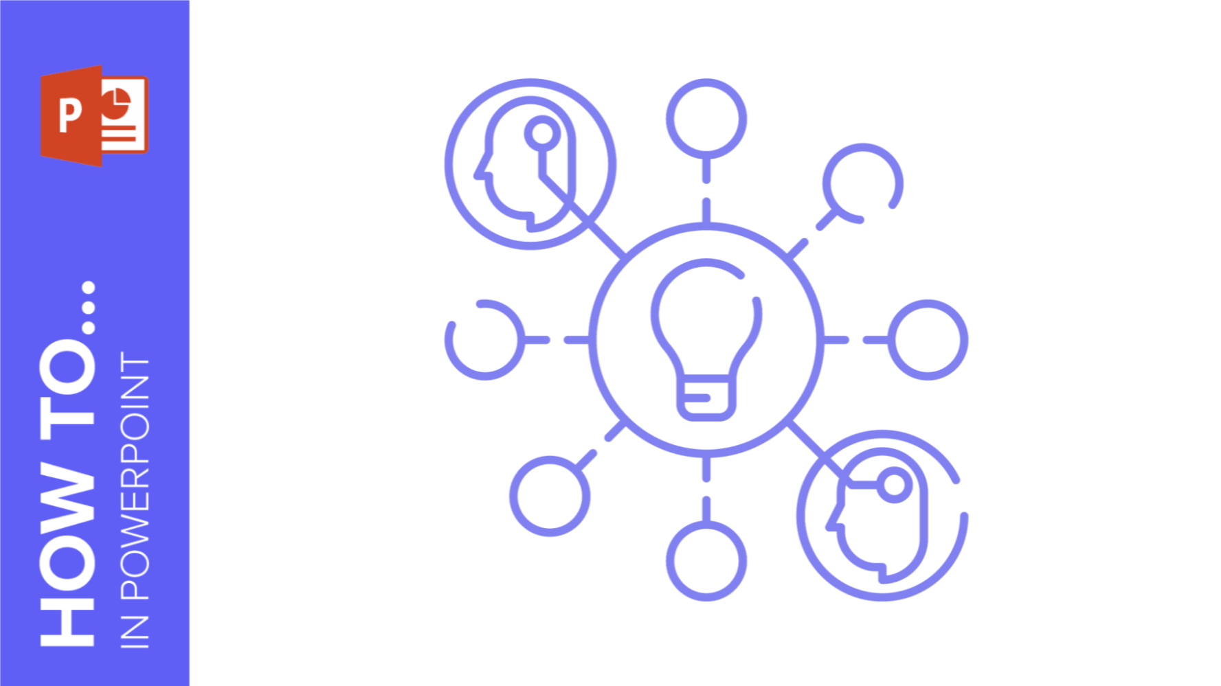
How to Make a Mind Map in PowerPoint
Mind mapping is a great idea to learn a series of concepts, ideas or information in a very visual way. Those mind maps are similar to hierarchical diagrams that have a series of branches. They need to be balanced, share the same ranking and must originate in the center. To...

How to Create a Mind Map in Google Slides
A mind map is a powerful tool that allows you to create a hierarchy with your ideas and concepts. Its main aim is to help you understand and acquire information in an easier way. It resembles a diagram and it helps you learn in a visual way. Mind maps are pretty...
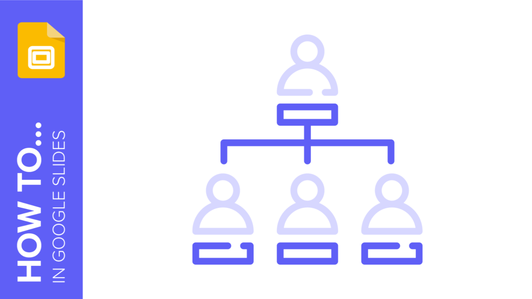
How to Create an Organizational Chart in Google Slides
An organizational chart depicts the different relationships in a company using graphics and helps viewers understand and visualize its structure and hierarchy. It comes in particularly useful in business plans, pitch decks, company presentations, etc. There are two ways to create an organizational chart in Google Slides. The easier way would...
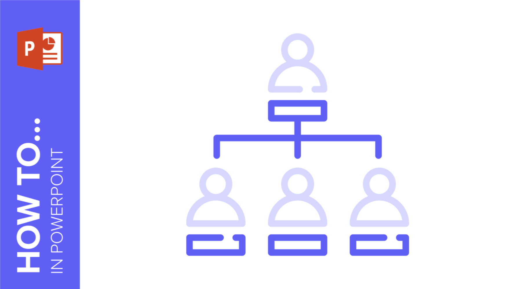
How to Create an Organizational Chart in PowerPoint
If you’re looking to help viewers visualize the structure of your company, an organizational chart will get the job done. Be it for a pitch deck, project proposal, or business presentation, organizational charts are extremely useful to help understand hierarchy and the relationship between the different entities. With PowerPoint, there are...