
Infographics & Charts Google Slides themes and Powerpoint templates - Page 2
Learn more about how to deal with Infographics and charts with these tutorials for Google Slides and PowerPoint templates. Present your data and processes in a visual way!

How to Present Data Effectively
You’re sitting in front of your computer and ready to put together a presentation involving data. The numbers stare at you from your screen, jumbled and raw. How do you start? Numbers on their own can be difficult to digest. Without any context, they’re just that—numbers. But organize them well...

How to Create a Timeline in PowerPoint
Timelines come in a rich variety of colors, shapes, and types. While there are plenty of creative ways to design them, they usually include a few basic elements including shapes, text, numbers, and lines. With these simple elements, you can put together a visually attractive and easy-to-understand chronology of the...

How to Create a Timeline in Google Slides
What better way to portray progress and evolution on a Google Slides presentation than with a timeline? A timeline does the job of telling a story (or history) chronologically in a direct and straightforward manner that’s also visually attractive and easy to digest. It shouldn’t contain too much text so...
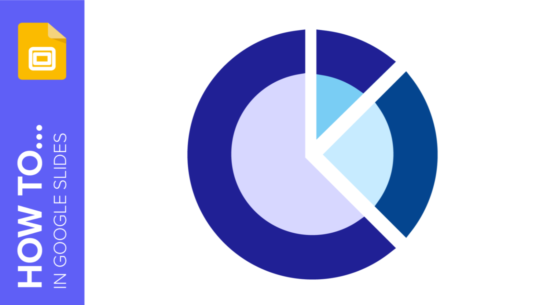
How to Make a Radial Chart in Google Slides
Presenting data on Google presentations can be done in many different ways. There are basic bar charts and pie charts. But if you want to take things a step further, radial charts are a great way to add visual effects to a presentation and simplify more complex data. This is...
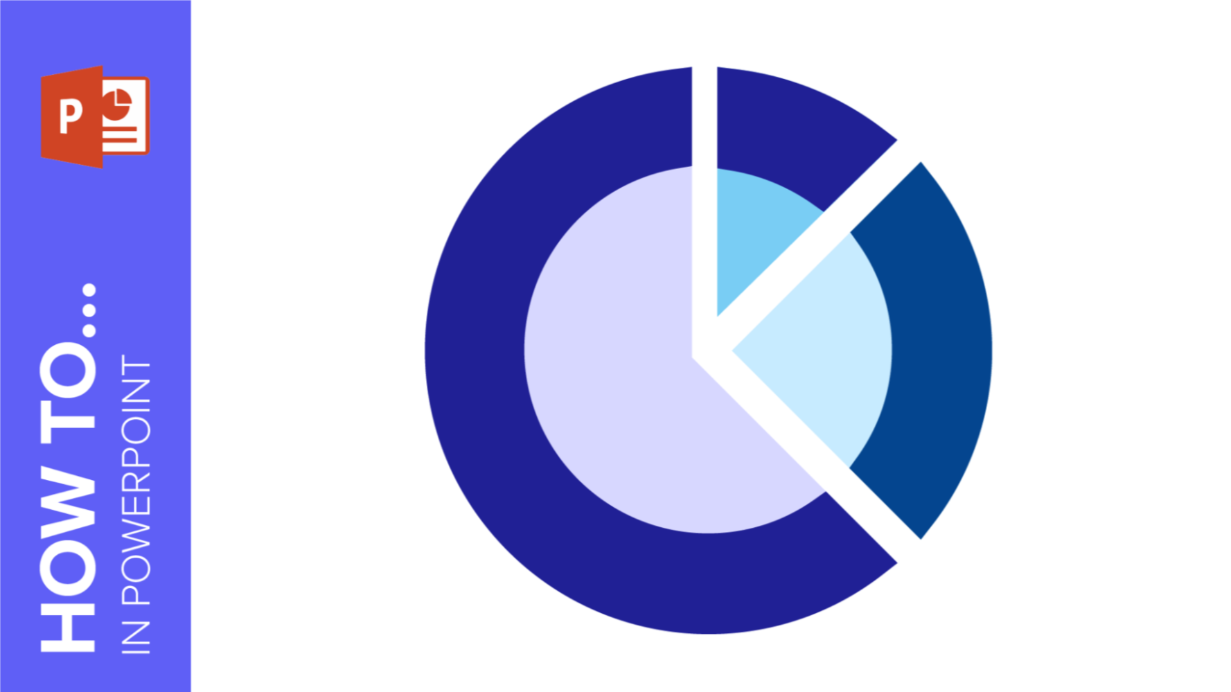
How to Make a Radial Chart in PowerPoint
When it comes to data presentations on PowerPoint, there’s a resource that helps your audience make sense of numbers—charts. When done properly, they are easy to understand and extremely versatile. The best part? They come in a huge variety of forms. Today, we’re going to talk specifically about radial charts....
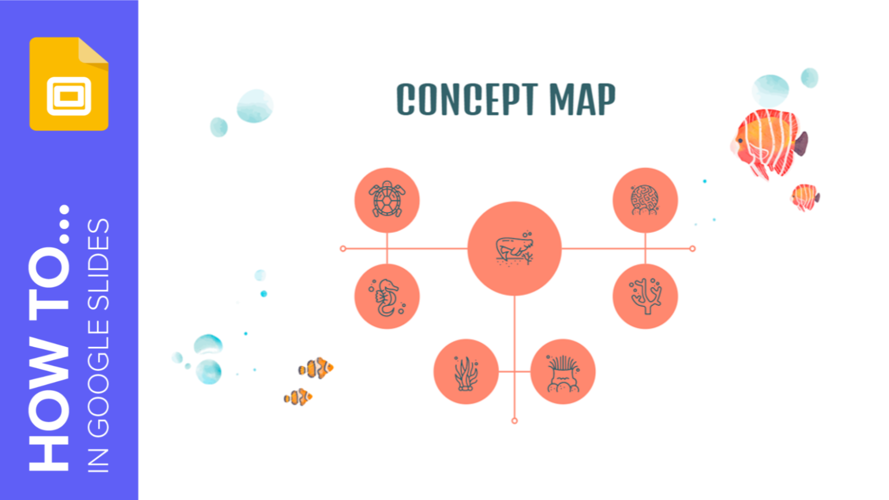
How to Make a Concept Map in Google Slides
We live in bustling times. Between work, family, social media, etc., our minds can get extremely cluttered. That can make it difficult to focus, especially when there are complex concepts to explain. This is why concept maps play a crucial role in organizing information: They make it easy to digest....
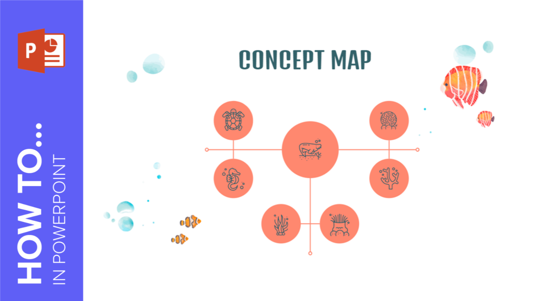
How to Make a Concept Map in PowerPoint
It’s estimated that 65 percent of humans are visual learners. That goes without saying that it is often easier to explain complicated concepts with visual aids than text. That’s where a concept map comes into play. In this Slidesgo School tutorial, we’ll teach you how to make a concept map...

How to Create Flowcharts in Google Slides
Diagrams help you visualize all the steps of a process. In these graphic elements, each step of the process is represented with a shape, and these are connected by arrows. In this Slidesgo School tutorial, you’ll learn how to create flowcharts in Google Slides.

How to Create a Flowchart in PowerPoint
A flowchart is a graphic representation of a process in which each step appears as a symbol and these are connected with arrows. In this tutorial, you’re going to learn how to create flowcharts for your PowerPoint presentation.
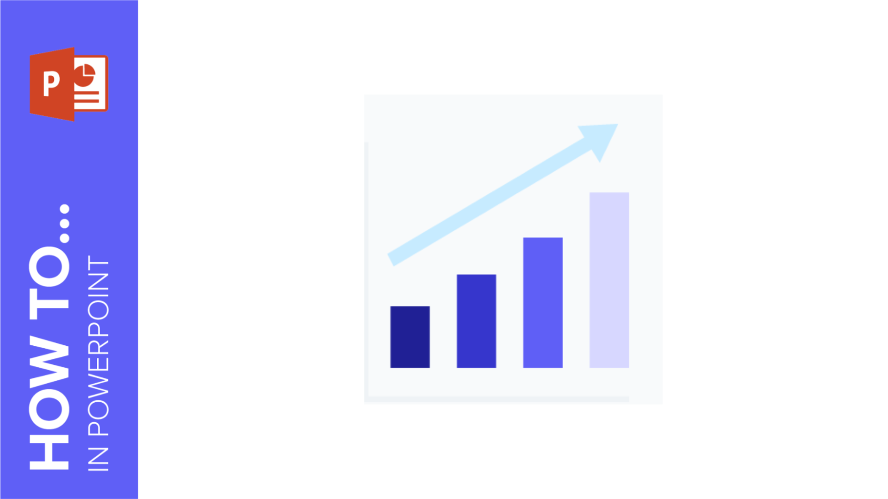
How to Insert Charts in PowerPoint
Including a chart in your presentation is always a good way to display your numerical or statistical data in a visual manner. In this tutorial, you’ll learn how to create charts in PowerPoint and how to insert an already existing chart from an Excel document. You’ll also learn how to...
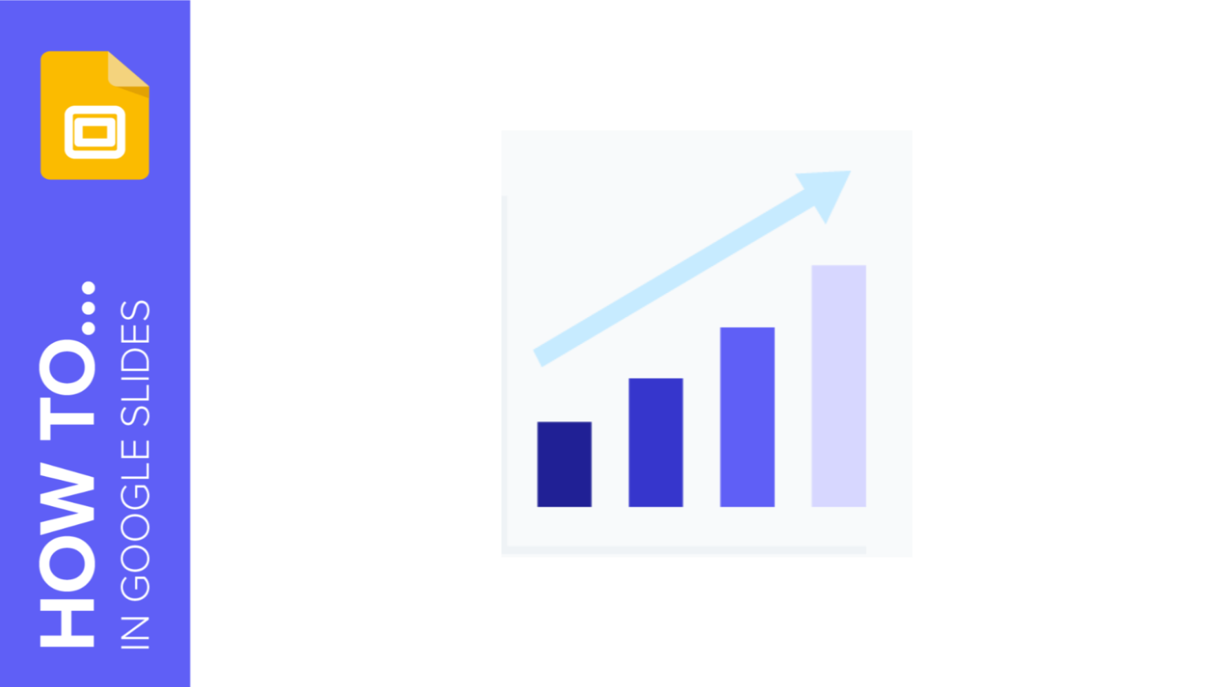
How to Make Charts in Google Slides
Using charts to represent your numerical or statistical data helps your audience understand everything visually at a glance. In this new Google Slides tutorial, you’ll learn how to create pie charts, bar graphs and other kinds of charts, so you’ll be able to display the information clearly and boost your...