
How to Present Data Effectively

You’re sitting in front of your computer and ready to put together a presentation involving data.
The numbers stare at you from your screen, jumbled and raw.
How do you start?
Numbers on their own can be difficult to digest. Without any context, they’re just that—numbers.
But organize them well and they tell a story.
In this blog post, we’ll go into the importance of structuring data in a presentation and provide tips on how to do it well. These tips are practical and applicable for all sorts of presentations—from marketing plans and medical breakthroughs to project proposals and portfolios.
What is data presentation?
In many ways, data presentation is like storytelling—only you do them with a series of graphs and charts.
One of the most common mistakes presenters make is being so submerged in the data that they fail to view it from an outsider’s point of view.
Always keep this in mind: What makes sense to you may not make sense to your audience. To portray figures and statistics in a way that’s comprehensible to your viewers, step back, put yourself in their shoes, and consider the following:
- How much do they know about the topic?
- How much information will they need?
- What data will impress them?
Providing a context helps your audience visualize and understand the numbers. To help you achieve that, here are three tips on how to represent data effectively.
3 essential tips on data presentation
Whether you’re using Google Slides or PowerPoint, both come equipped with a range of design tools that help you help your viewers make sense of your qualitative data.
The key here is to know how to use them and how to use them well. In these tips, we’ll cover the basics of data presentation that are often overlooked but also go beyond basics for more professional advice.
Use the right chart
The downside of having too many tools at your disposal is that it makes selecting an uphill task.
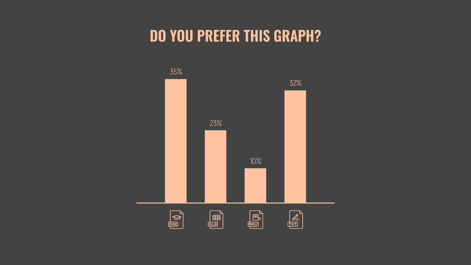
Pie and bar charts are by far the most commonly used methods as they are versatile and easy to understand.
If you’re looking to kick things up a notch, think outside the box. When the numbers allow for it, opt for something different. For example, donut charts can sometimes be used to execute the same effect as pie charts.
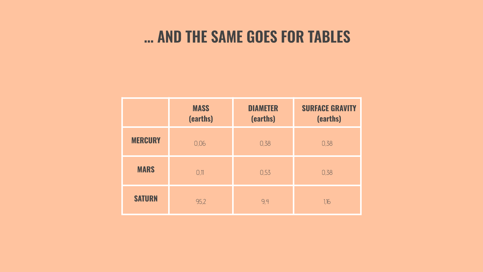
But these conventional graphs and charts aren’t applicable to all types of data. For example, if you’re comparing numerous variables and factors, a bar chart would do no good. A table, on the other hand, offers a much cleaner look.
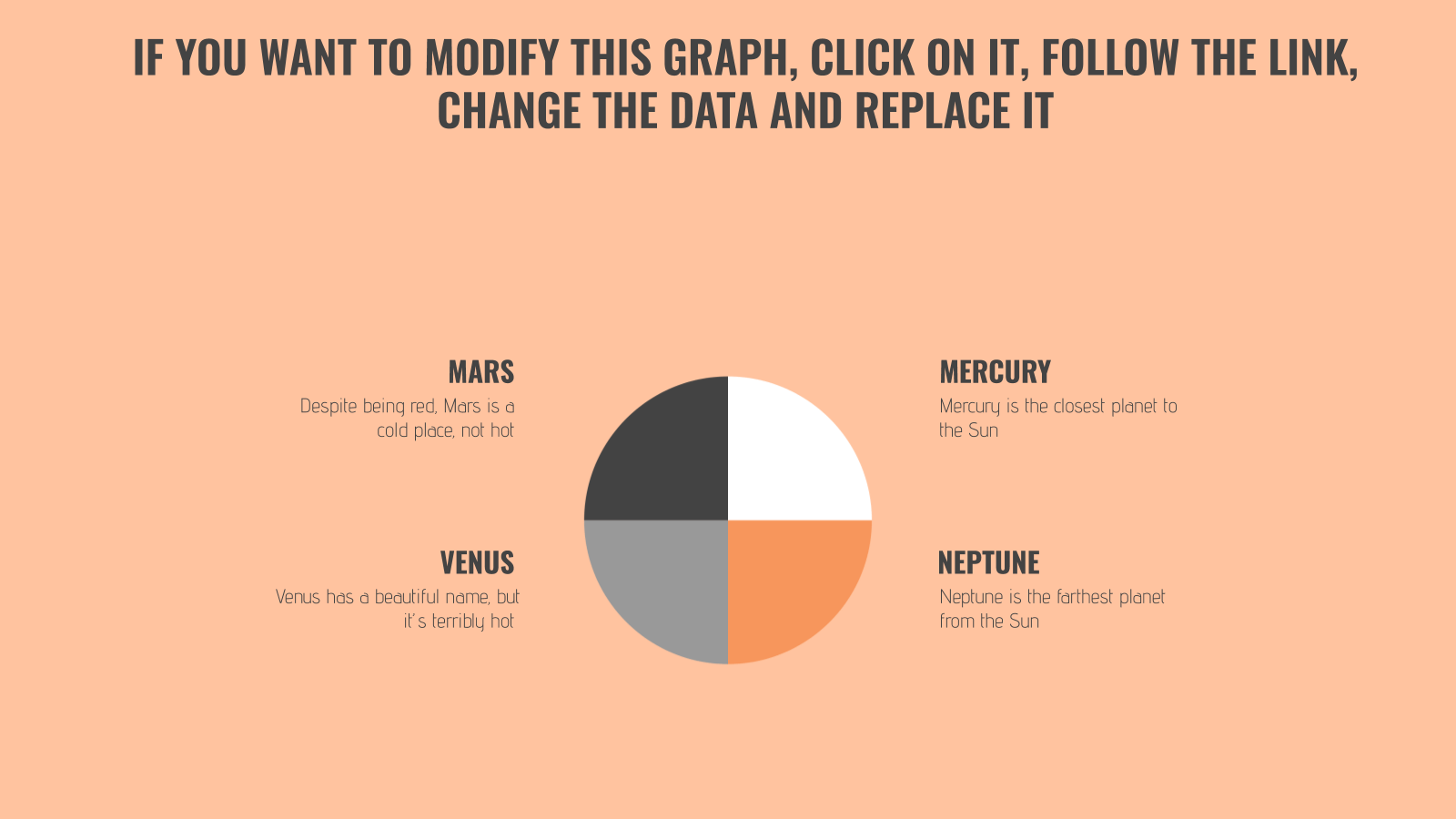
Pro tip: If you want to go beyond basics, create your own shapes and use their sizes to reflect proportion, as seen in this next image.
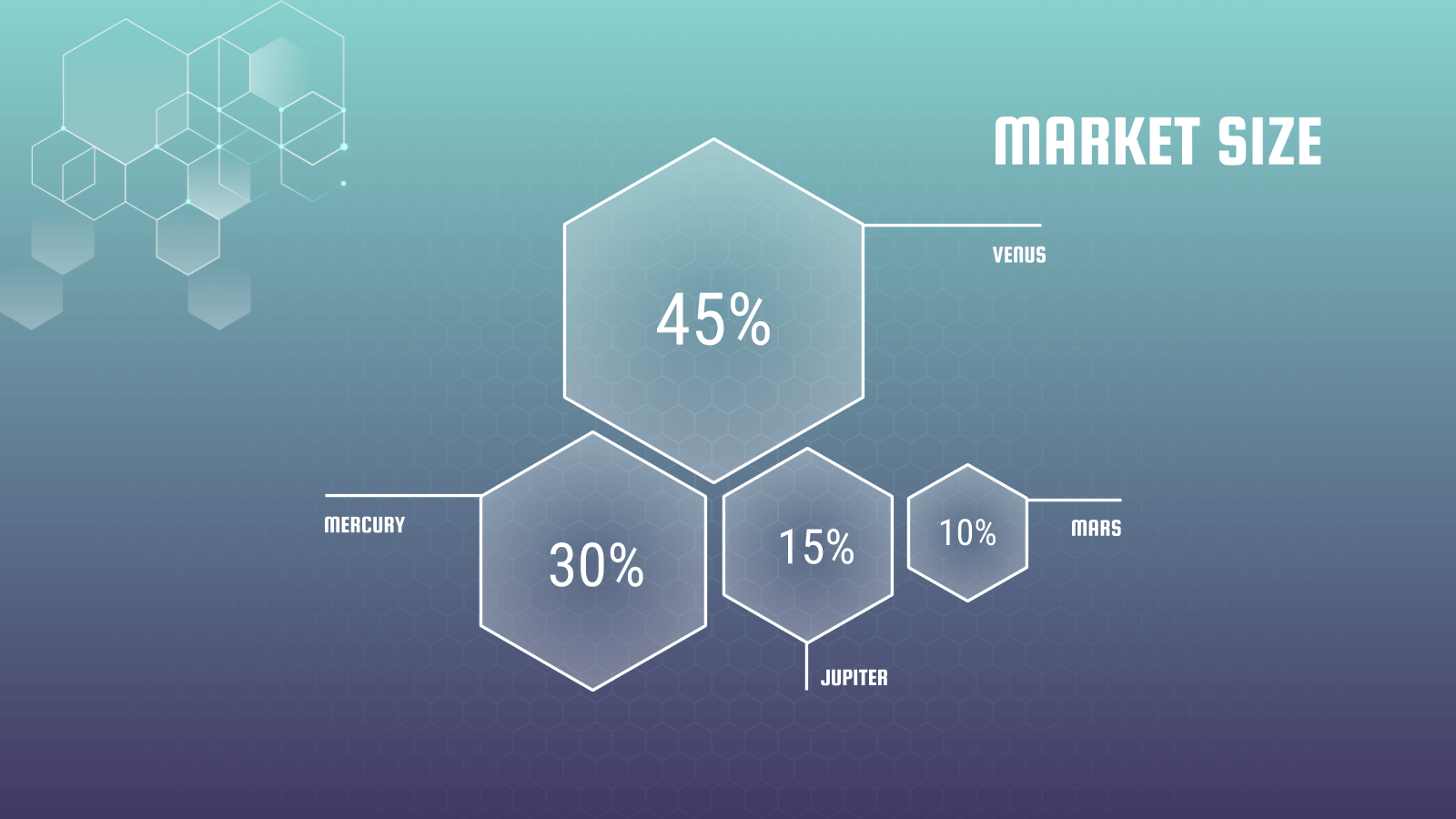
Their sizes don’t have to be an exact reflection of their proportions. What’s important here is that they’re discernible and are of the same shape so that your viewers can grasp its concept at first glance.
Note that this should only be used for comparisons with large enough contrasts. For instance, it’d be difficult to use this to compare two market sizes of 25 percent and 26 percent.
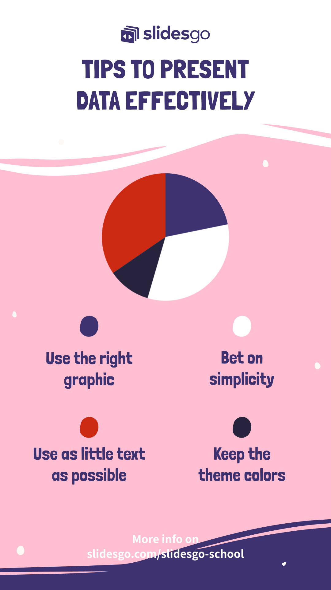
Keep it simple
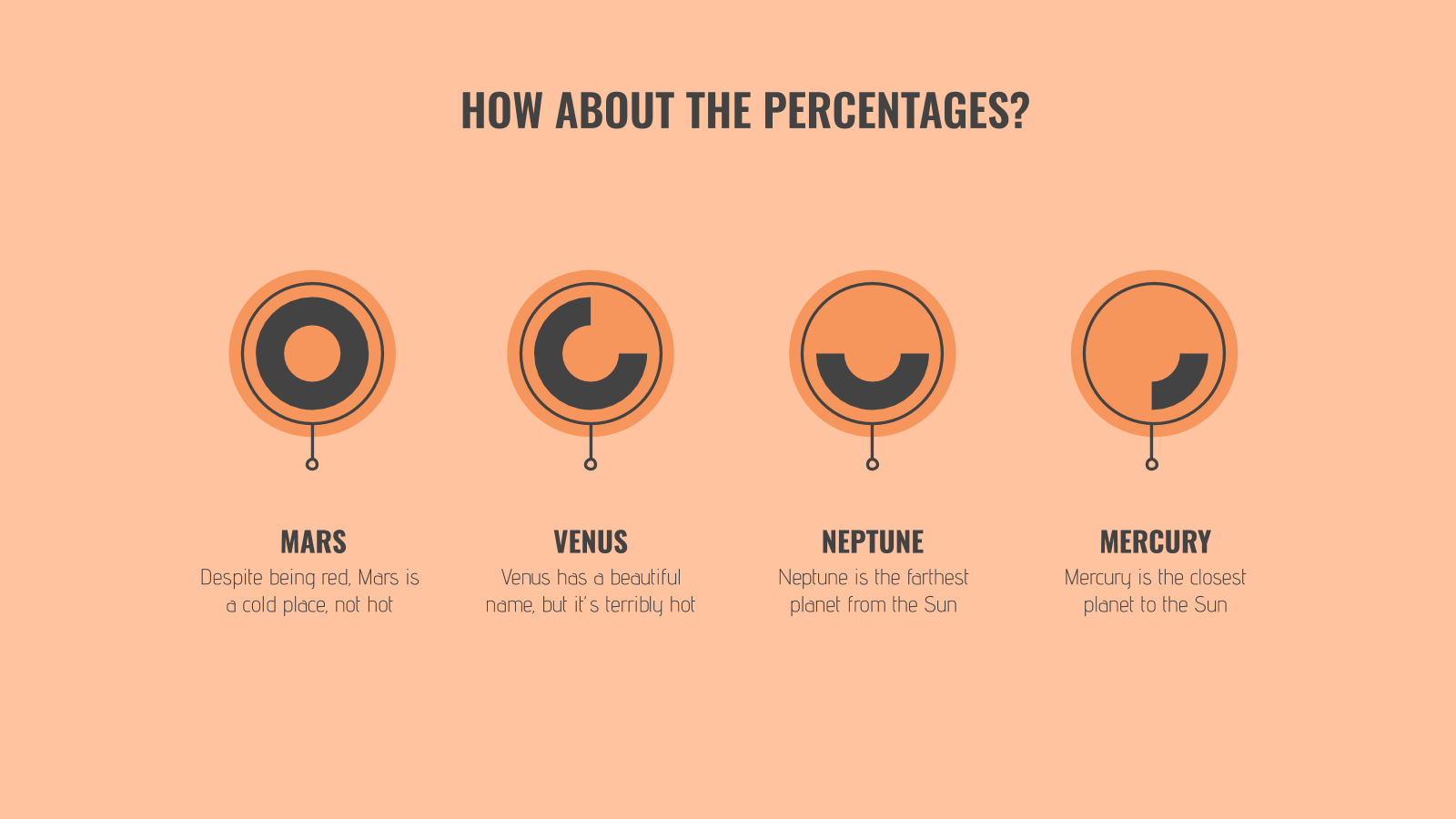
When it comes to making qualitative data digestible, simplicity does the trick.
Limit the number of elements on the slide as much as possible and provide only the bare essentials.
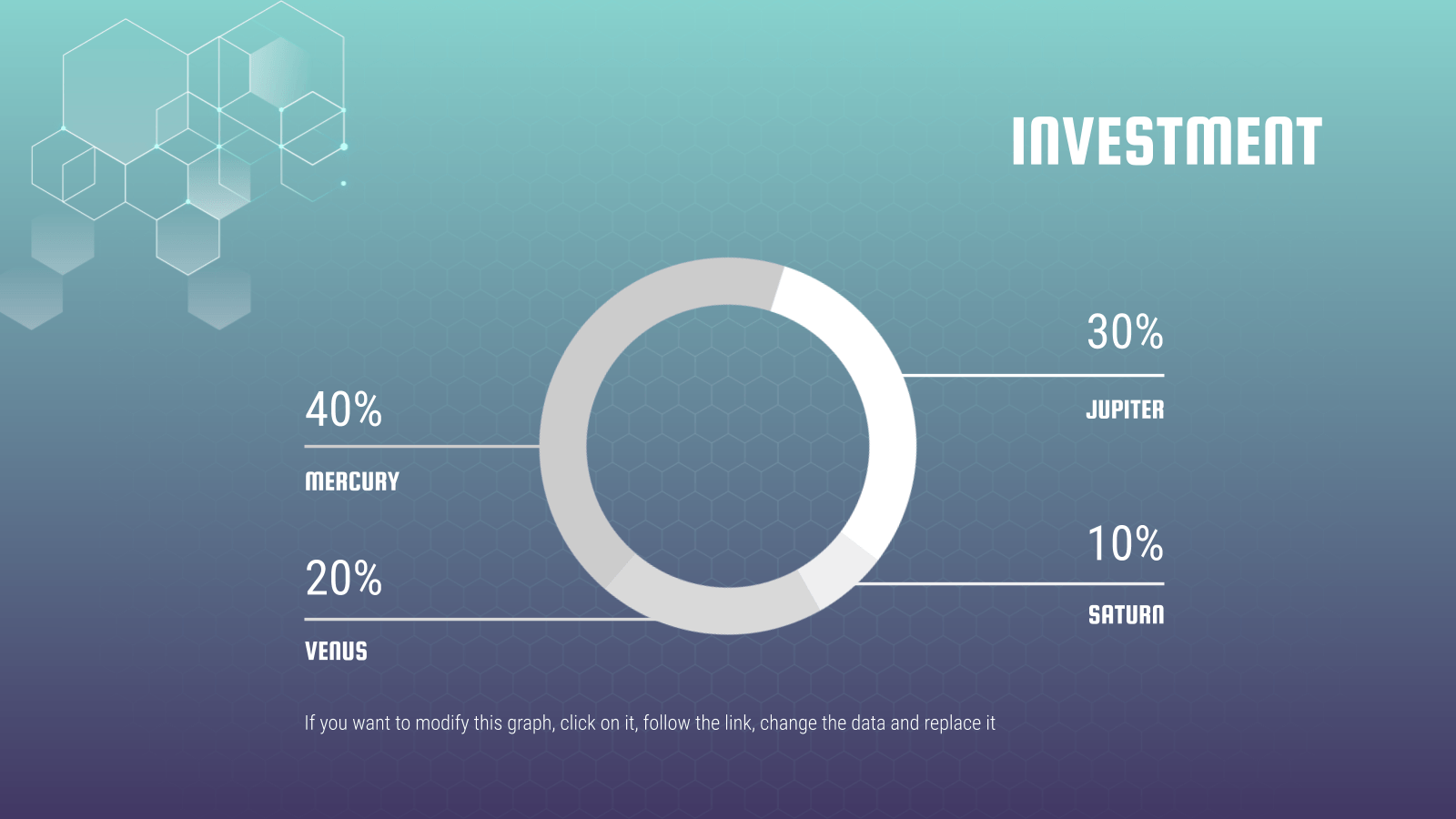
See how simple this slide is? In one glance, your eye immediately goes to the percentages of the donut because there are no text boxes, illustrations, graphics, etc. to distract you.
Sometimes, more context is needed for your numbers to make sense. In the spirit of keeping your slides neat, you may be tempted to spread the data across two slides. But that makes it complicated, so putting it all on one slide is your only option.
In such cases, our mantra of “keep it simple” still applies. The trick lies in neat positioning and clever formatting.
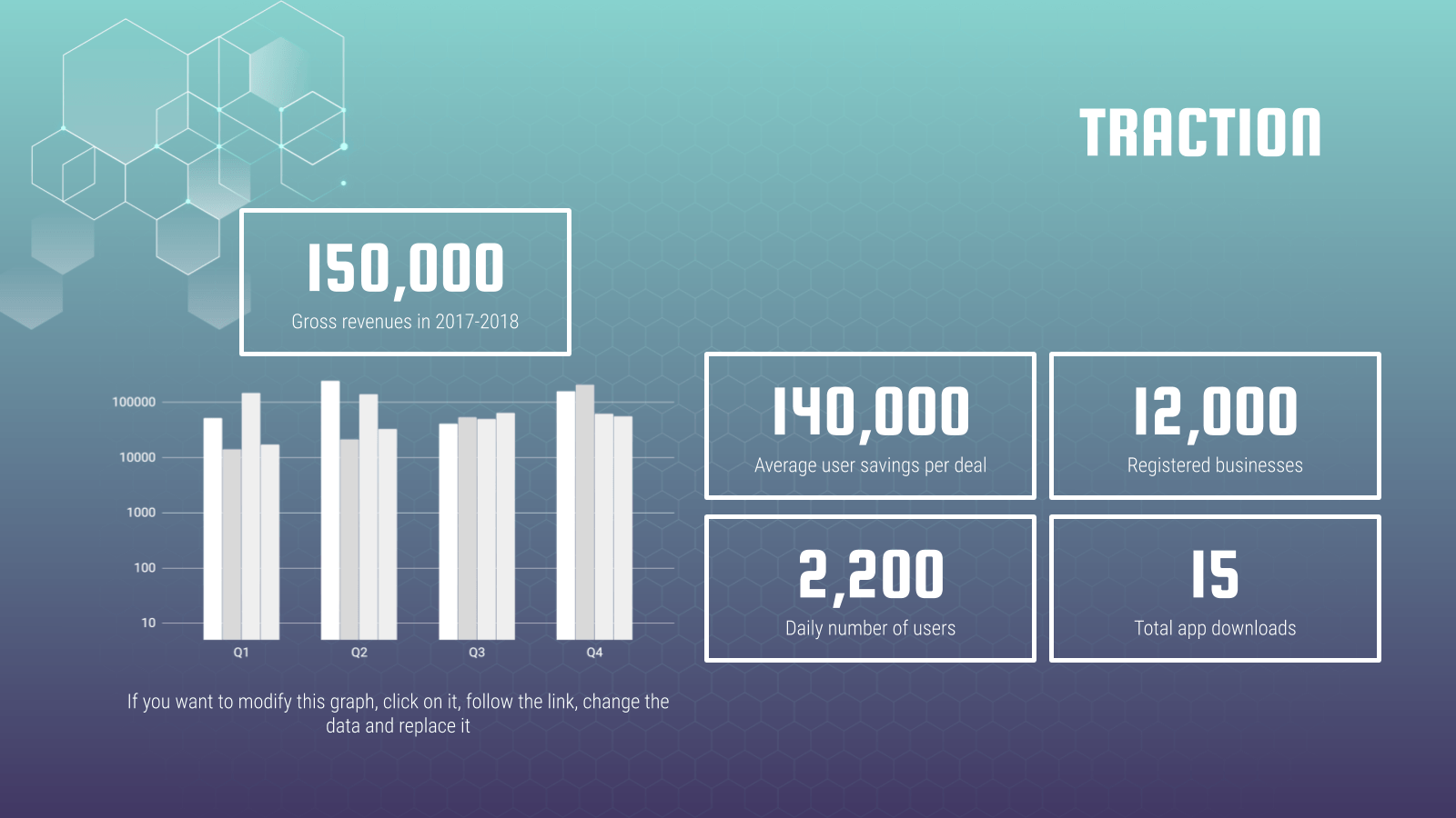
In the above slides, we’ve used boxes to highlight supporting figures while giving enough attention to the main chart. This separates them visually and helps the audience focus better.
With the slide already pretty full, it’s crucial to use a plain background or risk overwhelming your viewers.
Use text wisely and sparingly
Last but certainly not least, our final tip involves the use of text.
Just because you’re telling a story with numbers doesn’t mean text cannot be used. In fact, the contrary proves true: Text plays a vital role in data presentation and should be used strategically.
To highlight a particular statistic, do not hesitate to go all out and have that be the focal point of your slide for emphasis. Keep text to a minimum and as a supporting element.

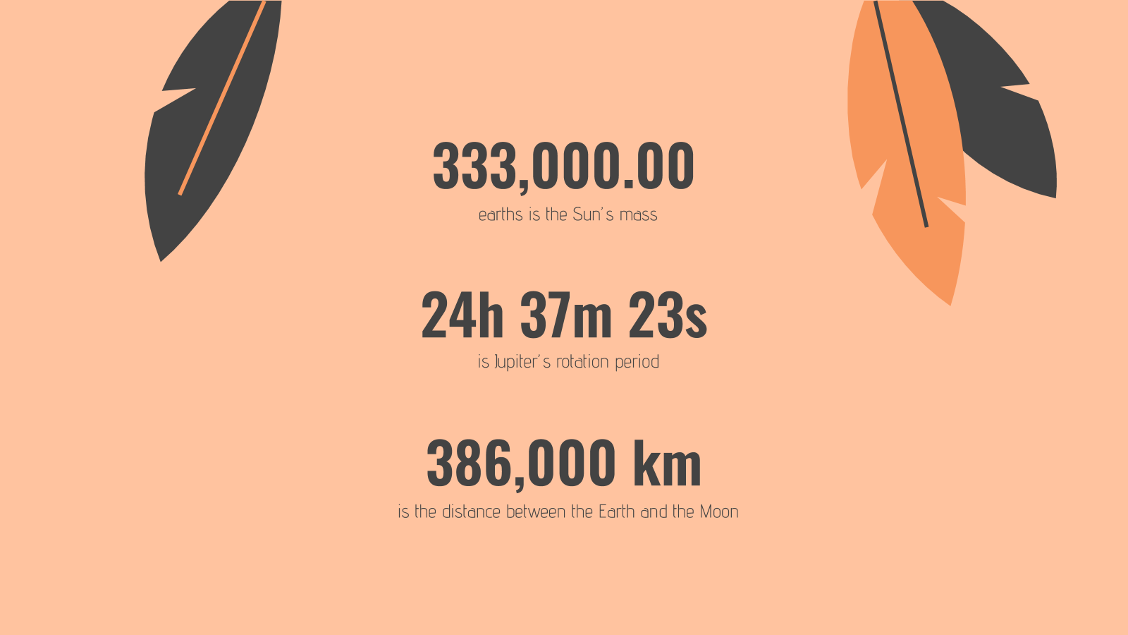
Make sure your numbers are formatted clearly. Large figures should have thousands separated with commas. For example, 4,498,300,000 makes for a much easier read than “4498300000”. Any corresponding units should also be clear.
With data presentation, don’t forget that numbers are still your protagonist, so they must be highlighted with a larger or bolder font.
Where there are numbers and graphics, space is scarce so every single word must be chosen wisely.
The key here is to ensure your viewers understand what your data represents in one glance but to leave it sufficiently vague, like a teaser, so that they pay attention to your speech for more information.
→ Slidesgo’s free presentation templates come included with specially designed and created charts and graphs that you can easily personalize according to your data. Give them a try now!
Do you find this article useful?
Related tutorials

How Smart Template Matching Saves Hours on Your Next Presentation
Content Find your perfect template, automatically How it works Templates that match your topic Get better results FAQ Skip the Search, Start Creating Find your perfect template, automatically Great presentations look intentional—where the design supports the message. But finding a template that fits usually means scrolling through dozens of options....

Creative PowerPoint Night Ideas
Want to be the star of your next PowerPoint Night? With the right ideas and a spark of creativity, you can turn any theme into a show-stopping experience that keeps everyone laughing and engaged. Whether you’re planning a friendly game night, a classroom challenge, or a team-building session, this guide is your...

Smart Guide: Best AI Prompts for Powerful Presentations
Ever stared at a blank slide, knowing your message matters but not sure how to bring it to life? You’re not alone. With the rise of AI Presentation Maker, more creators, educators, and professionals are asking: What are the best AI prompts for presentations?This guide shows you exactly how to...

How to convert PDF to PPT online for free
Ever tried making a presentation from a PDF? It’s not exactly fun—copying, pasting, reformatting… plus, it takes forever. So, why do it? Instead convert your PDF to PPT in seconds through our new tool AI PDF to PPT converter.Whether you’re pitching an idea, designing tomorrow’s lesson plan, or presenting a report, this...