
How to Make Charts in Google Slides

Using charts to represent your numerical or statistical data helps your audience understand everything visually at a glance. In this new Google Slides tutorial, you’ll learn how to create pie charts, bar graphs and other kinds of charts, so you’ll be able to display the information clearly and boost your presentations.
How to Create a Chart
Whenever you create a chart in Google Slides, it will link to a Google Sheets document. Having this in mind, let’s see how you can make a chart from scratch for your presentation.
- Select the slide where you want to insert a chart.
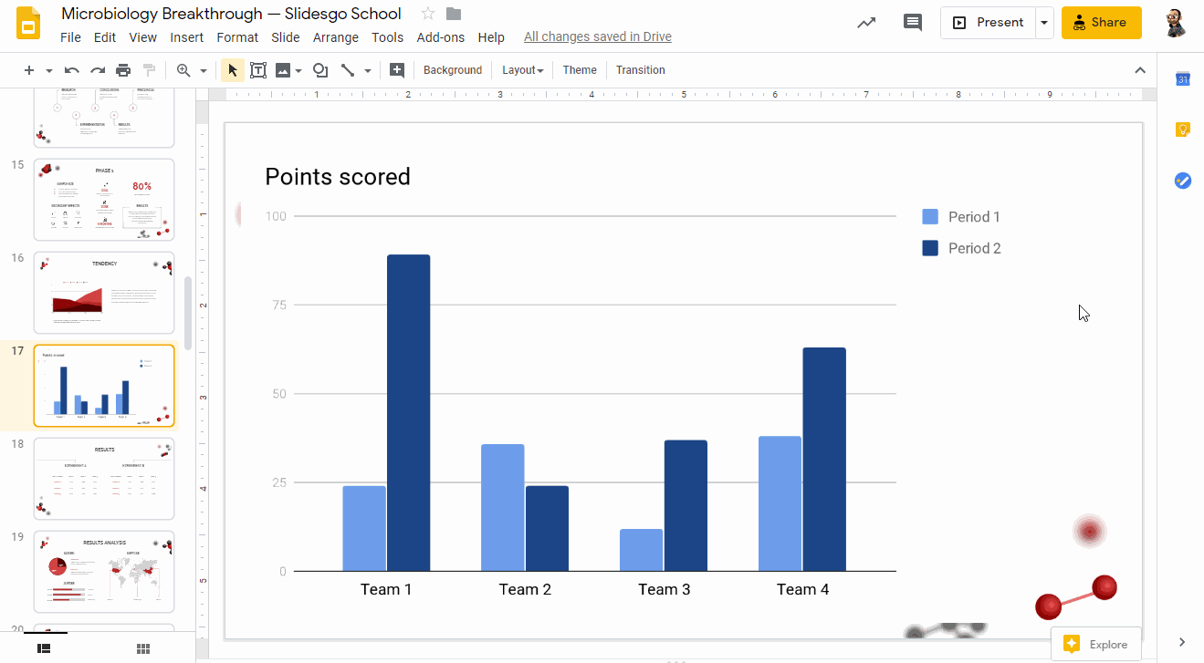
- Click Insert → Chart. You’ll see different options: bar, column, line and pie. There’s also an option to add a chart from an already existing Google Sheets document. Select the one that best fits your data.
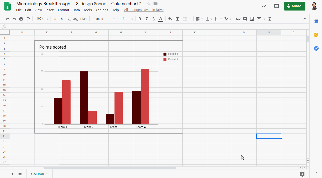
- Once you’ve added the chart, it will be inserted as an image. To edit it, click Edit in Sheets, which will appear in a pop-up in the bottom left corner.
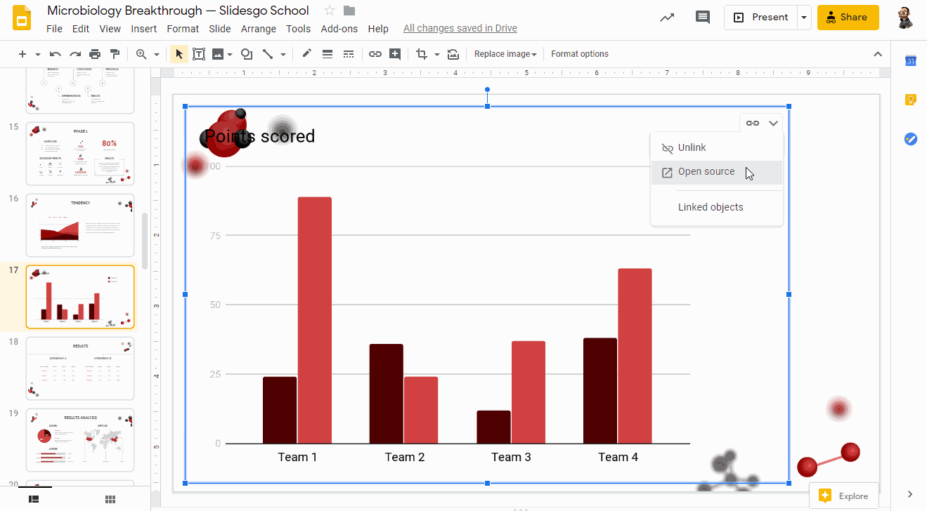
- As an alternative, click the Link options drop-down arrow and choose Open source. A Google Sheets document will open.
- When you’re done modifying the data and/or the design in Google Sheets, go back to Google Slides. To apply the changes, click the Update button, located in the top right corner.
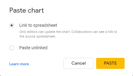
- As an alternative, you can copy the chart from Google Sheets by pressing Ctrl/Cmd + C and paste it in your Google Slides presentation.
- When pasting, you will be asked whether to link the chart to the source spreadsheet or not.
Editing a Chart
- Select the chart that you want to edit in your presentation.
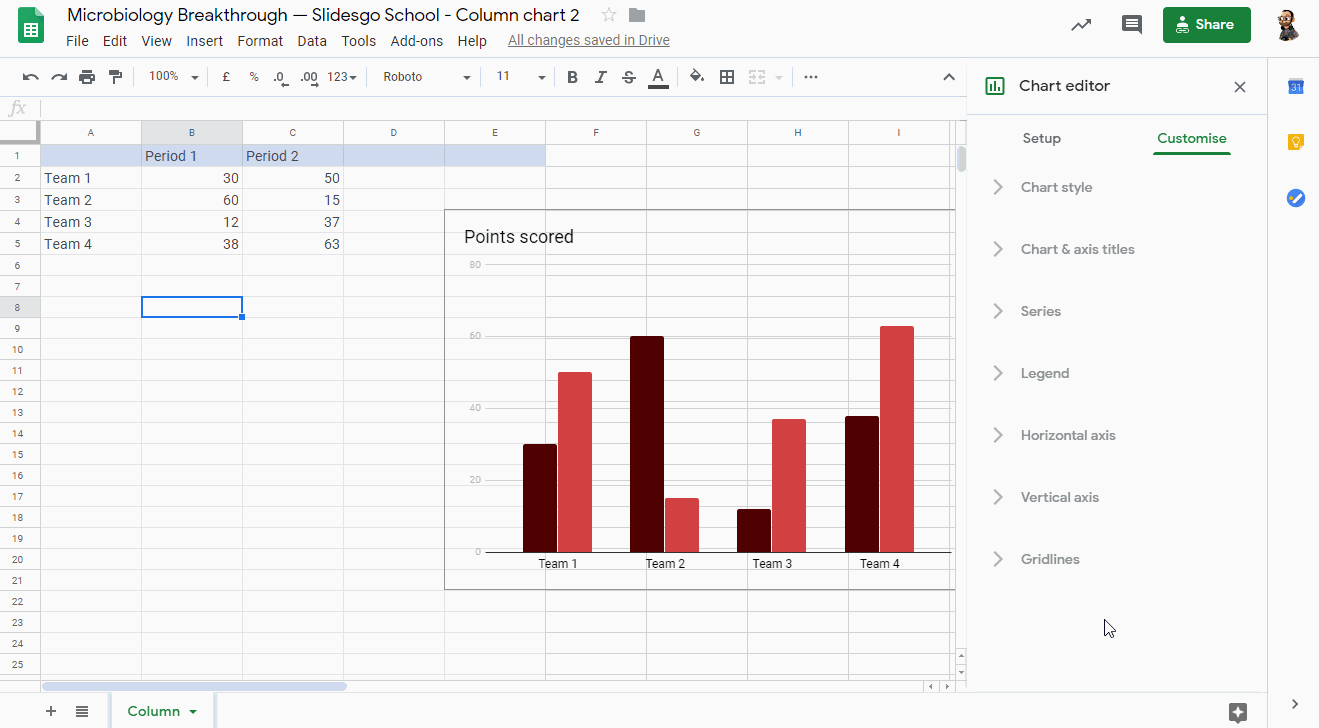
- Any Google Slides chart is processed as an image. To edit it, click the Link options drop-down arrow, located in the top right corner, and choose Open source. A Google Sheets document will open.
- Modify the data that has been generated by default. You’ll find it in the first cells.
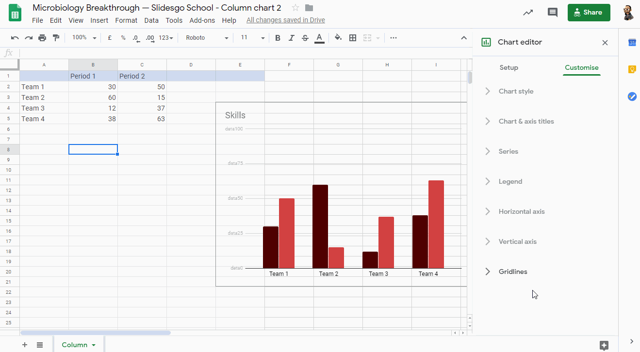
- To edit the colors of the chart or the background, select the desired element and choose a color from the panel on the right. You can also click the three vertical dots, located in the top right corner of the chart, and select Edit chart.
- On the Setup tab from the Chart editor panel, you can select the data range, change the chart type, add operations and determine whether you want to use the first row as headers or not. Click the Stacking drop-down arrow to see options that allow you to modify how the data will be displayed in the chart.

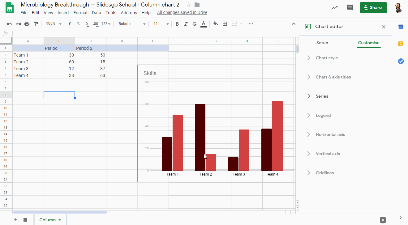
- On the Customize tab from the Chart editor panel, you can adjust different settings. Let’s have a look at them.

- In the Chart & axis titles submenu, you can enter the title text and select its font, size, format and color. This will override the settings from the Chart style submenu, but only for the titles.
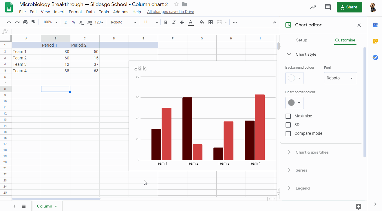
- In the Chart style submenu, you can adjust the background color (or leave it without any color), change the font and adjust the chart border color (or leave it without color). There are also other options to turn the chart 3D, maximize it and enable the Compare mode.
- In the Legend submenu, you can set the position of the legend and its format.

- If you’re working with a bar chart, in the Series submenu you can edit the colors of the periods. There are also other options to enable the error bars and data labels.
- If you’re working with a bar or line chart, the Horizontal axis and Vertical axis submenus will be available too. These allow you to adjust the axes of the chart and the format of the labels.
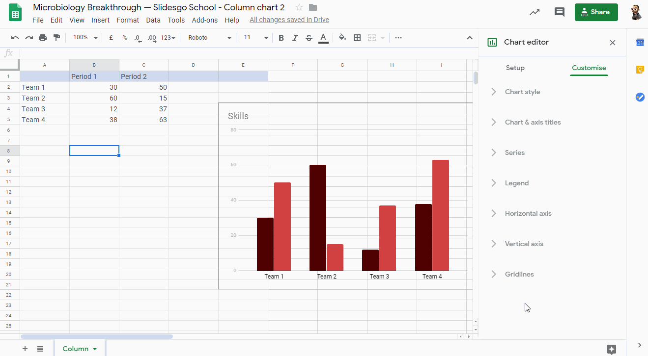
- Finally, in the Gridlines submenu you can enable the gridlines if the chart supports this feature. You can also set how many there will be, as well as their color.
- To apply the changes in your Google Slides presentation, click the Update button, located in the top right corner. You can also copy the chart from Google Sheets by pressing Ctrl/Cmd + C and paste it in your presentation.
Working with the Charts Included in Our Templates
- Make a copy of our template in your Google Drive. Then select the slide that contains the editable chart.

- You’ll notice that the chart is linked. Select the chart and click the link to the Google Sheets document.
- Make a copy of the spreadsheet in your Google Drive.
- It will open in Google Sheets, where you’ll see the charts that we’ve included in our template.
- Once you’re done modifying the chart, copy it by pressing Ctrl/Cmd + C, go back to Google Slides and paste it.
- You will be asked whether you want to link the chart to the source spreadsheet or not.

Do you find this article useful?
Related tutorials

How Smart Template Matching Saves Hours on Your Next Presentation
Content Find your perfect template, automatically How it works Templates that match your topic Get better results FAQ Skip the Search, Start Creating Find your perfect template, automatically Great presentations look intentional—where the design supports the message. But finding a template that fits usually means scrolling through dozens of options....

Creative PowerPoint Night Ideas
Want to be the star of your next PowerPoint Night? With the right ideas and a spark of creativity, you can turn any theme into a show-stopping experience that keeps everyone laughing and engaged. Whether you’re planning a friendly game night, a classroom challenge, or a team-building session, this guide is your...

Smart Guide: Best AI Prompts for Powerful Presentations
Ever stared at a blank slide, knowing your message matters but not sure how to bring it to life? You’re not alone. With the rise of AI Presentation Maker, more creators, educators, and professionals are asking: What are the best AI prompts for presentations?This guide shows you exactly how to...

How Teachers Are Really Using AI in the Classroom: Voices from the Field
“I hope that AI can ensure students are still doing the planning, writing, and critical thinking needed. Students can't lose these skills.” -6th grade Science Teacher, FloridaFull disclosure: I interviewed my mom for this blog post.My mom, a retired 25+ year veteran educator who recently returned to the classroom, told me...