
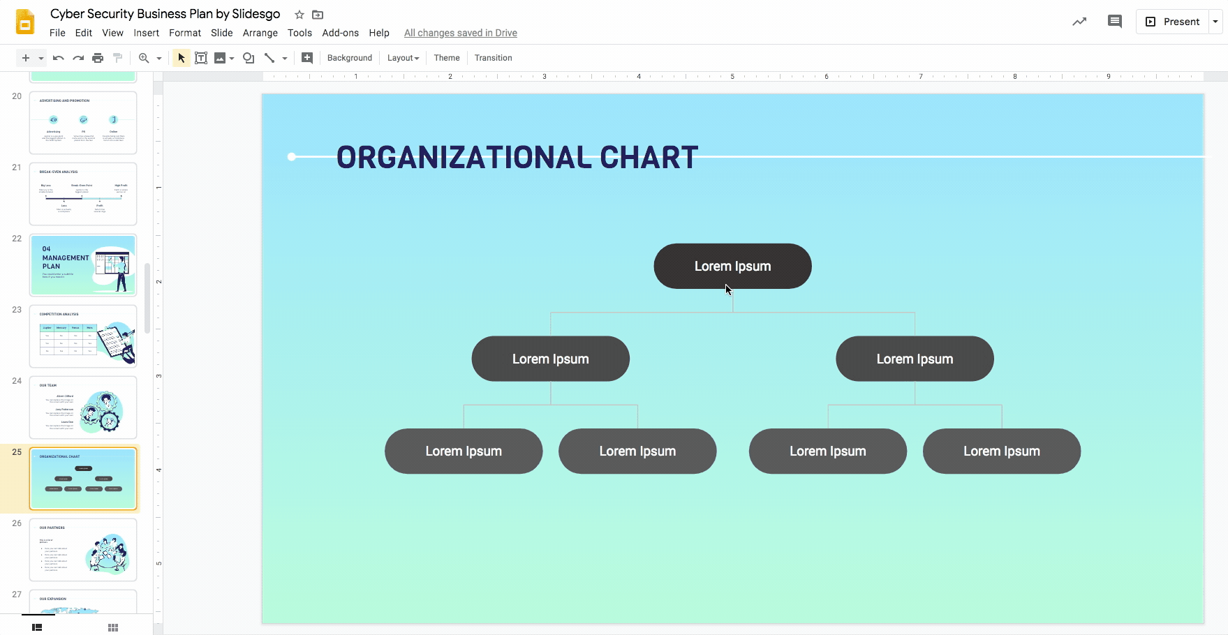
How to Create an Organizational Chart in Google Slides

An organizational chart depicts the different relationships in a company using graphics and helps viewers understand and visualize its structure and hierarchy. It comes in particularly useful in business plans, pitch decks, company presentations, etc.
There are two ways to create an organizational chart in Google Slides. The easier way would be to use one of their built-in diagram templates as a base and edit it accordingly. If you prefer to have a more customized organizational chart, you may design one from scratch. In this tutorial, we’ll explain how you can do both.
Using an organizational chart template
- Open your presentation and select the slide you want to add the organizational chart to.
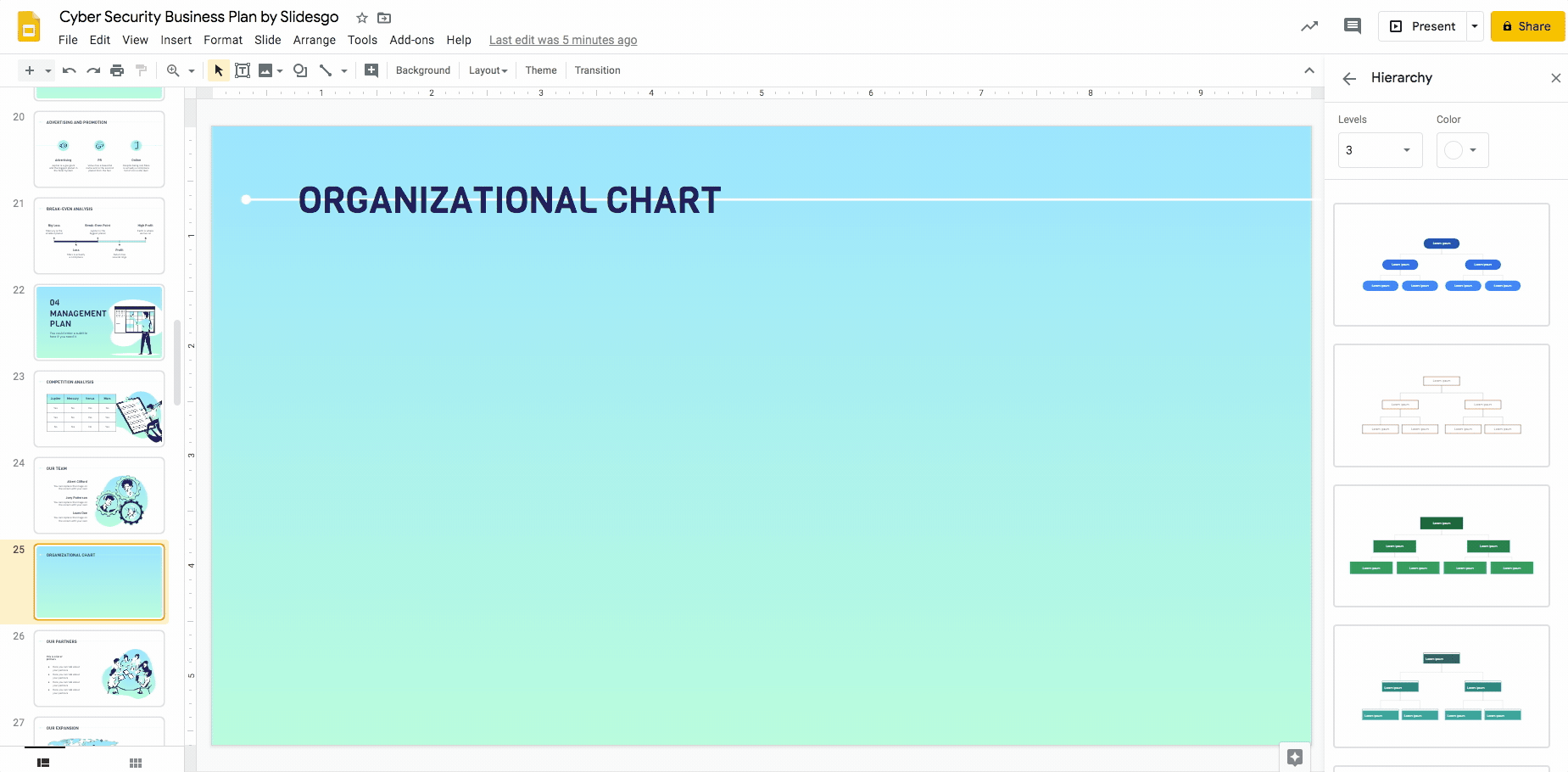
- Then select Insert → Diagram. This opens up a sidebar on the right showing the different types of diagrams. Select Hierarchy.
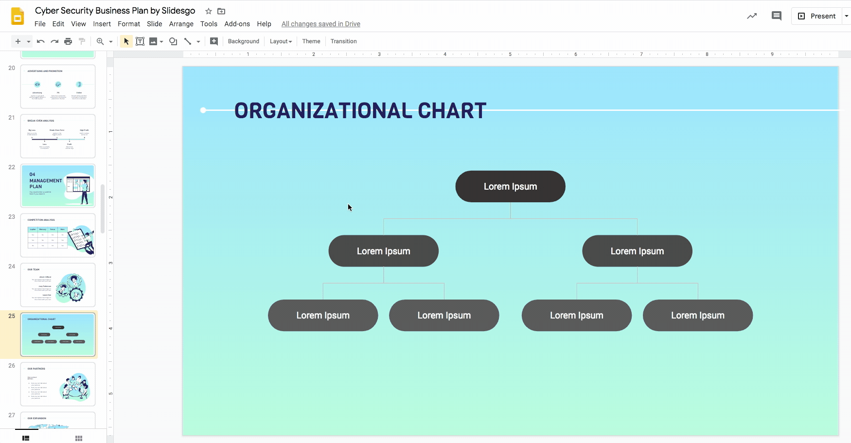
- Choose the type of structure that best fits your needs and the number of levels you want your organizational chart to have. At this point, you can also change the base color of the chart.
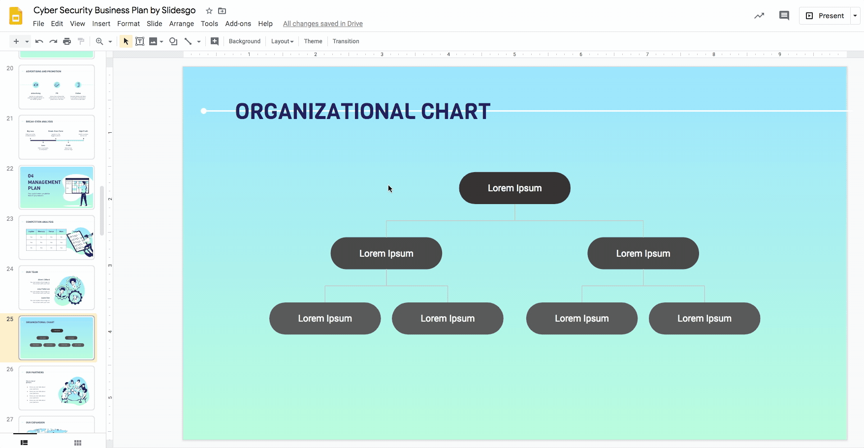
- To style the elements of the organizational chart, use the options Fill color and/or Border color. You may do it by selecting one element at a time.
Pro tip: You can select various elements and style them all at one go. Select elements of the same type (eg. all the lines or all the ovals) one by one while holding down Shift.
- Style the texts using the options Font, Font size, and Text color while maintaining the typefaces and colors used in the template. You could also use the Align option, but most built-in diagrams are already centrally aligned, which is usually the most visually appealing option.
Creating an organizational chart from scratch
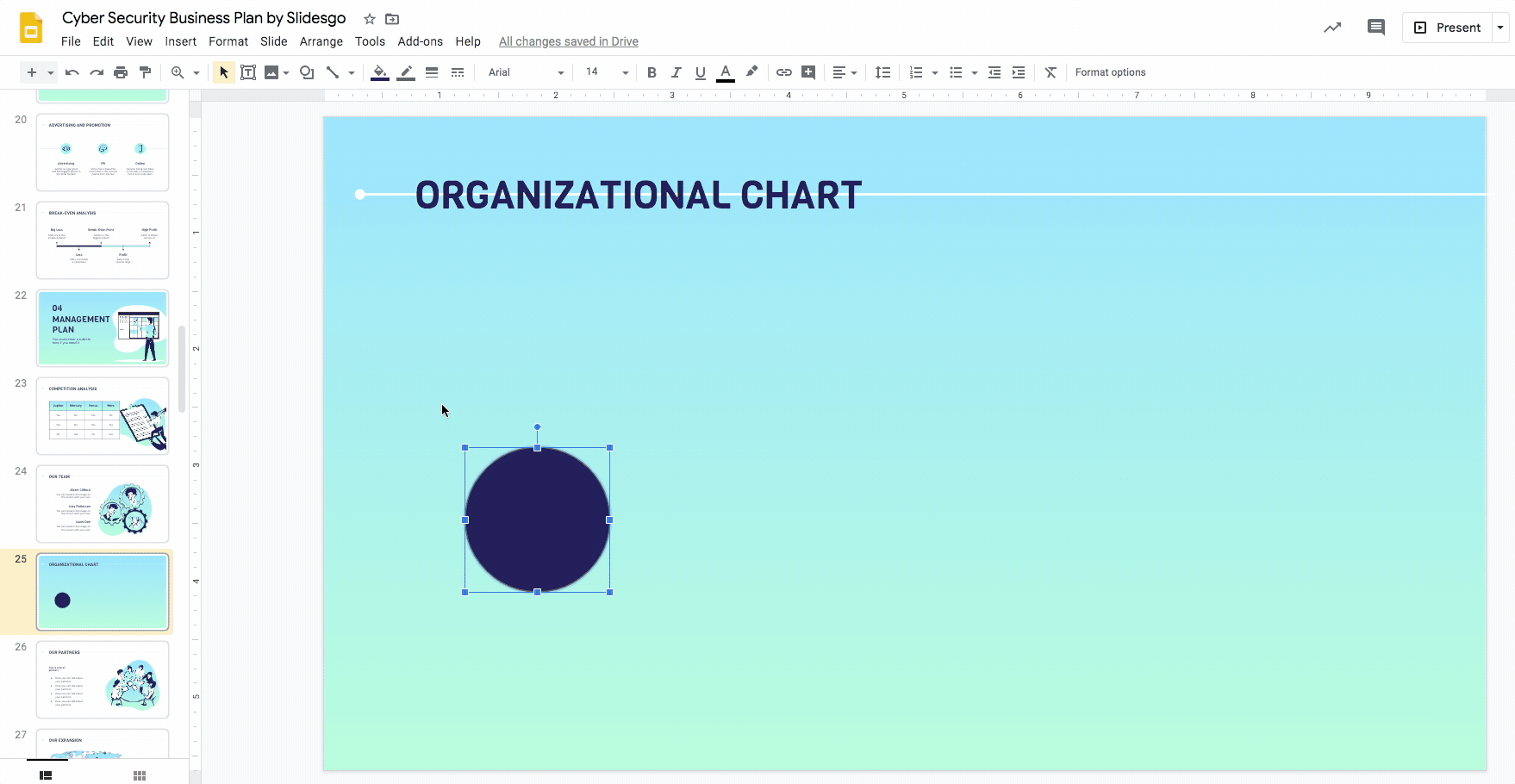
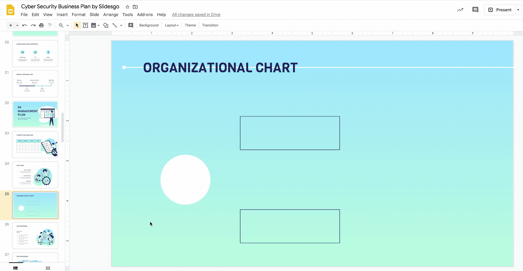
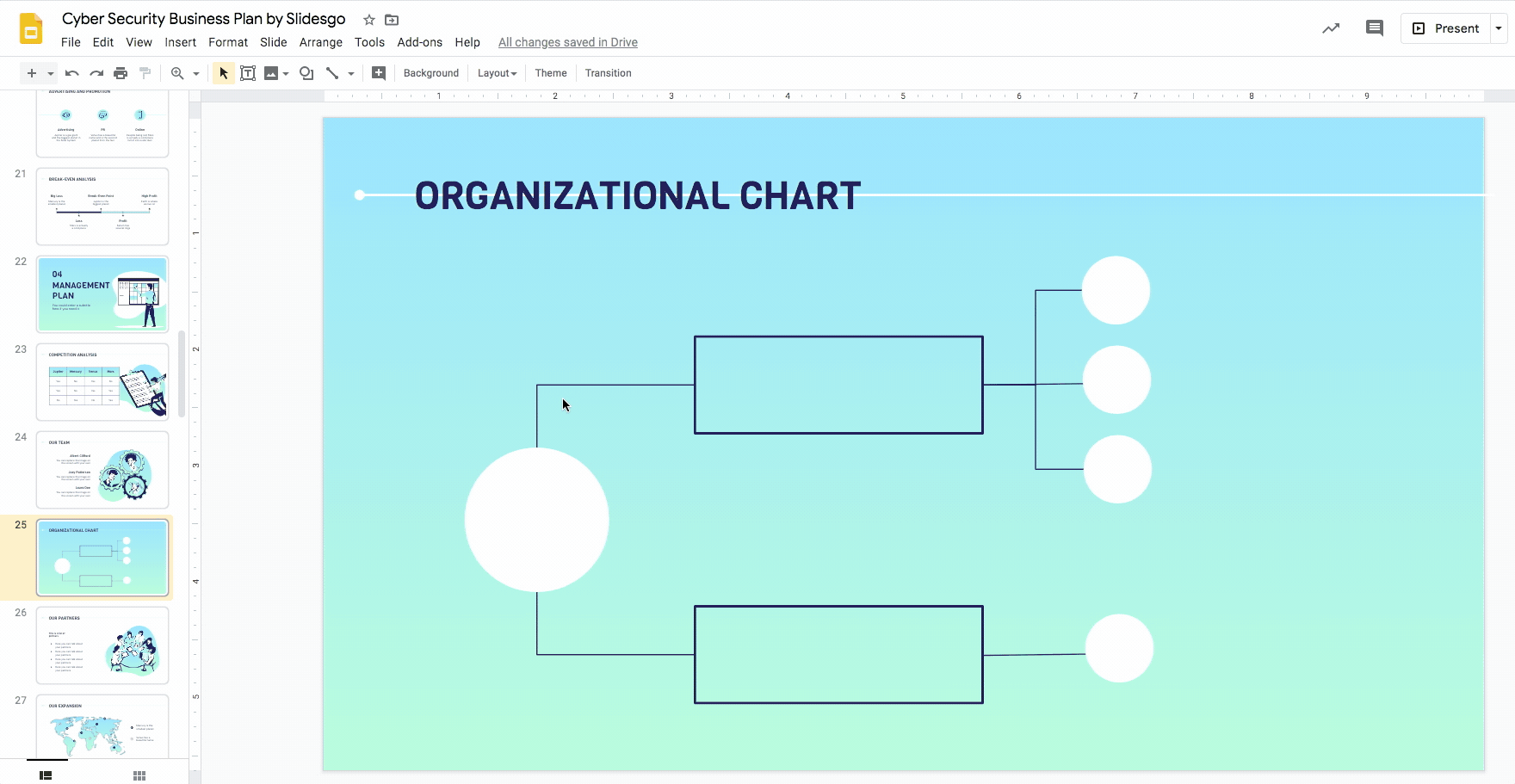
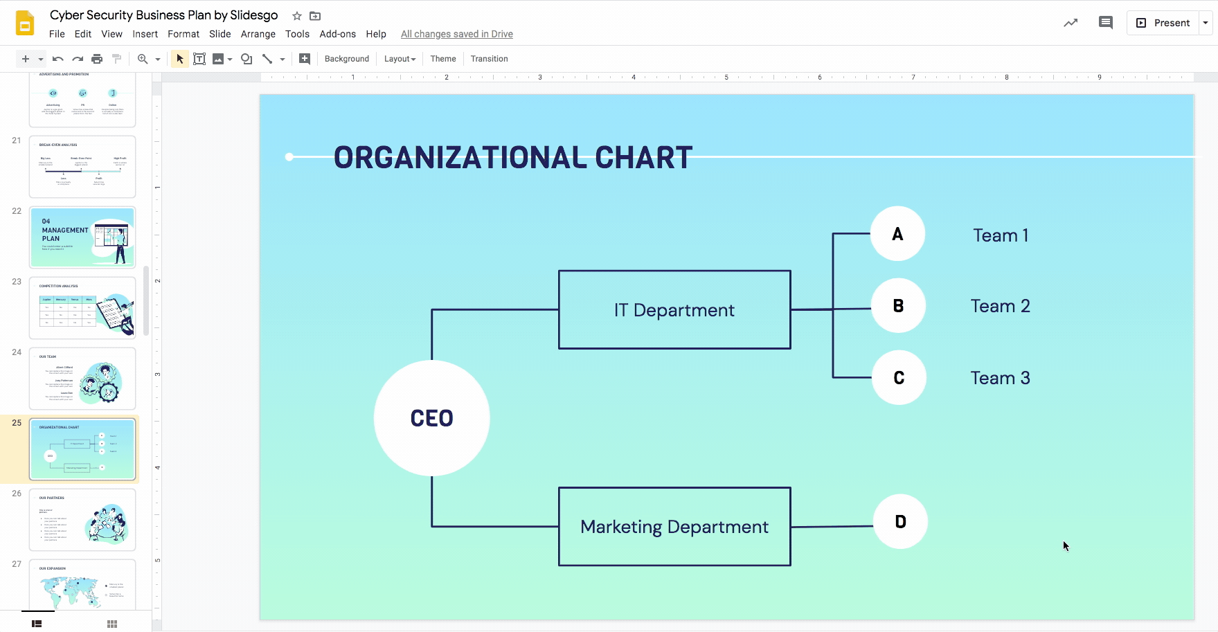
- Start by defining the structure, layers, and shapes of your organizational chart. organizational charts consist of very simple shapes connected by lines or arrows. In this case, we’ll use a horizontal layout of three layers made up of circles and rectangles.
- Select Insert → Shape → Shapes → Oval. Click and drag to create the shape to create it. This will contain the main element of the organizational chart.
Pro tip: To create a perfect circle, hold down Shift while dragging.
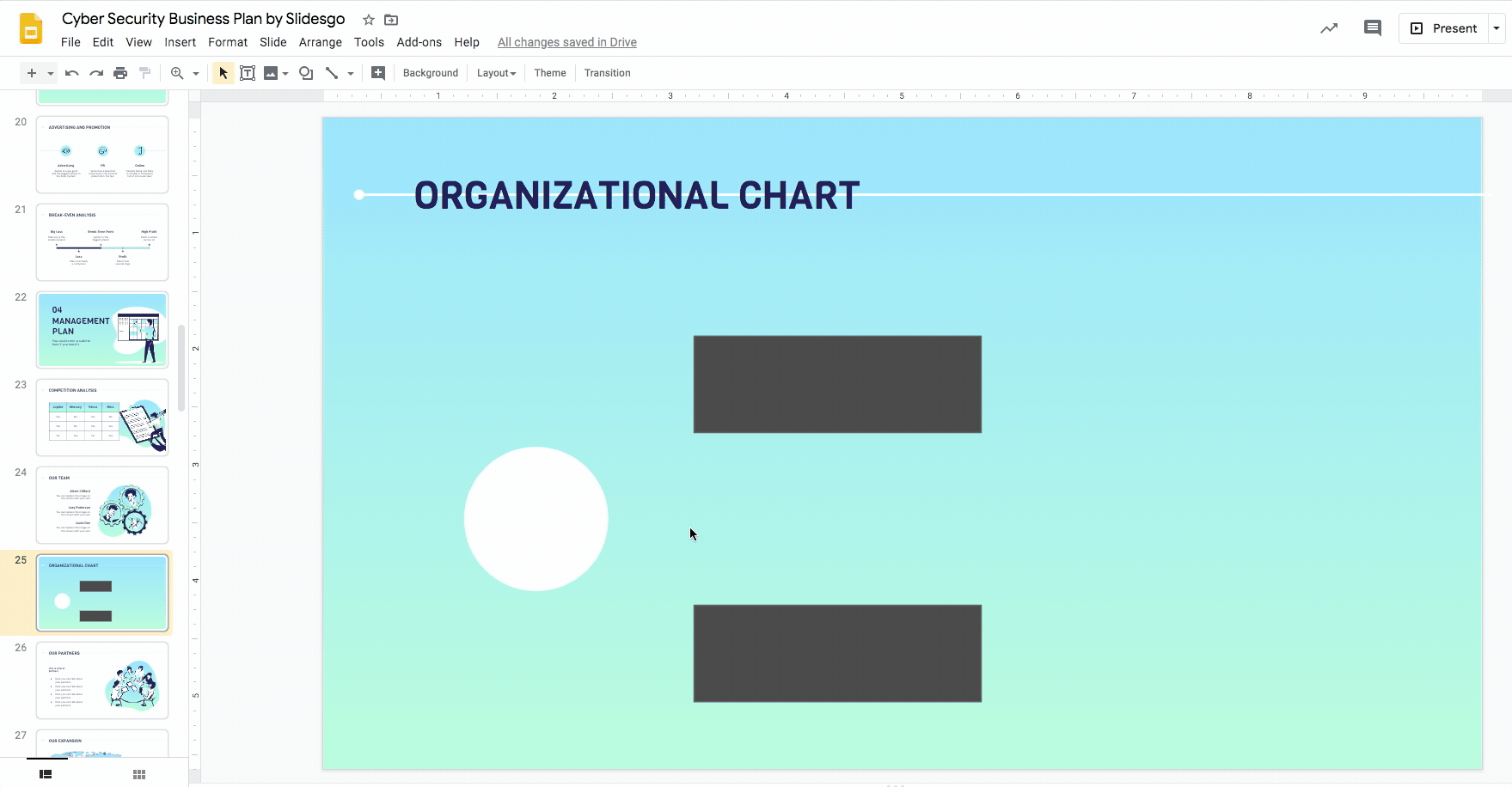
- Style it by using the option Fill color. As a rule of thumb, continue using the theme’s main colors. Here, we’ll also select the option Transparent under Border color.
- Select Insert → Shape → Shapes → Rectangle. Click and drag to create the first of two rectangles that will form the second layer of the organizational chart.
Place it as desired and replicate it with Ctrl C + Ctrl V or Cmd C + Cmd + V in Mac.
- Select them both by holding down Shift (you could also click and drag your cursor over an area containing the two elements).
- Style them by using the options Fill color and Border color. In this case, we’ll be choosing Transparent under Fill Color so that only the outlines are visible.
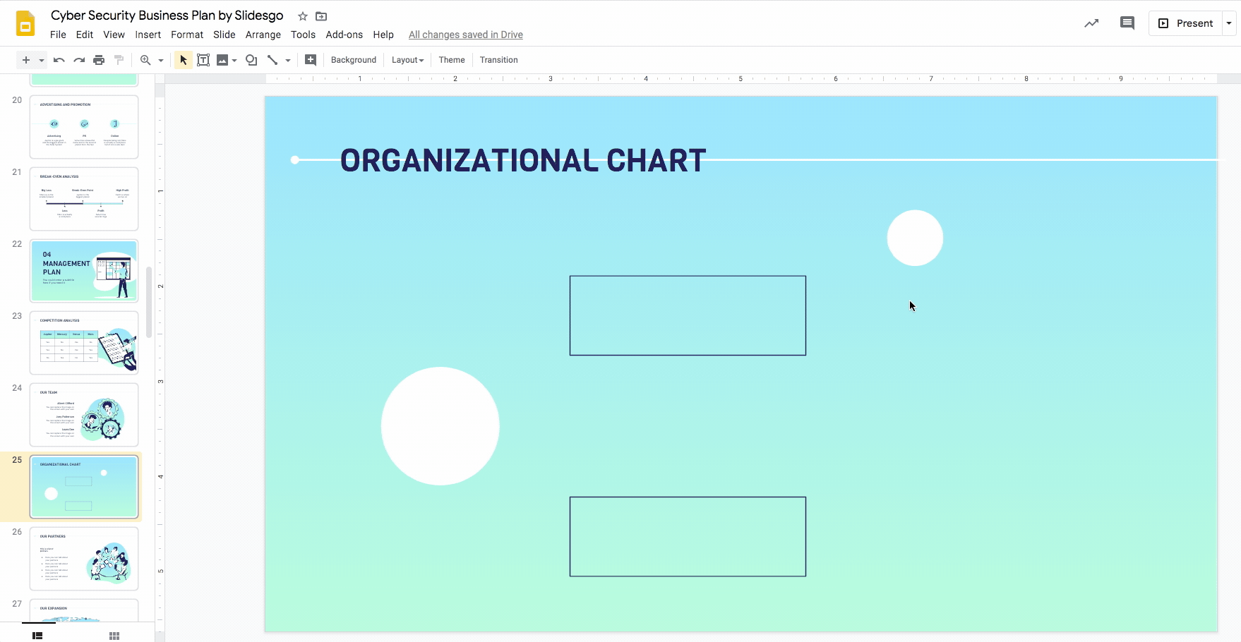
- We’ll now create the third layer of your organizational chart. To do that, we’ll need additional circles. You may simply select the main circle and copy and paste it (Ctrl C + Ctrl V or Cmd C + Cmd V in Mac).
- Resize the new circle by clicking on it to bring up its outline. Now, click on any of the corner blue dots and drag it inwards to make it smaller (remember to hold down Shift to maintain its circular dimensions). This is the first element of the third layer of the organizational chart.
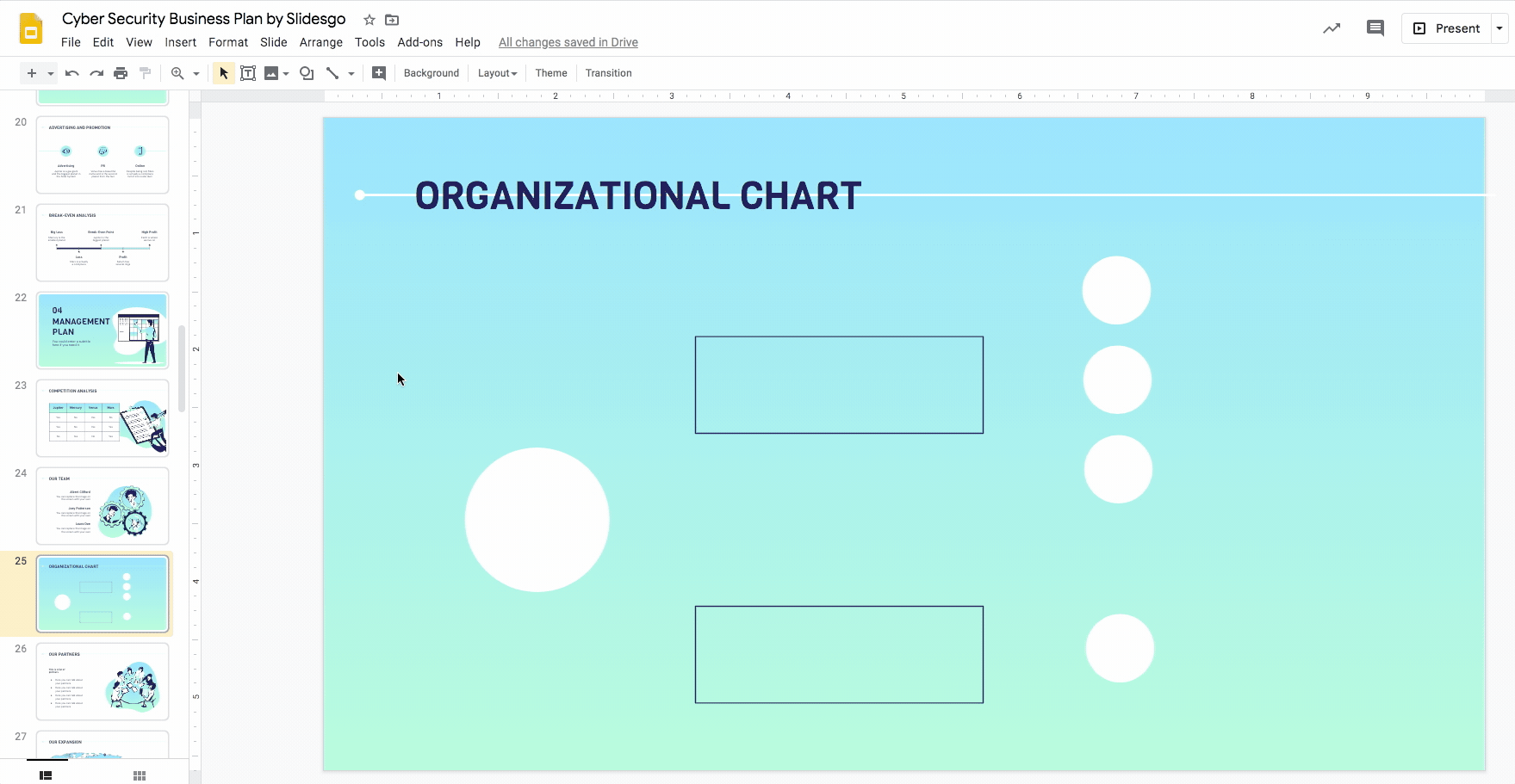
- Copy and paste the circle using Ctrl C + Ctrl V or Cmd C + Cmd V in Mac three more times.
- Align the elements horizontally and vertically. By moving the object slowly, Google Slides’ visual guidelines will prompt you when you arrive at an equidistant point.
Related tutorial: How to Arrange and Align Objects in Google Slides

Pro tip for Windows: Instead of copying and pasting an element with Ctrl C + Ctrl V or Cmd C + Cmd V in Mac, you can duplicate it by holding down Ctrl + Shift or Cmd + Shift in Mac and dragging it to its desired position. Once you have it in place, press Ctrl + Shift + Z or Cmd + Shift + Z in Mac to repeat the same action. This is the “redo” option and it helps to ensure that all elements are equidistant.
Pro tip for Mac: To duplicate an element by dragging it, press Cmd + Option/alt (⌘ +⌥). Then use the “redo” option with ⌘ + Shift + Z.
Using connectors in an organizational chart
- Select Insert → Line → Elbow Connector. We will use this to connect the elements of the organizational chart to portray the relationship between them.
- Hover your cursor over the main circle to bring up an outline with violet dots.
- Click on the desired dot you want the line to be connected to and drag out the line until you reach the corresponding dot of the first rectangle. This represents their connection.
- Repeat to connect the second rectangle with the same line type, Elbow Connector.
- Continue to connect the elements of the third layer with those of the second with Elbow Connectors (and lines if needed) until all the connections of your organizational chart are completed.
- To style all the lines in one step, select each line while holding down Shift. Use the options Line color and Line weight (remember to use theme colors!).
Adding texts to an organizational chart
- Double click on a shape to bring up the text box. Type in the titles of your organizational chart. Do this for the main circle and the second layer. The circles of the third layer may be too small for text. You may add an abbreviation instead. (We’ll go more into this later.)
- Select the text and style it with the Font, Font size, Text color and Align options. As always, to ensure your design is visually consistent, remember to use the same typefaces and colors in the rest of the template. Do not forget to centralize your text.
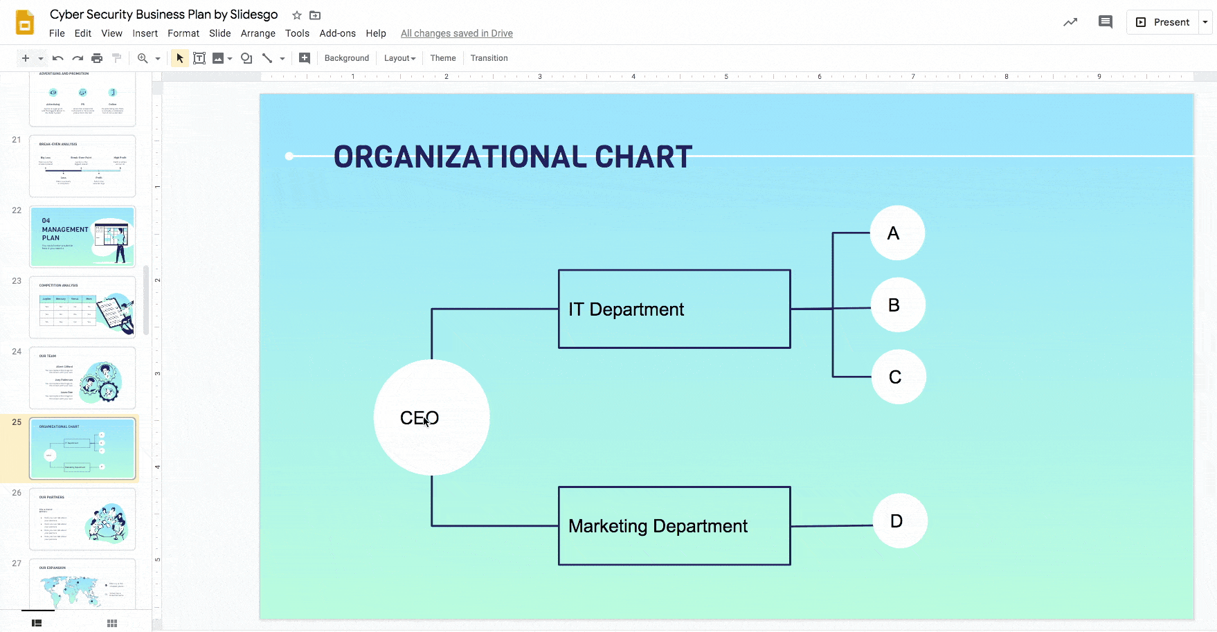
- If the third layer’s elements are too small to fit text, you can assign a letter (as we’ve done in our example) or abbreviation to it and add short descriptions next to it. Select Insert → Text box. Then click and drag to create the text box. Type in your description in this text box.
- Use the Font, Font size, Text color and Align options to style the text.
- Copy and paste the text box (Ctrl C + Ctrl V or Cmd C + Cmd V in Mac) and place them next to the remaining circles and adapt your text.
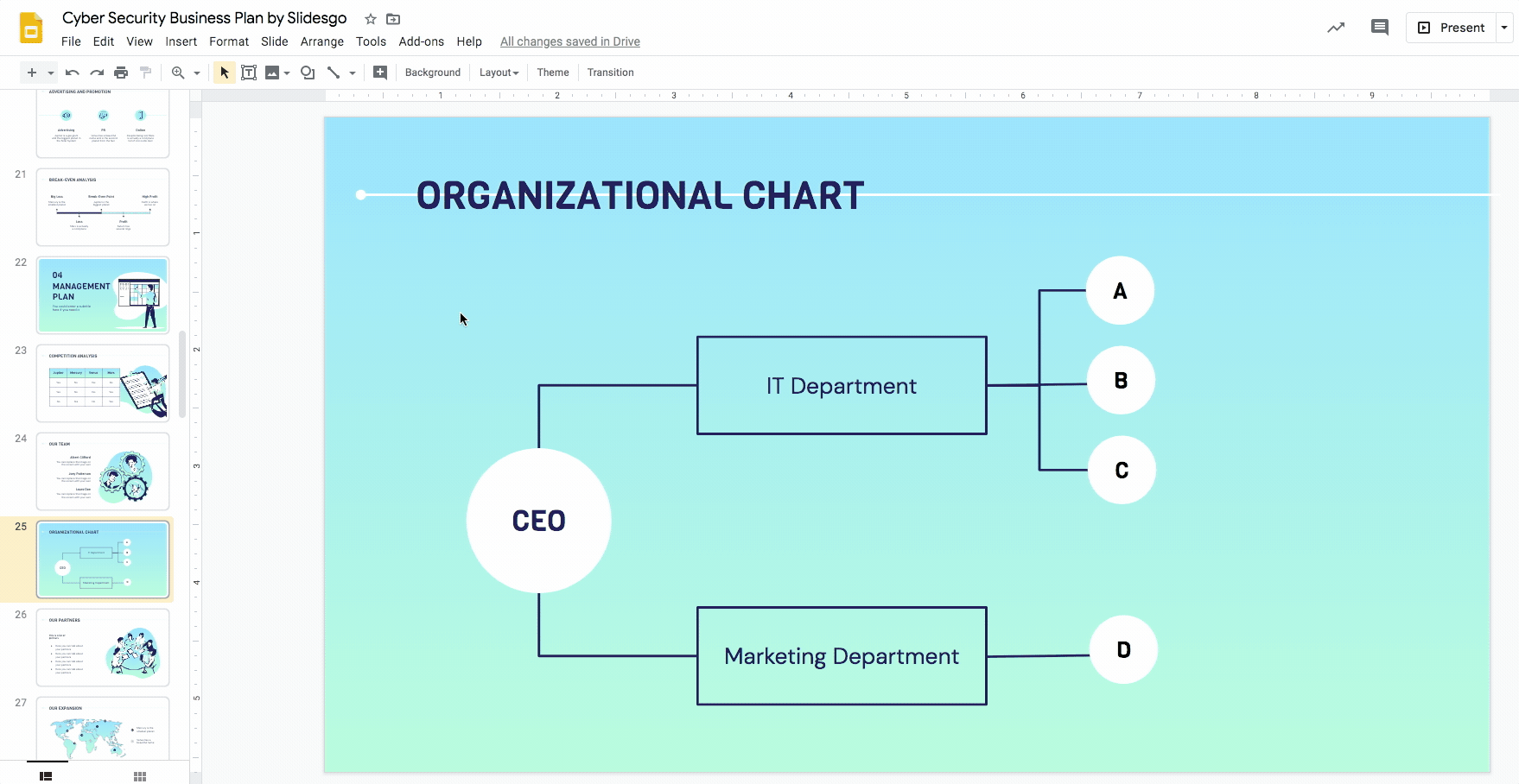
- High five! You’ve just nailed a customized organizational chart in Google Slides.
At Slidesgo, we offer a huge spectrum of beautiful templates that is completely free to download, edit, and customize. Check out our free Google slides themes today!
Do you find this article useful?
Related tutorials

How Smart Template Matching Saves Hours on Your Next Presentation
Content Find your perfect template, automatically How it works Templates that match your topic Get better results FAQ Skip the Search, Start Creating Find your perfect template, automatically Great presentations look intentional—where the design supports the message. But finding a template that fits usually means scrolling through dozens of options....

Creative PowerPoint Night Ideas
Want to be the star of your next PowerPoint Night? With the right ideas and a spark of creativity, you can turn any theme into a show-stopping experience that keeps everyone laughing and engaged. Whether you’re planning a friendly game night, a classroom challenge, or a team-building session, this guide is your...

Smart Guide: Best AI Prompts for Powerful Presentations
Ever stared at a blank slide, knowing your message matters but not sure how to bring it to life? You’re not alone. With the rise of AI Presentation Maker, more creators, educators, and professionals are asking: What are the best AI prompts for presentations?This guide shows you exactly how to...

How to convert PDF to PPT online for free
Ever tried making a presentation from a PDF? It’s not exactly fun—copying, pasting, reformatting… plus, it takes forever. So, why do it? Instead convert your PDF to PPT in seconds through our new tool AI PDF to PPT converter.Whether you’re pitching an idea, designing tomorrow’s lesson plan, or presenting a report, this...