Composition Tips to Design Your Slides
Creating a Google Slides or PowerPoint composition is an art. There are a few things to take into consideration, such as the needs of your audience and the visual aspects of your creation.
In this tutorial, we are going to review the most important topics related to the design of slides. If you want to know about it, keep reading and improve your presentation with a good design.
Know your audience
Before writing your contents, you need to know which are the most important parts of sections to emphasize them. What do we mean with that? It is ordering and highlitings elements depending on their importance within the context of your discourse.
It is great to guide your audience through your ideas and to simplify the understanding of the topic. There are different ways of achieving this. Let’s explore them. First of all, ask yourself about the listeners’ needs and what your audience wants to know. Make those points stand out.
Visual hierarchy
Changing colors and adding a background hue can be very effective to create a ranking. Have a look at this example:
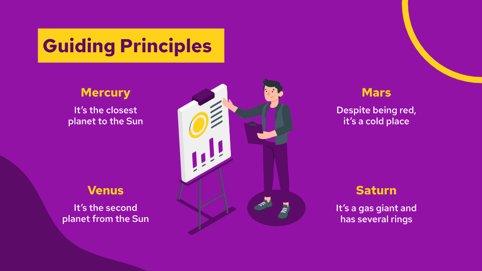
The main headline shows a highlight in saffron. This lets your public know that it is the main point of the slide. In fact, it is even bigger than the other pieces of text.
The second important items are in yellow and, the third, in white. Intuitively, your brain is able to follow the order created by those tones, as the first hue is more prominent.
Thanks to this employment of hues, we have achieved a visual hierarchy. Using color, we have created contrasts that add different levels of importance depending on the slide item. This way, we enhance relevant elements in a very effective way.
→ Download this Ecommerce Marketing Plan template now.
Font hierarchy
There is another way of creating a hierarchy. We have seen how to use different hues, but how about using different types of fonts?
When talking about lettering, always remember to choose a very legible typeface. It will translate into a successful presentation. Clarity is key: if your audience can’t read very well what’s on the screen, you will lose their attention.
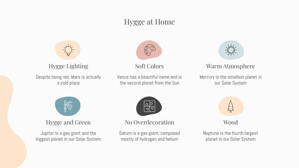
The serif typeface is elegant and makes the text stand out. It is a good idea to line the most important pieces of information (title and subtitles) with this font, while the explanation appears with a sans serif face.
→ Learn more about the Danish way of life with this Hygge Style template.
Size hierarchy
Another important piece in this hierarchy jigsaw is the use of size to create an order. Instinctively, our brains understand that the biggest elements in a painting, composition or other visual arrangement are the most important ones.
Let’s explore this idea looking at some examples:
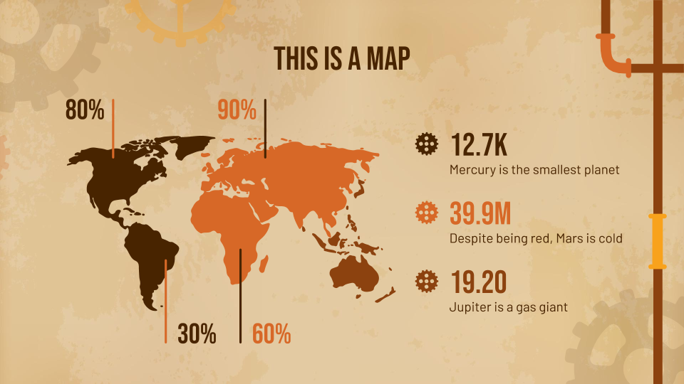
Note the size of the map. It occupies most of the slide, so its relevance here is great. Everything here has to do with the location of data.
The second important thing after the map, are the percentages, numbers and icons, that work as bullet points, as their dimensions indicate. The third element in this rank would be the explanation, which corresponds with the line on planets. Pay attention to how small they look in comparison with the rest of the items.
Of course, this design is balanced, and there is a great use of blank spaces to achieve this. The corners appear without any element, and most of the information occupies the center of the slide.
If you are in love with Victorianism but also with technological innovations, download this Steampunk Aesthetic presentation.
Creating a hierarchy using the composition of elements
When we talk about creating a hierarchy by building a composition with different elements, we must explain different points to offer some clarification.
In this respect, the hierarchical disposition of elements can be vertical and horizontal (from the top to the bottom and from left to right.) The main elements appear at the top and left.
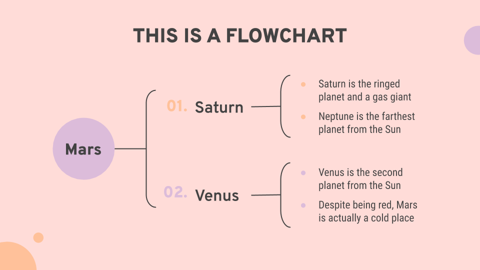
A visual hierarchy is convenient to accentuate the importance of some elements when compared to others. In this case, we are displaying a flowchart. The headline states clearly the topic of the slide. But pay attention to the flowchart itself. It shows the vertical and horizontal hierarchy we stated before. The most important topics appear to the left: Mars, Saturn and Venus are the first pieces of information that we want our public to read. Vertically, Saturn appears above Venus. The diagram replies this in the explanatory bullet points.
→ Willing to present your Research Project Proposal? Use our template and dazzle your audience. Did you prefer our Twingg Background presentation? Give it a go.
Visual arrangement
Let’s explore this sort of arrangement a little bit more, as it can influence very much the effectiveness of your content. The main idea when creating your presentation is to make it easy to understand and easy to read. Arranging and aligning the texts, images and content, i.e., playing with the composition of elements, comes in handy in this respect.
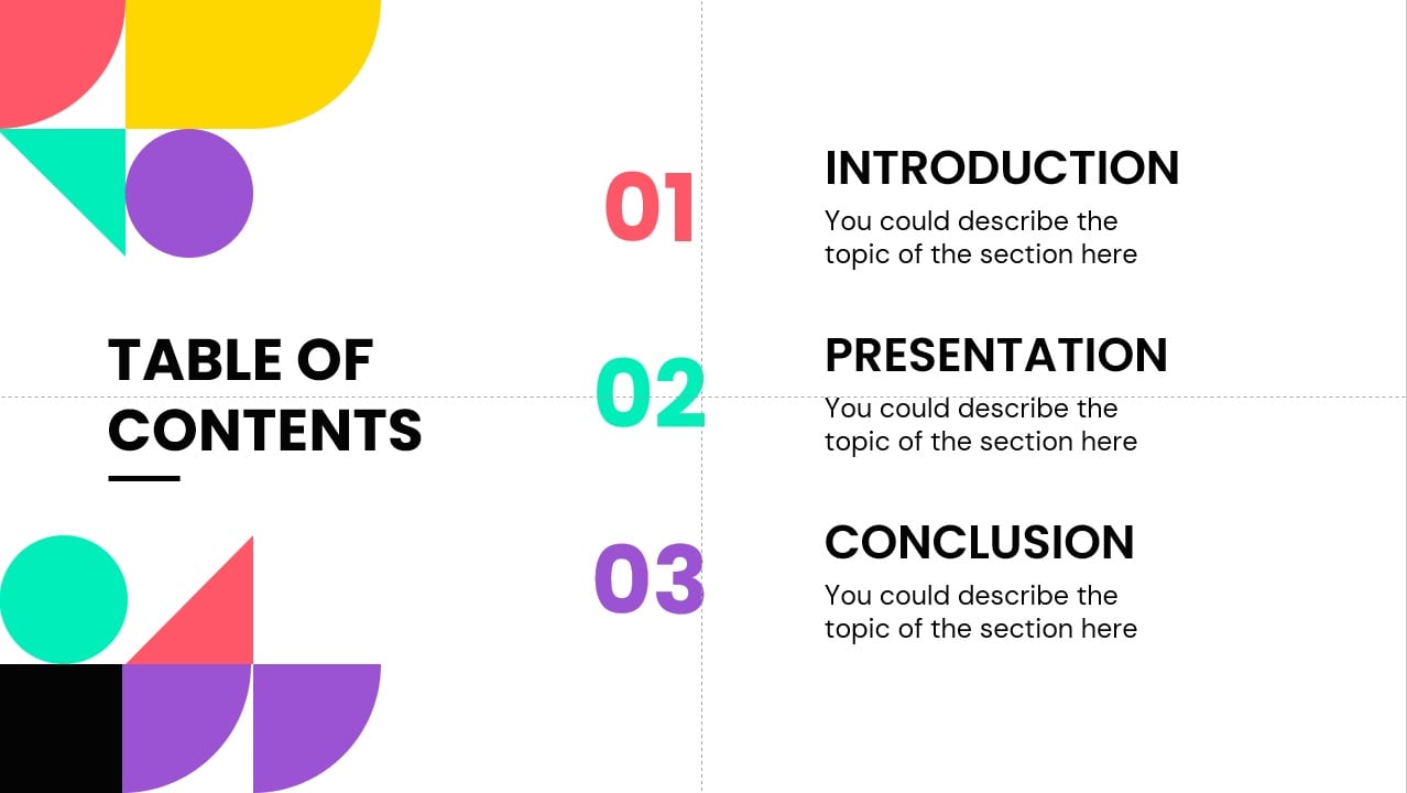
The following instance, we are going to explore the position of the resources.The title occupies the left side of the slide and, the sections, appear to the right, using a big font. Use this very structure when you want to direct the attention of the listener or the reader towards a very concrete piece of information. As you can see, the texts are aligned with the numbers and with the title.
There are other sorts of visual arrangements that you can learn and apply. In a vast majority of languages, we begin reading from left to right, and from the top to the bottom of the page. Hence, aligning elements paying attention to these principles is useful.
In the following structure, we capture this by creating a sort of staircase in which we begin with the greatest number or quantity until we reach the bottom of the transparency.
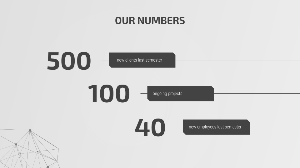
At a glance, the reader will understand that, the first amount, is the most important one. This can be extensible to other pieces of info, not just numbers.
Download these Geometric Background presentation and Tech Newsletter theme and discover new arrangements!
As we said at the beginning of this subsection, creating a good alignment between the text and the images is also key when designing a good slide:
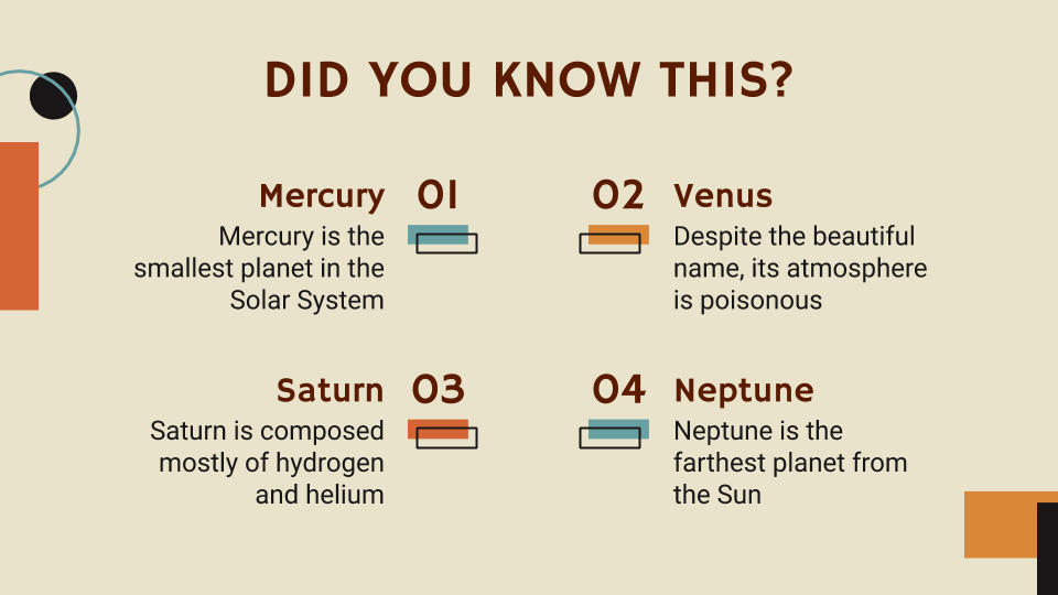
As you can observe, this slide follows the principles that we have said before. Titles, subtitles and explanations appear in different typefaces and hues, and the most important topic (Did you know this?) appear at the top. The alignment of the text boxes appears to the center of the slide, focusing one’s attention to the middle of the slide.
→ Design your Grammar Lesson with this template.
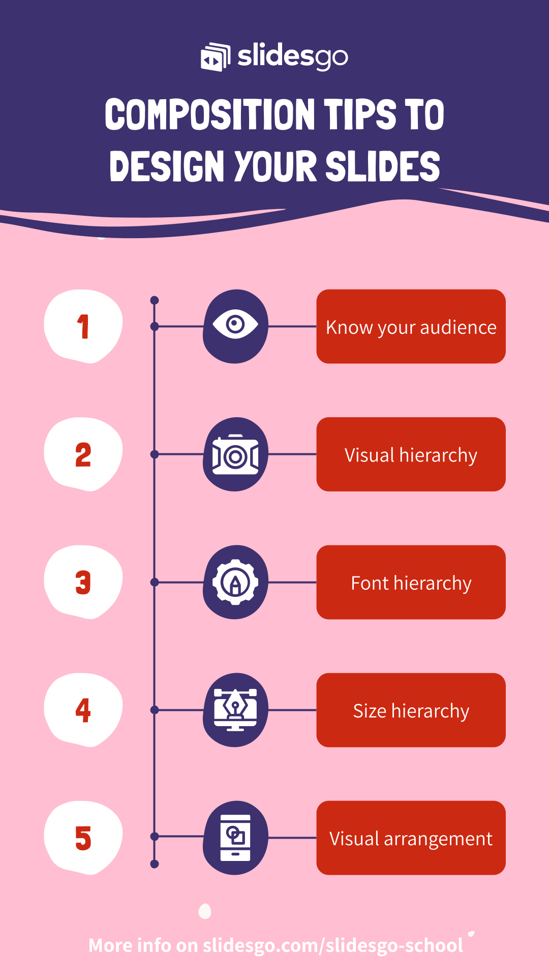
Remember that creating a good design for your slide is simple if you follow some simple tips: create a hierarchy using different colors, fonts, sizes and order, and pay attention to the arrangement of elements, mainly texts and images.
Explore our free new templates for Google Slides and PowerPoint and discover great slide designs that will help you boost your project!
Tags
Edit & FormatDo you find this article useful?
Related tutorials
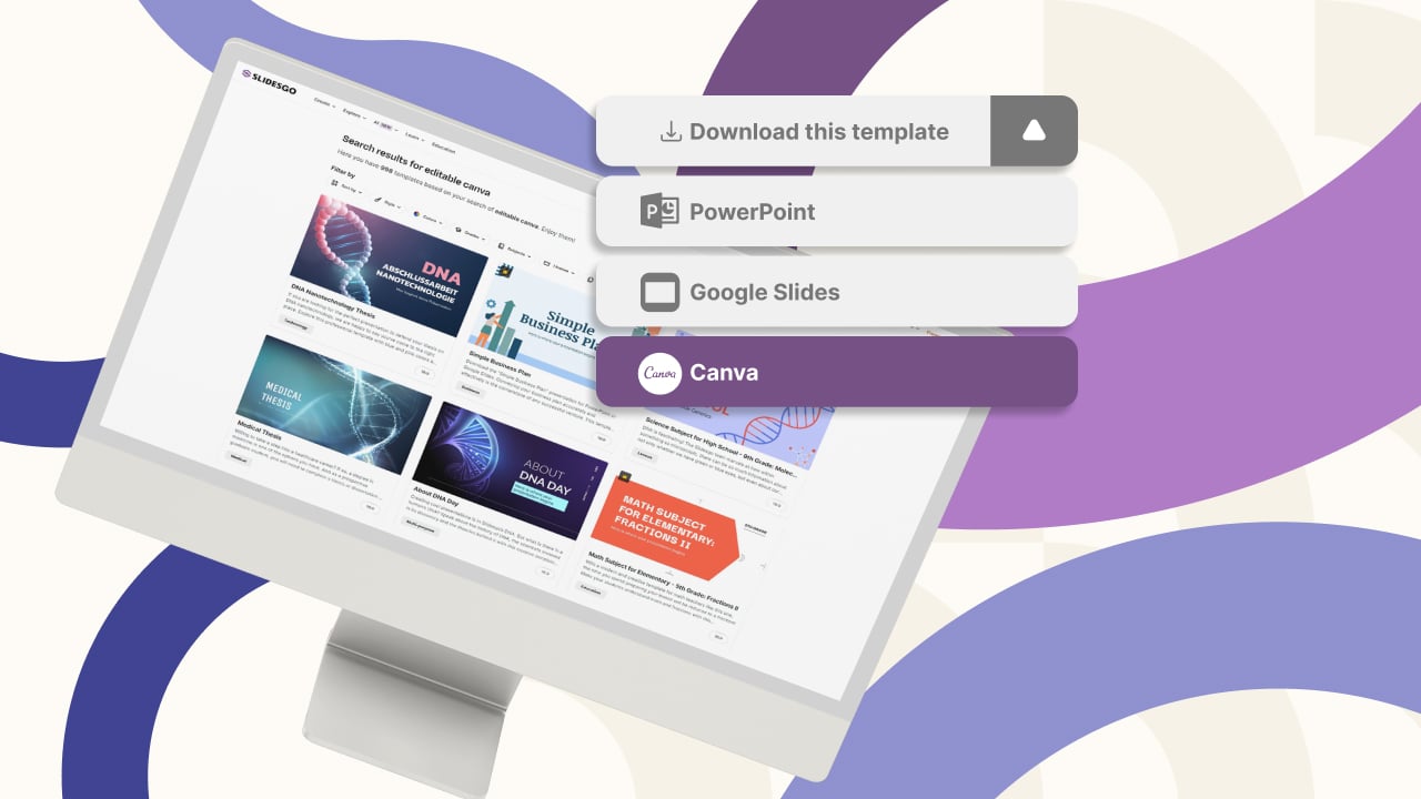
New feature available: edit our templates with Canva
Whenever you need to create, Slidesgo is there. We’re continually enhancing your presentation design process with templates that are primed to impress for any occasion. And in order to let your ideas flow best, comfort is key. How could Slidesgo help you with this? By making you feel right at home with...
How to print PowerPoint notes
Crafting an impactful PowerPoint slideshow and delivering a captivating presentation are distinct skills. The first focuses on designing appealing visuals to convey a clear message, while the second involves employing effective presentation techniques to ensure the audience grasps the idea. The content of this article will help you with the latter...
Discover Our Online Presentation Software for Free
We have great news for you today! If you’ve been a Slidesgo fan for years (or months, or weeks, or days, or mere hours, we welcome everyone!), you’ll probably know for now that our templates are available mostly in two formats: for use in Google Slides and PowerPoint.Google Slides is a...

Webinar: Presentation Audit
With more than 15,000 templates released on Slidesgo and a user base composed of millions of people, we estimate that the total number of presentations created adds up to… um, a lot! Our team of professional designers work very hard to provide you with editable slides so that the only thing...
