
How to Make Charts in Google Slides

Using charts to represent your numerical or statistical data helps your audience understand everything visually at a glance. In this new Google Slides tutorial, you’ll learn how to create pie charts, bar graphs and other kinds of charts, so you’ll be able to display the information clearly and boost your presentations.
How to Create a Chart
Whenever you create a chart in Google Slides, it will link to a Google Sheets document. Having this in mind, let’s see how you can make a chart from scratch for your presentation.
- Select the slide where you want to insert a chart.
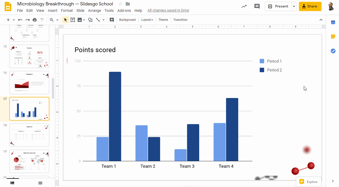
- Click Insert → Chart. You’ll see different options: bar, column, line and pie. There’s also an option to add a chart from an already existing Google Sheets document. Select the one that best fits your data.
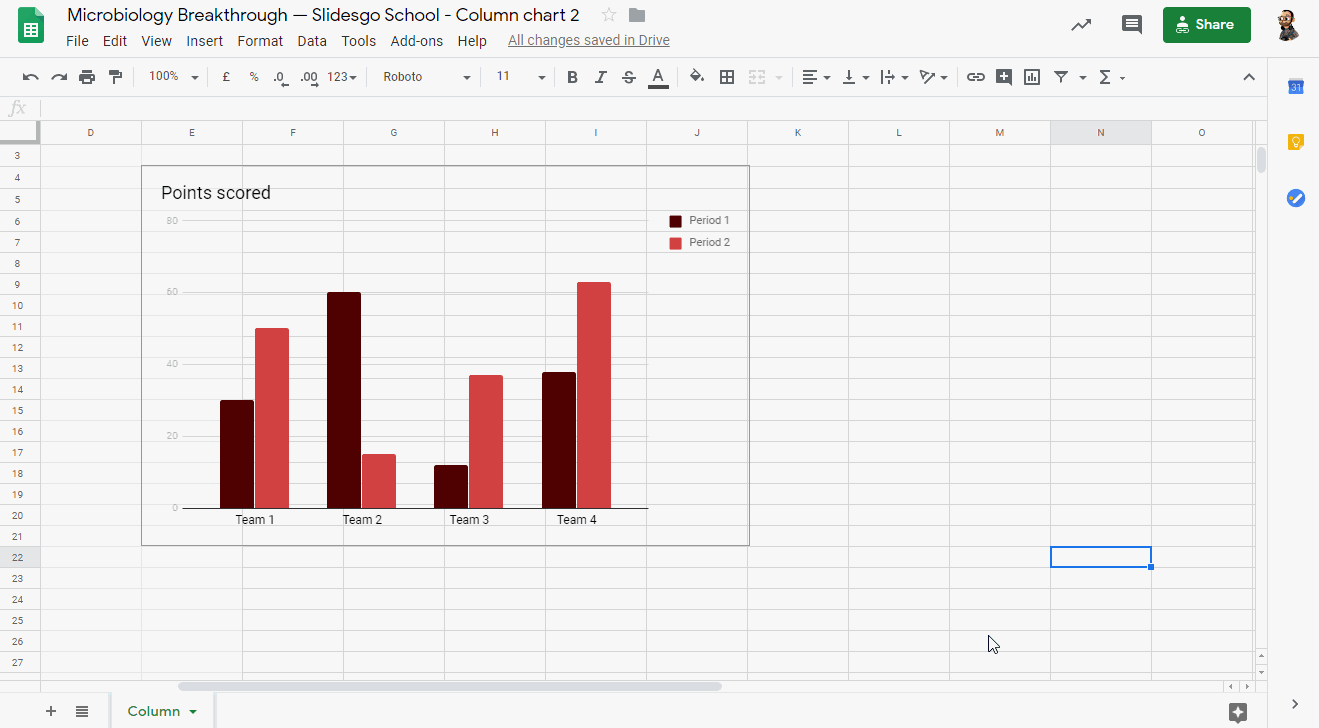
- Once you’ve added the chart, it will be inserted as an image. To edit it, click Edit in Sheets, which will appear in a pop-up in the bottom left corner.
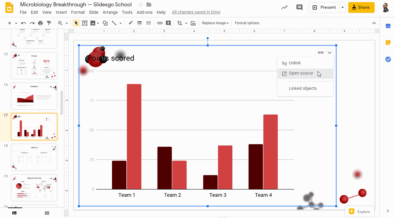
- As an alternative, click the Link options drop-down arrow and choose Open source. A Google Sheets document will open.
- When you’re done modifying the data and/or the design in Google Sheets, go back to Google Slides. To apply the changes, click the Update button, located in the top right corner.
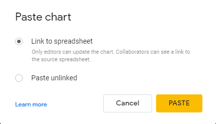
- As an alternative, you can copy the chart from Google Sheets by pressing Ctrl/Cmd + C and paste it in your Google Slides presentation.
- When pasting, you will be asked whether to link the chart to the source spreadsheet or not.
Editing a Chart
- Select the chart that you want to edit in your presentation.
- Any Google Slides chart is processed as an image. To edit it, click the Link options drop-down arrow, located in the top right corner, and choose Open source. A Google Sheets document will open.
- Modify the data that has been generated by default. You’ll find it in the first cells.
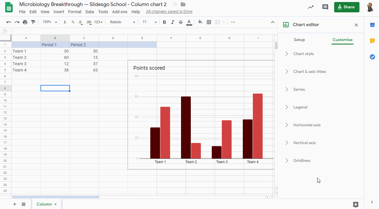
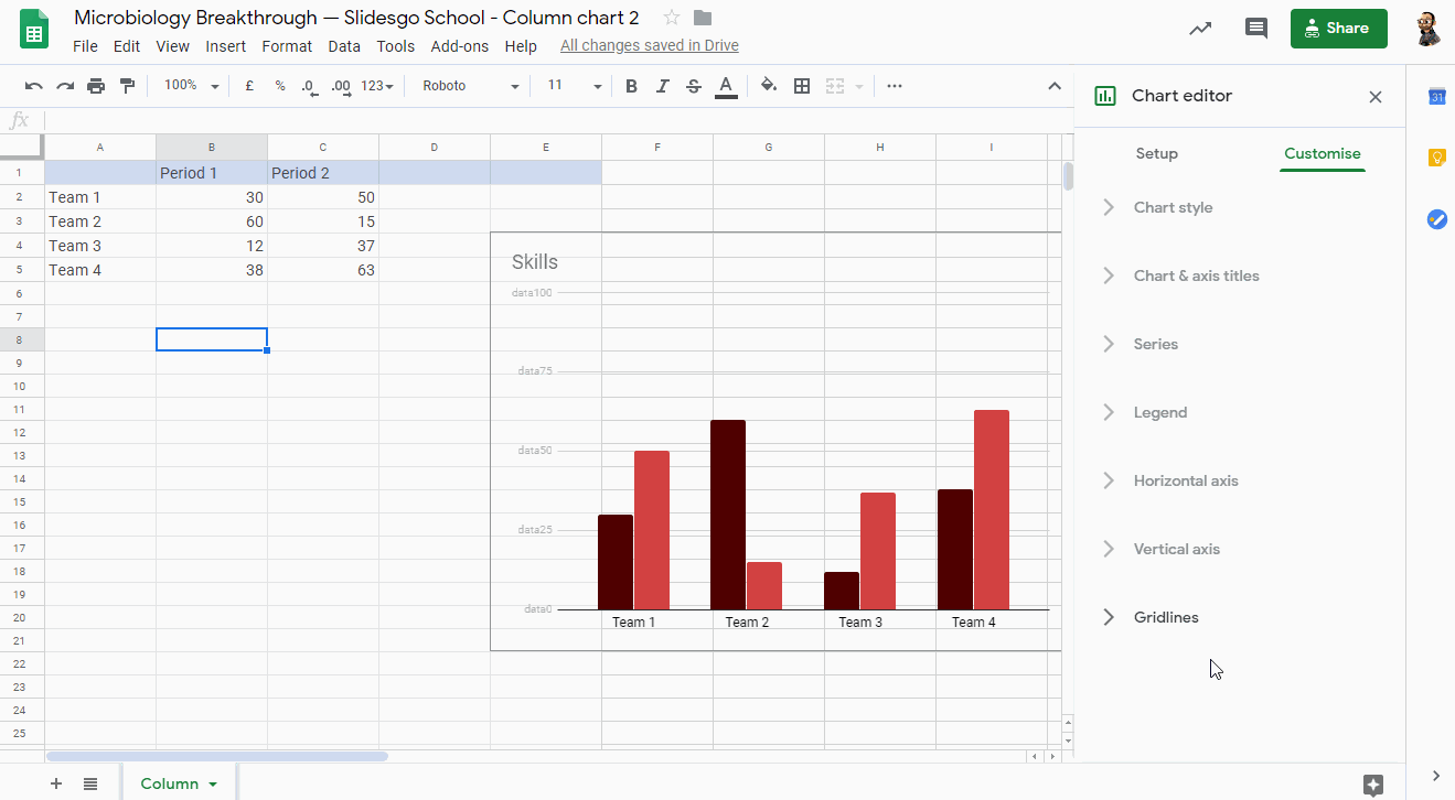
- To edit the colors of the chart or the background, select the desired element and choose a color from the panel on the right. You can also click the three vertical dots, located in the top right corner of the chart, and select Edit chart.
- On the Setup tab from the Chart editor panel, you can select the data range, change the chart type, add operations and determine whether you want to use the first row as headers or not. Click the Stacking drop-down arrow to see options that allow you to modify how the data will be displayed in the chart.

- On the Customize tab from the Chart editor panel, you can adjust different settings. Let’s have a look at them.

- In the Chart & axis titles submenu, you can enter the title text and select its font, size, format and color. This will override the settings from the Chart style submenu, but only for the titles.
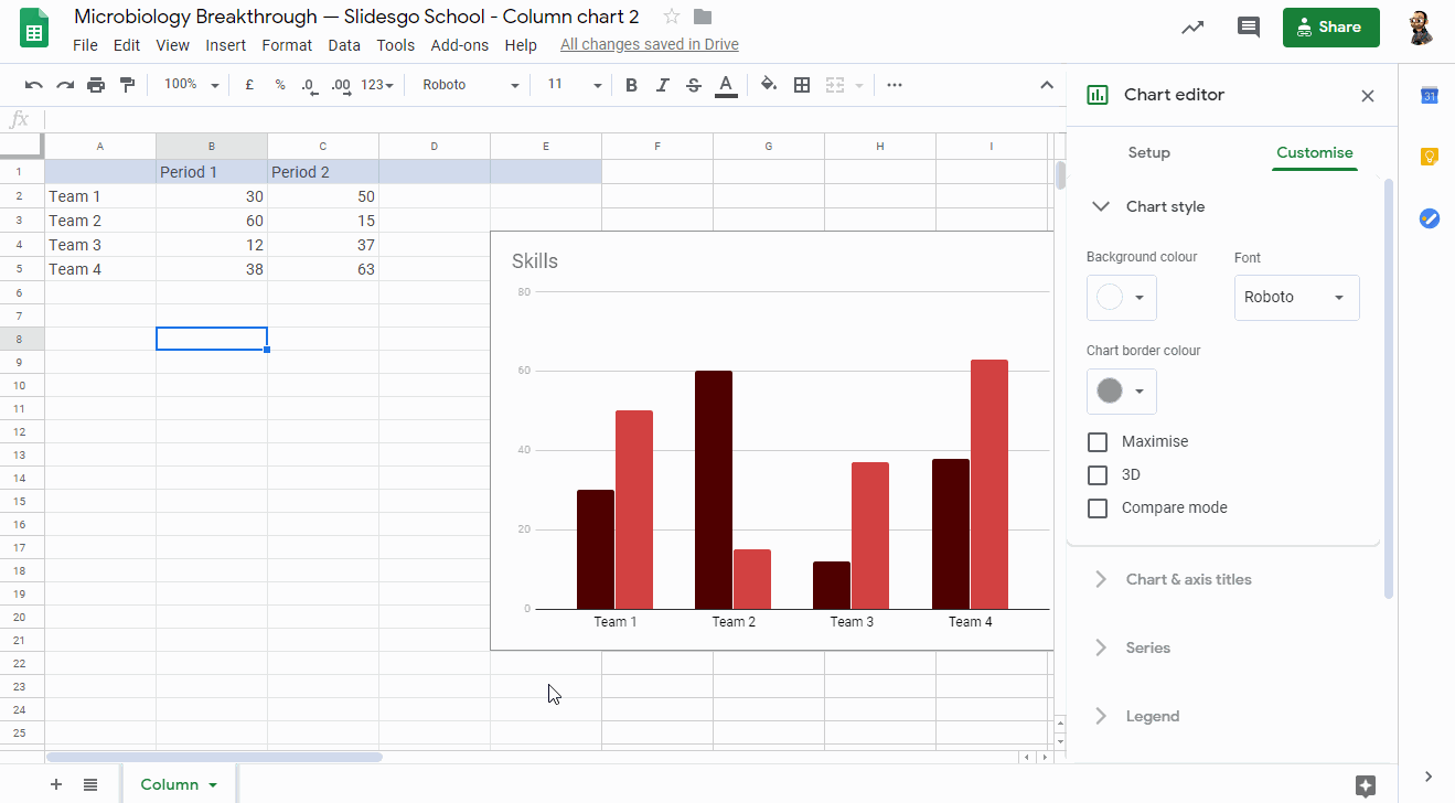
- In the Chart style submenu, you can adjust the background color (or leave it without any color), change the font and adjust the chart border color (or leave it without color). There are also other options to turn the chart 3D, maximize it and enable the Compare mode.
- In the Legend submenu, you can set the position of the legend and its format.

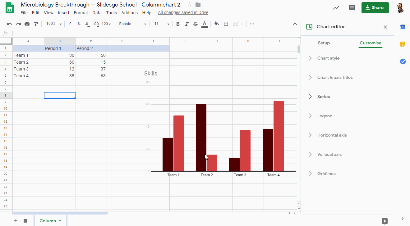
- If you’re working with a bar chart, in the Series submenu you can edit the colors of the periods. There are also other options to enable the error bars and data labels.
- If you’re working with a bar or line chart, the Horizontal axis and Vertical axis submenus will be available too. These allow you to adjust the axes of the chart and the format of the labels.
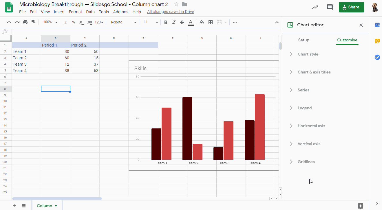
- Finally, in the Gridlines submenu you can enable the gridlines if the chart supports this feature. You can also set how many there will be, as well as their color.
- To apply the changes in your Google Slides presentation, click the Update button, located in the top right corner. You can also copy the chart from Google Sheets by pressing Ctrl/Cmd + C and paste it in your presentation.
Working with the Charts Included in Our Templates
- Make a copy of our template in your Google Drive. Then select the slide that contains the editable chart.

- You’ll notice that the chart is linked. Select the chart and click the link to the Google Sheets document.
- Make a copy of the spreadsheet in your Google Drive.
- It will open in Google Sheets, where you’ll see the charts that we’ve included in our template.
- Once you’re done modifying the chart, copy it by pressing Ctrl/Cmd + C, go back to Google Slides and paste it.
- You will be asked whether you want to link the chart to the source spreadsheet or not.

Do you find this article useful?
Related tutorials

How to present survey results in PowerPoint or Google Slides
A survey is a technique that is applied by conducting a questionnaire to a significant sample of a group of people. When we carry out the survey, we start from a hypothesis and it is this survey activity that will allow us to confirm the hypothesis or to see where the problem and solution of what we are investigating lies.We know: fieldwork is hard work. Many hours collecting data, analyzing and organizing it until we have our survey results.Well, we don't want to discourage you (at Slidesgo we stand for positivism) but this is only 50% of the survey work....
How to Create a Venn Diagram in Google Slides
If you wish to give an awesome presentation, using diagrams is great because they make your data look nicer and help your audience understand your points.In this Slidesgo School article, we’ll teach you how to create Venn diagrams in Google Slides so you can have them in your bag of resources!
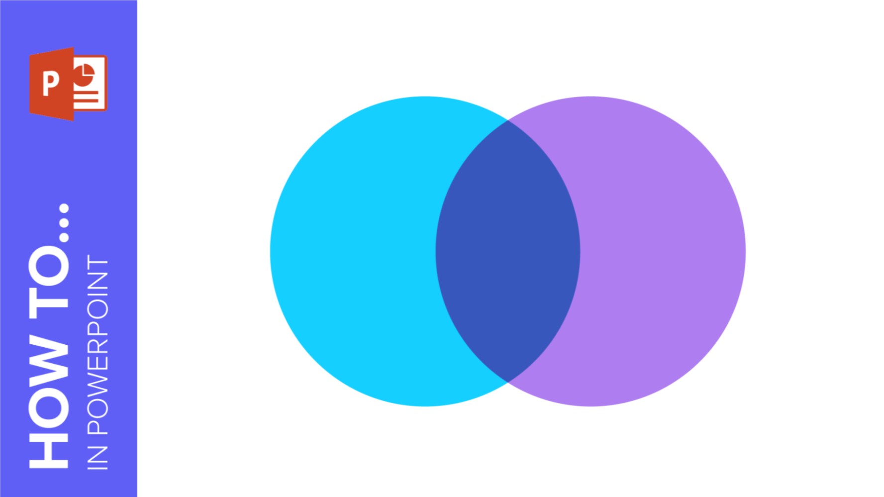
How to Create a Venn Diagram in PowerPoint
How many times did you have to explain your data with a PowerPoint presentation and you weren’t able to find the most visual way to do it? To help you with this matter easily and quickly, in this Slidesgo School post we will explain how to insert or create a Venn diagram in PowerPoint, as well as its history and components.

How to add and edit maps in Google Slides
Map infographics are very useful for any presentation, as they allow you to transmit data quickly and easily. In this post we are going to explain how to include and edit maps in your Google Slides presentations.