
Education Google Slides themes and Powerpoint templates - Page 3
If you have to make a presentation for class on any subject, why not make the most of it? There are a variety of resources you can use to complete your presentation. And to help you learn how to become an expert in their use, we have compiled these articles to inspire you or to develop technical skills in using Google Slides and PowerPoint in educational presentations. Let's learn together!
How to Add Infographics in PowerPoint
When trying to explain complicated topics or information, it’s worth using some visual aids. This way, the mind will quickly get the connections between ideas or the division of concepts. Have you ever tried using infographics? Infographics are diagrams that will help you present or show information. It doesn’t matter if...
How to Insert Infographics in Google Slides
Does the word “infographics” ring a bell? Those are diagrams that work as visual aids. You can present difficult concepts, processes, steps and the like in a very simple way. They can include texts, numbers or icons. Likewise, they can have different shapes and designs. Of course, there are different types...
How to Create a Jeopardy Game in Google Slides
Jeopardy is an American television game show in which contestants have some clues or answers, and they need to give their responses in the form of questions—and, of course, they can get some money! We’re sure you have watched this show several times. Jeopardy games are pretty useful! They are great...
How to Make a Jeopardy Game in PowerPoint
Thinking about new ways of reviewing concepts for your students? Do you simply want to have fun with your friends? Or are you a medical student and need a helping hand with the names of the different parts of the inner ear? We can help you! Gamification is always a good...
How to Create a Mind Map in Google Slides
A mind map is a powerful tool that allows you to create a hierarchy with your ideas and concepts. Its main aim is to help you understand and acquire information in an easier way. It resembles a diagram and it helps you learn in a visual way. Mind maps are pretty...
How to Make a Mind Map in PowerPoint
Mind mapping is a great idea to learn a series of concepts, ideas or information in a very visual way. Those mind maps are similar to hierarchical diagrams that have a series of branches. They need to be balanced, share the same ranking and must originate in the center. To...

Create Engaging Presentations for Your Online Classroom
Teachers of the world, we are here to help you! Due to the coronavirus pandemic, schools worldwide are transitioning to a completely new model of education: in-person classes are out, distance learning is in. As schools adjust to this new normal, teachers everywhere are scrambling to find the resources they...
How to Make a Quiz for Your Online Classes Using PowerPoint
Sometimes it is not easy to get your students involved when giving a presentation. One of the best ways to capture their attention is creating interactive quizzes and questions, so they will interact with the slides. This way, the learning process will turn into something fun and amazing for children. If...

How to Create a Quiz for Your Online Classes Using Google Slides
Quizzes are great tools to get your audience involved, as they need to participate and give their own answers. In fact, they are particularly useful when teaching children, as their attention gets diverted quite easily. This way, they will learn in an interactive and entertaining way. Creating a quiz is not...
How to Create a Timeline in Google Slides
What better way to portray progress and evolution on a Google Slides presentation than with a timeline? A timeline does the job of telling a story (or history) chronologically in a direct and straightforward manner that’s also visually attractive and easy to digest. It shouldn’t contain too much text so...
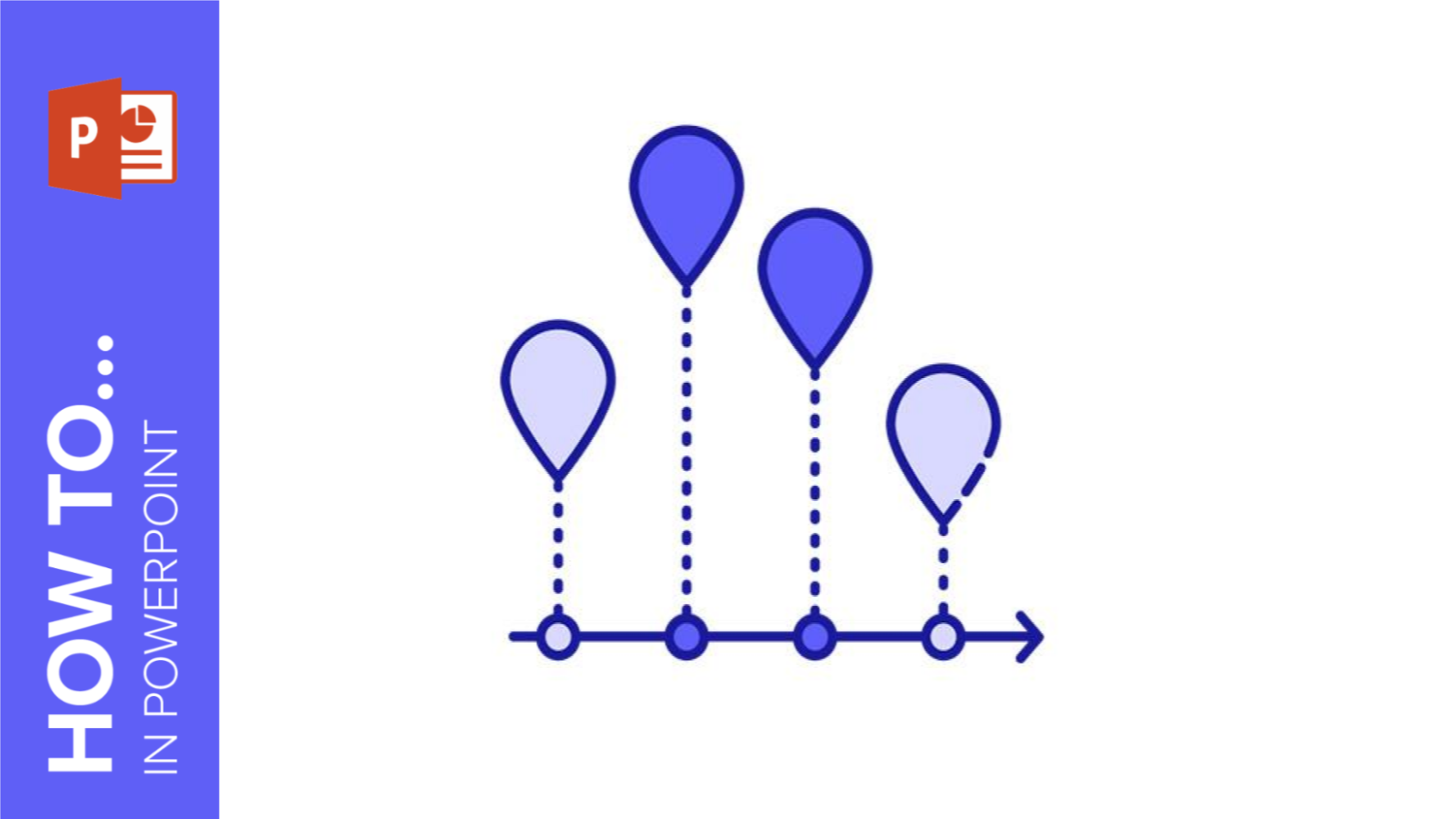
How to Create a Timeline in PowerPoint
Timelines come in a rich variety of colors, shapes, and types. While there are plenty of creative ways to design them, they usually include a few basic elements including shapes, text, numbers, and lines. With these simple elements, you can put together a visually attractive and easy-to-understand chronology of the...

How to Use Storytelling in Presentations
Where ordinary presenters inform, great ones engage in storytelling. Their main objective is to get a message through to their audience. But while some do so by relaying facts, effective ones take their audience on a journey using great storytelling techniques. This all boils down to having different mindsets and approaches....