
How to present survey results in PowerPoint or Google Slides

A survey is a technique that is applied by conducting a questionnaire to a significant sample of a group of people. When we carry out the survey, we start from a hypothesis and it is this survey activity that will allow us to confirm the hypothesis or to see where the problem and solution of what we are investigating lies.
We know: fieldwork is hard work. Many hours collecting data, analyzing and organizing it until we have our survey results.
Well, we don't want to discourage you (at Slidesgo we stand for positivism) but this is only 50% of the survey work. After having organized the results, it's time to share and present them! Such good work can't be hidden and, besides, sharing is living, and can determine the next step of your research or your following survey.
Close your eyes for a moment. Imagine now that you are listening to a large number of figures, percentages, and other quantitative expressions typical of a survey. Would the result of that survey be clear to you? Probably not. A picture is worth a thousand words (one of our catchphrases, yes). Now, imagine (or continue reading this post, because you will find images) that all these data are represented in graphs or infographics, with colors, eye-catching fonts... The feeling is very different! The human brain interprets an image 60,000 times faster than a text!
So, in this post, we are going to show you some ways to present survey results in Google Slides and PowerPoint, so that your surveys can be understood in a very clear and concise way. Here we go!
Graphs and charts
When it comes to providing an audience with numerical data, one of the best ways is with a graph. A good graph conveys the most relevant features of your survey and also allows you to compare, highlight a trend or show other related elements.
If you are afraid of working with charts, don't worry! To solve those doubts and concerns you may have before using a chart, we have several very interesting posts at Slidesgo School: whether you want to learn how to modify a graph in our templates or if you want to make and insert a chart in PowerPoint or Google Slides previously created by you.
EXTRA TIP! Use different colors in your graphs, one for each value or result of the survey, it will provide a lot of clarity on the subject.
Below, we are going to show you different types of graphs and charts with which you can represent your survey data. Just select the types that you think are ideal for the characteristics of your survey.
Bar charts
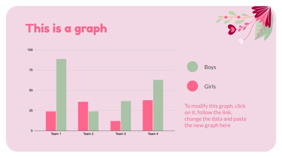
They are a safe choice, as they are very easy to create and interpret. All values can be compared very easily!
Line charts
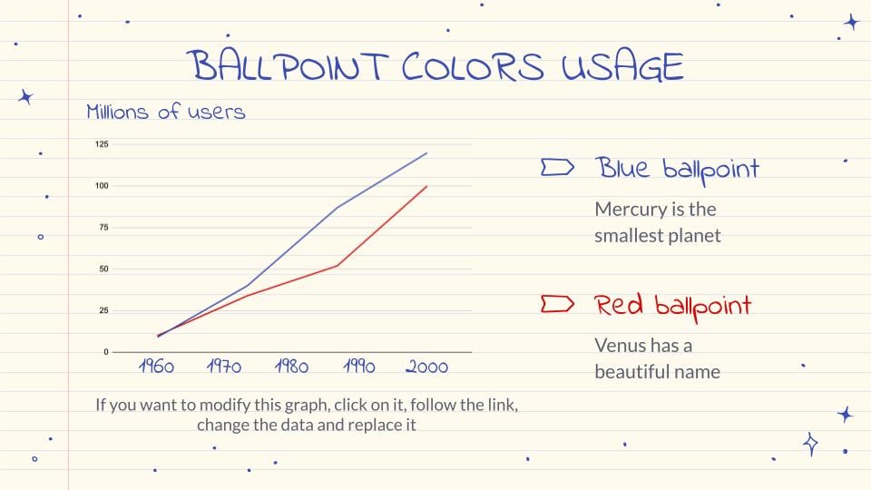
These types of charts are very well suited to illustrate how different elements vary over time or a given distance. In the example, you can see the evolution of two elements over time. Where is your research going? This type of graph will answer this question.
Venn diagram
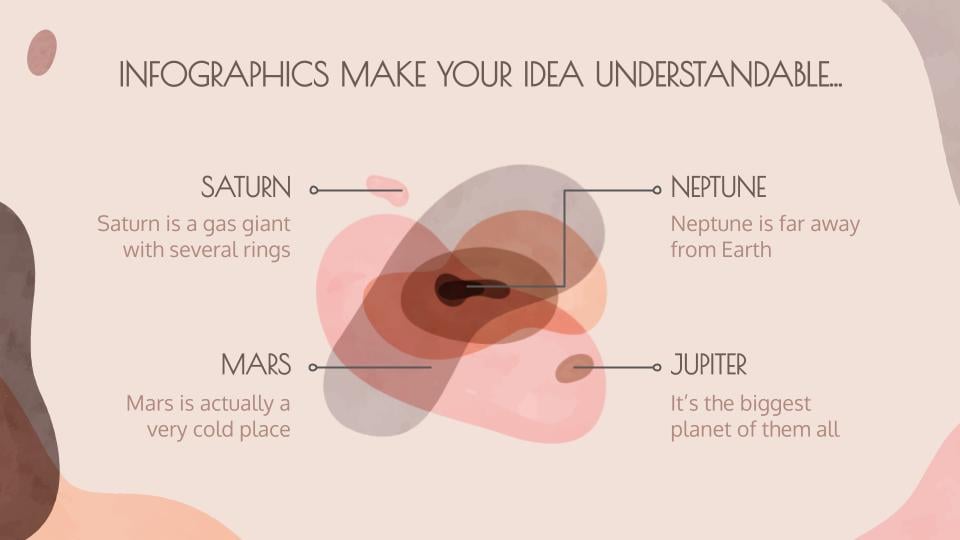
Venn diagrams (named after its creator, John Venn) are infographics that show the grouping of one or several elements delimited by closed lines so that the elements of each group remain inside.
In the image, you can see a Venn diagram in an abstract style, without following very fixed lines, in case you would like to give a more casual touch to your results!
However, understanding and knowing how to generate Venn diagrams can be difficult, that's why, on our blog, we have two posts dedicated to how to create a Venn diagram, both in Google Slides and PowerPoint. Grab paper and a pencil, there is some very interesting information!
Pie charts
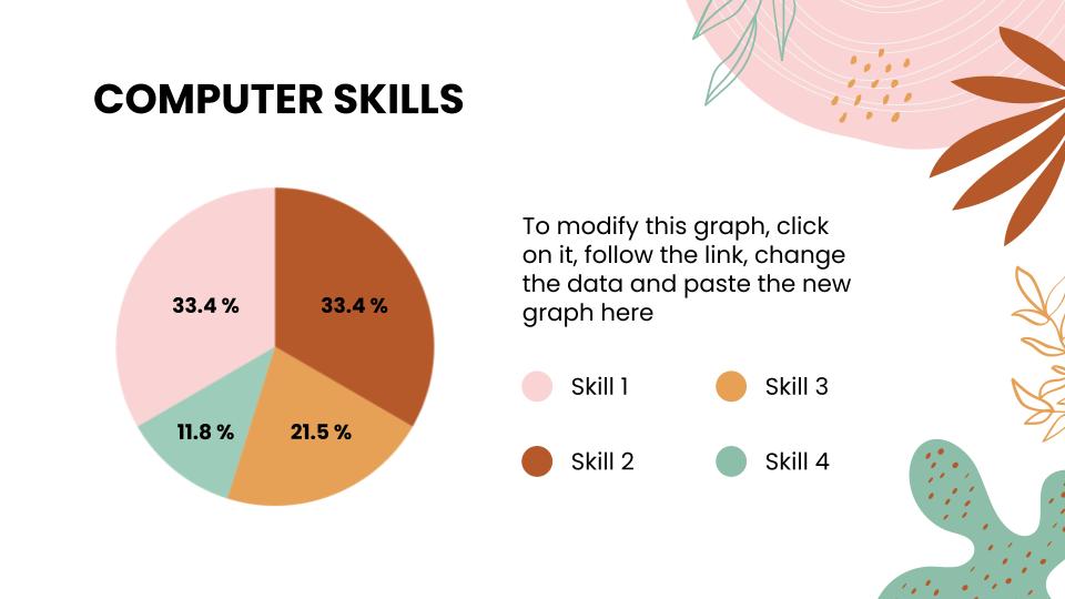
Mmmm, it smells like cake! We're sorry to tell you this, but this is not a pie, but a pie chart, perfect for your survey results! This type of graph is very popular and is used to compare different parts that together make a whole, a total. Going back to our tip of using colors... Notice how clear it is to use a different color for each element!
Infographics
Infographics are perfect for talking about surveys. They are eye-catching, they organize the information in a very appropriate order, they make the data look more pleasant and impactful and they are the ideal complement for your presentations. At Slidesgo, we have a very complete section of infographics for all types of presentations. Which one fits best with your content?
We are going to show you a series of examples of infographics so that you can see how clear everything is with the use of infographic resources. Maybe even a set of infographics will come in handy for your survey results!
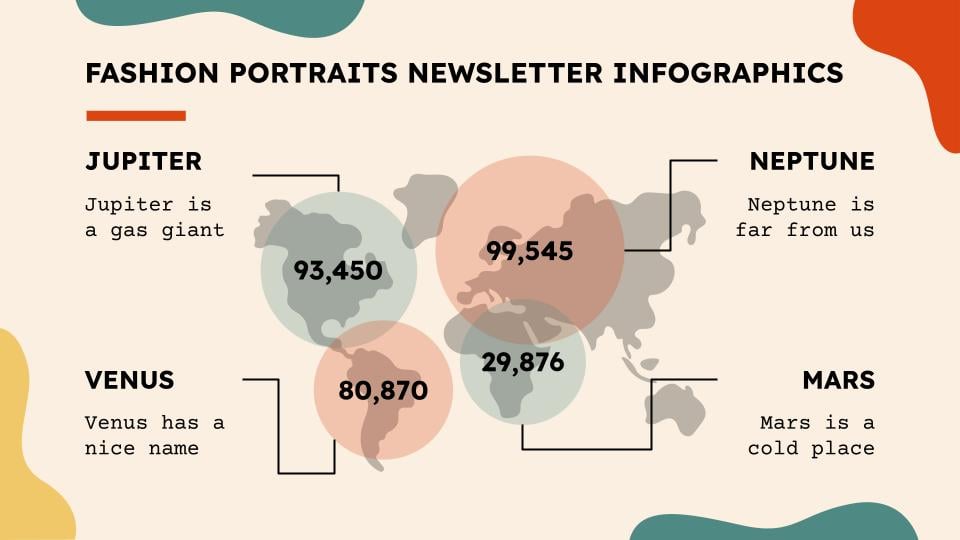
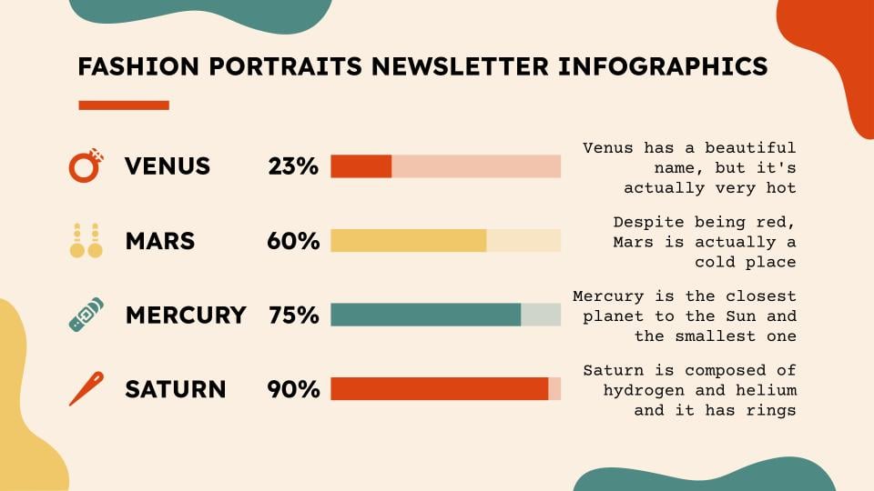
Fashion Portraits Newsletter Infographics
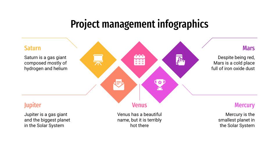
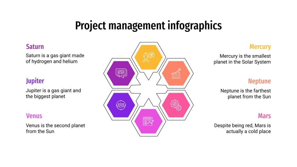
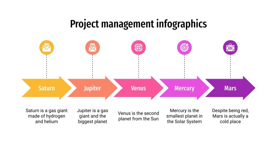
Project Management Infographics
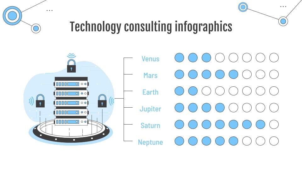
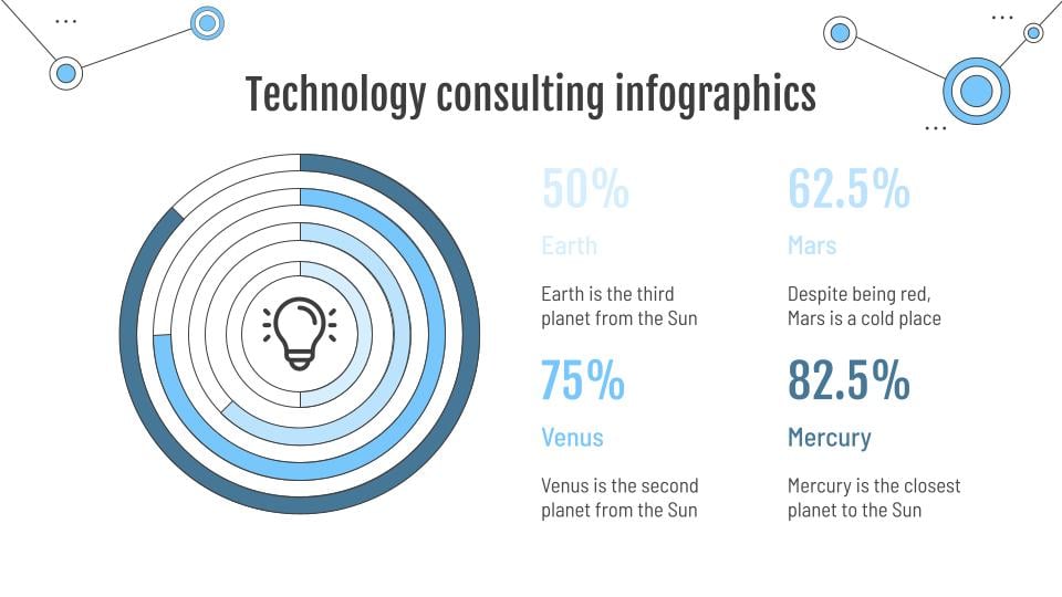
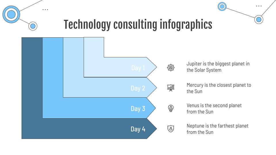
Technology Consulting Infographics
Other tips
This post is coming to an end... Hopefully, you have learned a lot about how to present your survey results! To conclude, we want to give you a few last tips, because we want your presentation to turn out great:
- In addition to numerical data, present the objectives and conclusions of your survey. The audience will appreciate it if you make them part of the survey interpretation process.
- Explain how you collected the information. Detail the process of conducting the survey, so that the audience can see the hard work behind it.
- Talk about the different variables in your survey. Age, locations where the survey took place, and other variables that are part of your different surveys.
- Use a moderate number of graphs or infographics. Balance is the key, so include only those data that are relevant to the development of the survey and eliminate those variables or parts that are not influential.
And that's all! If you apply all these recommendations, everyone will internalize the results of your surveys and will want to know about future projects.
Do you find this article useful?
Related tutorials
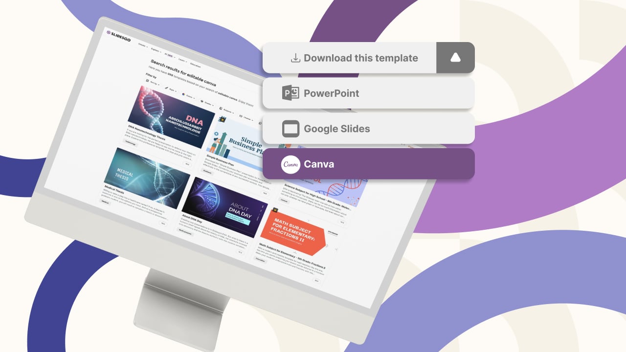
New feature available: edit our templates with Canva
Whenever you need to create, Slidesgo is there. We’re continually enhancing your presentation design process with templates that are primed to impress for any occasion. And in order to let your ideas flow best, comfort is key. How could Slidesgo help you with this? By making you feel right at home with our resources, no matter your preferred platform.You spoke, and we listened. Now, your favorite slides can be accessed on a new platform: Canva! This new format adds to our existing options (PowerPoint and Google Slides), expanding your ways to utilize our first-rate presentation content. We’ve started with a selection of Canva-ready...
How to print PowerPoint notes
Crafting an impactful PowerPoint slideshow and delivering a captivating presentation are distinct skills. The first focuses on designing appealing visuals to convey a clear message, while the second involves employing effective presentation techniques to ensure the audience grasps the idea. The content of this article will help you with the latter part of this process, guiding future presenters on how to print PowerPoint with speaker notes to enhance your presentations success and effectiveness.

Discover Our Online Presentation Software for Free
We have great news for you today! If you’ve been a Slidesgo fan for years (or months, or weeks, or days, or mere hours, we welcome everyone!), you’ll probably know for now that our templates are available mostly in two formats: for use in Google Slides and PowerPoint.Google Slides is a free tool, since you only need a Google account in order to use it. PowerPoint, on the other hand, is part of the Microsoft Office suite, so it’s not a free program, but that didn’t stop it from being one of the most popular options in the world!What if we...

Webinar: Presentation Audit
With more than 15,000 templates released on Slidesgo and a user base composed of millions of people, we estimate that the total number of presentations created adds up to… um, a lot! Our team of professional designers work very hard to provide you with editable slides so that the only thing you need to do is, well, customize the elements to your liking. Starting from any given template, the results may vary a lot depending on the person who edited the contents.Have you ever wondered “Is my presentation good enough?” and wished that an expert on presentations looked at your template...