
Presentation Design Trends 2026: 10 Styles Shaping Your Slides
In 2026, presentations are no longer just visual support tools—they’re becoming clear, human, and emotionally engaging experiences. Typography steps into the spotlight, shapes soften, and colors aim to restore focus on what really matters. Data and stories aren’t just shown; they’re spoken in a way that feels natural and considered.
The way we present is shifting. No more rigid, linear decks—it’s about participation, empathy, and clarity that still sparks connection. Ten trends are already paving the way, each with its own bold energy.
And when you’re ready to bring them to life, explore our Slidesgo presentation templates—each trend has a style waiting for you to try.
1. Bold, geometric type takes the lead
Text is the hero now. Headlines grow bigger and more expressive, paired with simple sans-serif companions. Variable fonts add rhythm and flexibility, letting you play with weight and width. Perfect for pitches, keynotes, and educational content where words carry weight.
How to try it. Keep it simple: one big headline per slide, supported by body text set between 24–32 pt. Don’t overcomplicate—two font families are enough. Let contrast in size and weight guide the eye, making the reading flow feel effortless.
Slidesgo inspiration. Check out the “Type Shift” deck—its bold cover and statement slide show exactly how typography can carry a story on its own.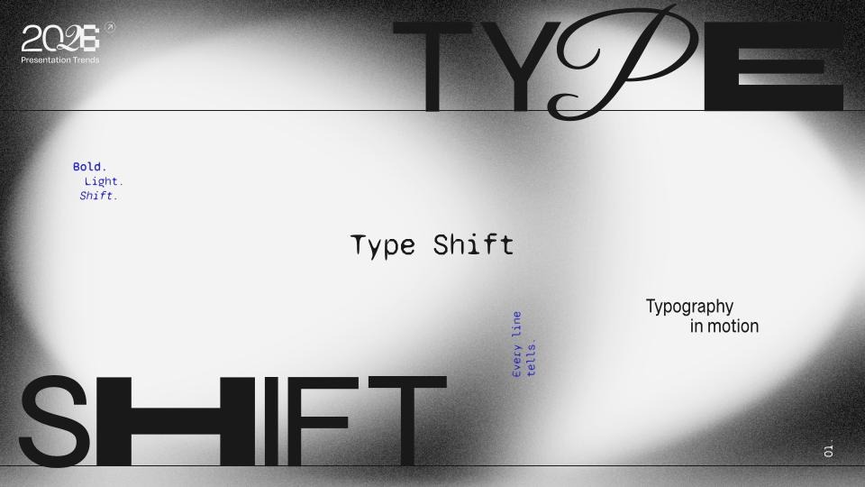
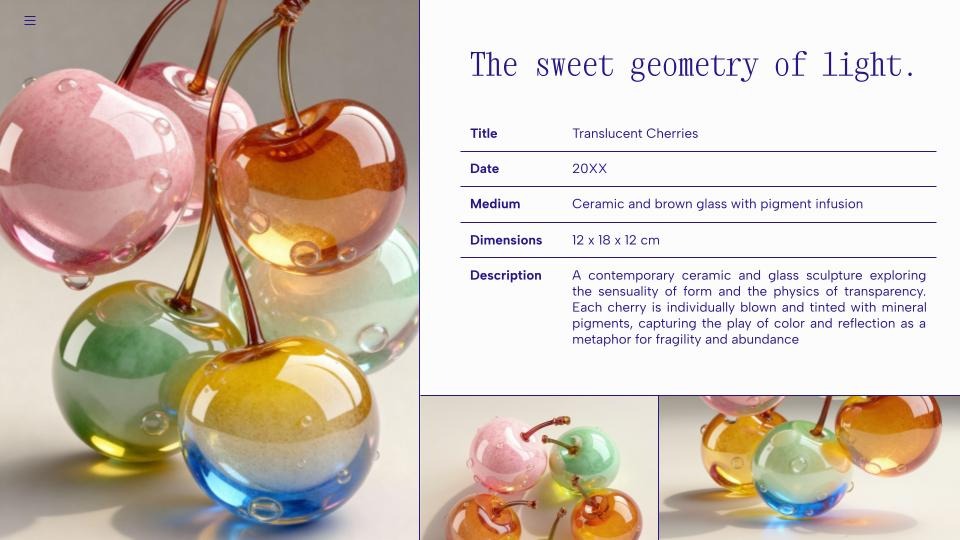
2. Simple shapes and soft curves
Design gets softer in 2026. Decorative 3D and photographic elements with smooth, rounded forms take center stage. These shapes bring a sense of softness and elegance, adding personality and scale without relying on complex layouts.
Where it works. Ideal for intros, section breaks, and key-message slides where atmosphere and impact matter more than dense content.
How to try it. Use cutout photos, volumetric objects, or full-scene images featuring gentle curves or inflated forms. Keep the layout minimal so the imagery can stand out without competing with text.
Slidesgo inspiration. The “Ceramic Grace” table slide shows how a single soft, sculptural photo element can add atmosphere and elevate a simple layout into something expressive.
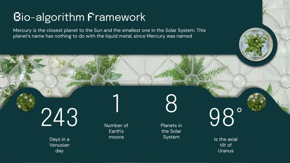
3. Restorative palettes with teal accents
Color in 2026 feels like a reset button. Warm neutrals, earthy browns, natural greens, and deep purples create a grounding base—then along comes Transformative Teal, the calm blue-green named Color of the Year, to bring everything into balance. Around it, the A/W 26/27 palette introduces tones like Wax Paper, Fresh Purple, Cocoa Powder, and Green Glow. Together they form palettes that feel restorative, hopeful, and deeply human.
Where it works. Perfect for wellness, sustainability, or institutional decks where trust and calm clarity matter most.
How to try it. Build a five-color scale with background, surface, text, and two accents—making sure body text passes contrast checks. Use teal as a gentle highlight rather than a flood.
Slidesgo inspiration. The “Hypernatural” deck shows how teal accents can frame metric-driven slides while keeping the palette grounded.
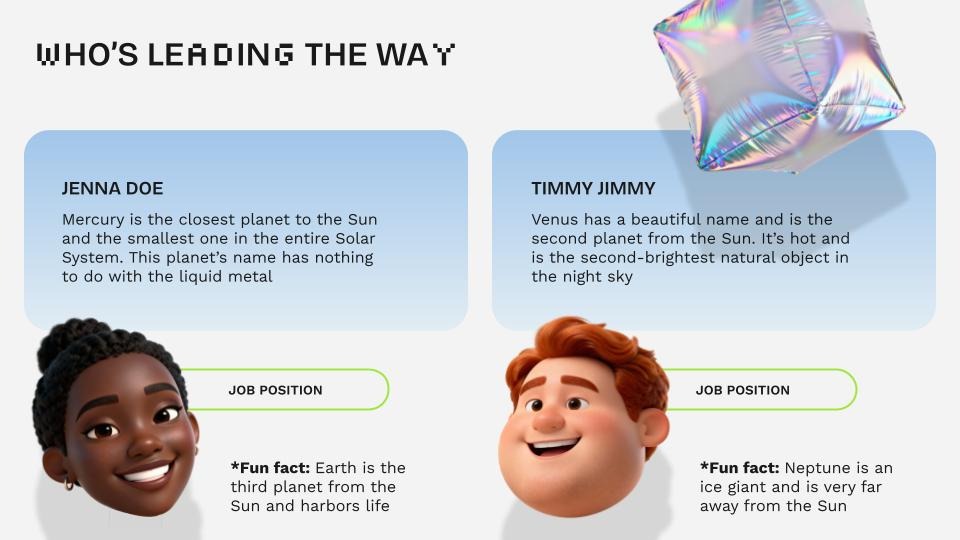
4, Playful details and kidult energy
Sometimes the smartest way to connect is to play. Stickers, doodles, and friendly shapes spark micro-moments of joy—lightening the mood without losing clarity.
Where it works. Icebreakers, onboarding, and classroom activities where engagement is everything.
How to try it. Limit it to one playful accent per slide. Try adding a live poll, a tap-to-reveal choice, or a simple doodle that breaks formality. Keep instructions short and direct.
Slidesgo inspiration. The “Bubble Syntax” team slide shows how playful characters and lighthearted shapes can make introductions feel friendly and engaging.
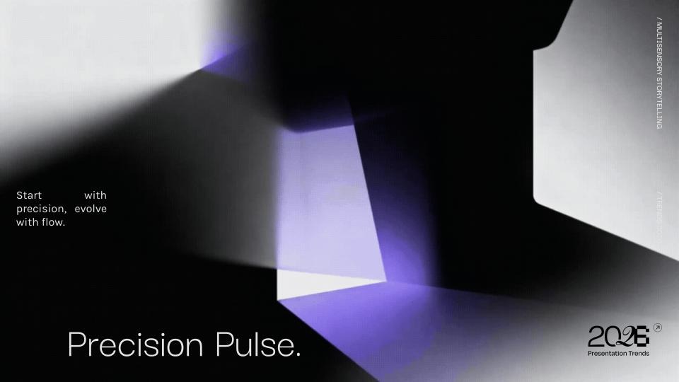
5. Multisensory, video-first storytelling
Presentations step into motion. Short video intros, narrated recaps, and motion snippets don’t just explain—they show. With tools like Google Vids making video creation easier, decks become cinematic experiences.
Where it works. Onboarding, product tours, flipped classrooms—any moment when seeing is understanding.
How to try it. Break ideas into three beats, export clips between 10–60 seconds, and let text take a backseat.
Slidesgo inspiration. With “Precision Pulse”, multisensory storytelling comes from the interplay of movement and abstract geometry, creating immersive transitions.
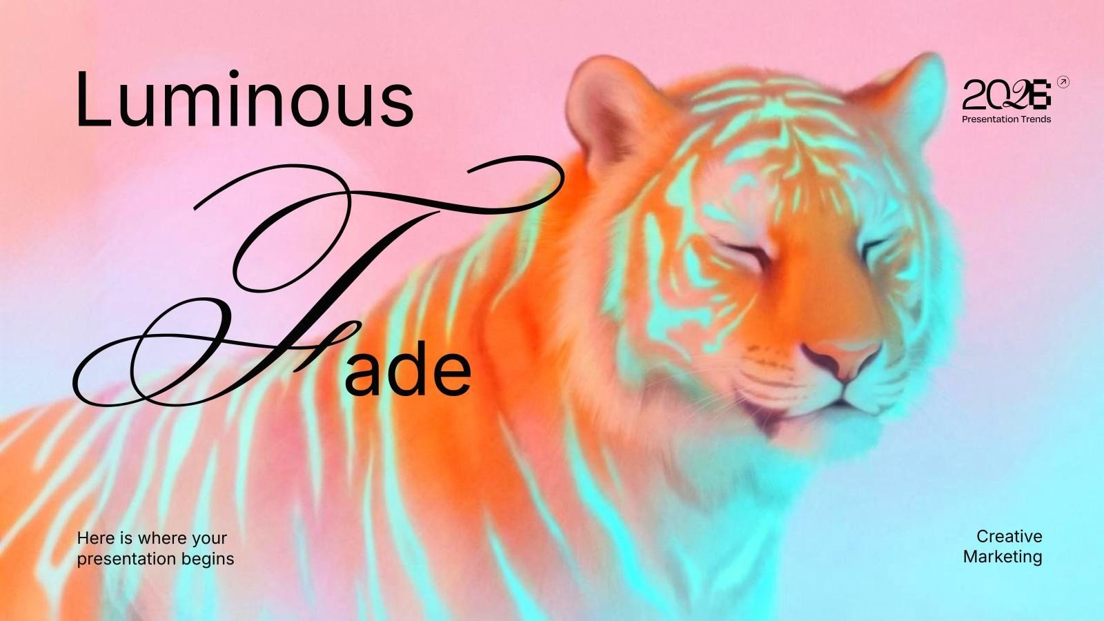
6. Illustration: minimal and maximal side by side
Two opposite aesthetics coexist: dreamy minimalism with soft textures and calm gradients, or bold maximalism with nostalgic collages, riso marks, and handcrafted imperfections. Occasionally, a hint of 3D slips in as an accent.
Where it works. Editorial explainers, brand storytelling, campaign slides.
How to try it. Pick your lane per deck. If you go maximalist, keep reading order clear with soft backgrounds and layered hierarchy.
Slidesgo inspiration. From the subtle textures of “Luminous Fade” to the retro punch of “Retro Decode”, both show how illustration styles can set the mood.
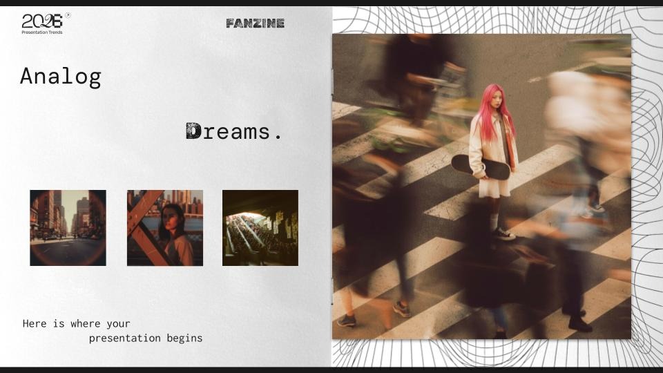
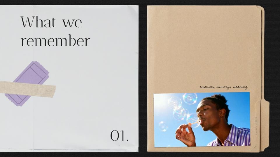
7. Photography: authentic, nostalgic, and surreal
Photos feel raw and human again—grainy portraits, muted tones, and real-life scenes. At the same time, bold editorial shots and surreal compositions keep things unexpected and vibrant.
Where it works. Employer branding, cause-driven decks, lifestyle storytelling, or education projects.
How to try it. Keep a consistent treatment throughout the deck. Add captions for context. For locations, experiment with drone intros or panoramic frames that set the stage.
Slidesgo inspiration. The “Analog Dreams” photo series leans on grainy textures and hazy motion blur to give urban scenes a nostalgic, almost surreal character.
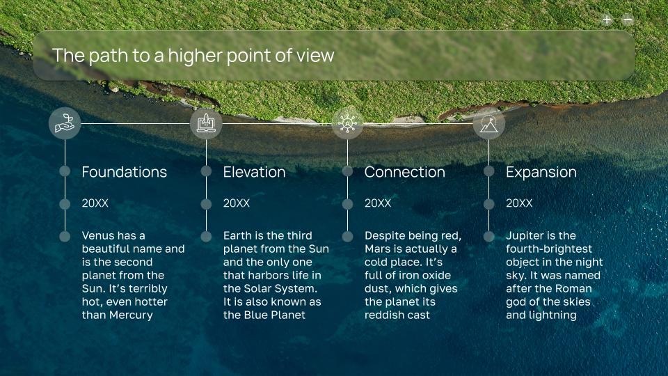
8. Data storytelling made simple
Charts aren’t just metrics anymore—they’re messages. One insight per graphic, titles that read like conclusions, and annotations that guide the story. Data feels clear, digestible, and purposeful.
Where it works. Company updates, classrooms, roadmaps—anywhere clarity beats complexity.
How to try it. Focus on a single idea per chart. Annotate peaks and shifts. Keep colors purposeful and consistent.
Slidesgo inspiration. In the “Dronescape” timeline slide, overhead landscapes anchor each phase, turning a simple sequence of steps into a cohesive, high-level journey.
9. Accessibility as design
Clarity is no longer optional. Strong hierarchies, generous sizes, and accessible contrasts are built in from the start. Every deck should feel designed for everyone.
Where it works. Everywhere. Every slide should be accessible by design.
How to try it. Keep body text at least 24 pt, titles between 44–64 pt, and contrast ratios that meet AA standards (4.5:1 for body, 3:1 for headlines).
Slidesgo inspiration. In accessibility-driven data layouts, contrast, sizing, and structured spacing ensure that key numbers stay clear and easy to scan. The ideal presentation for this is “Fictional Grid”.
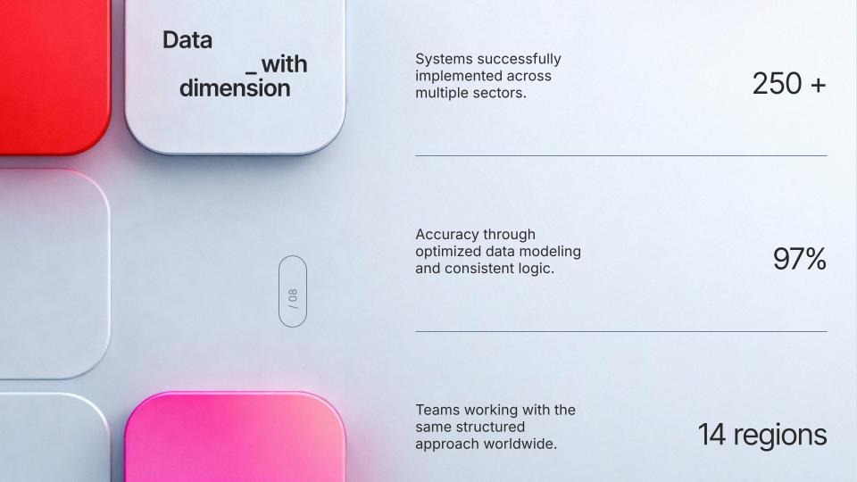
10. Asymmetric layouts with depth
Grids stay, but alignment loosens. Asymmetry injects energy, while shadows and layering create subtle depth. The result is dynamic and modern without losing readability.
Where it works. Corporate updates, conference talks, portfolio slides—moments where energy matters.
How to try it. Alternate strict column layouts with full-width spreads. Repeat visual cues to keep rhythm across the deck.
Slidesgo inspiration.The “Layered Memory” section slide uses off-balance composition and stacked textures to create depth and a subtly dynamic starting point.
The takeaway
2026 decks are all about human stories told with clarity. Whether through bold typography, soothing palettes, playful touches, or accessible charts, these trends put people first. And that’s what makes them so powerful: they don’t just inform—they connect.
Quick guide by use case
- Tech & innovation. Bold type, neon accents, geometric diagrams—plus a short video opener to set the tone.
- Education. Minimal slides with narrative photos, soft palettes, and small interactive touches.
- Business. Sober typography, asymmetric layouts, and data stories that speak through annotations.
Marketing. Retro or nostalgic vibes with controlled gradients and strong hero imagery.
Tags
Communication SkillsDo you find this article useful?
Related tutorials
How Smart Template Matching Saves Hours on Your Next Presentation
Content Find your perfect template, automatically How it works Templates that match your topic Get better results FAQ Skip the Search, Start Creating Find your perfect template, automatically Great presentations look intentional—where the design supports the message. But finding a template that fits usually means scrolling through dozens of options....
Creative PowerPoint Night Ideas
Want to be the star of your next PowerPoint Night? With the right ideas and a spark of creativity, you can turn any theme into a show-stopping experience that keeps everyone laughing and engaged. Whether you’re planning a friendly game night, a classroom challenge, or a team-building session, this guide is your...
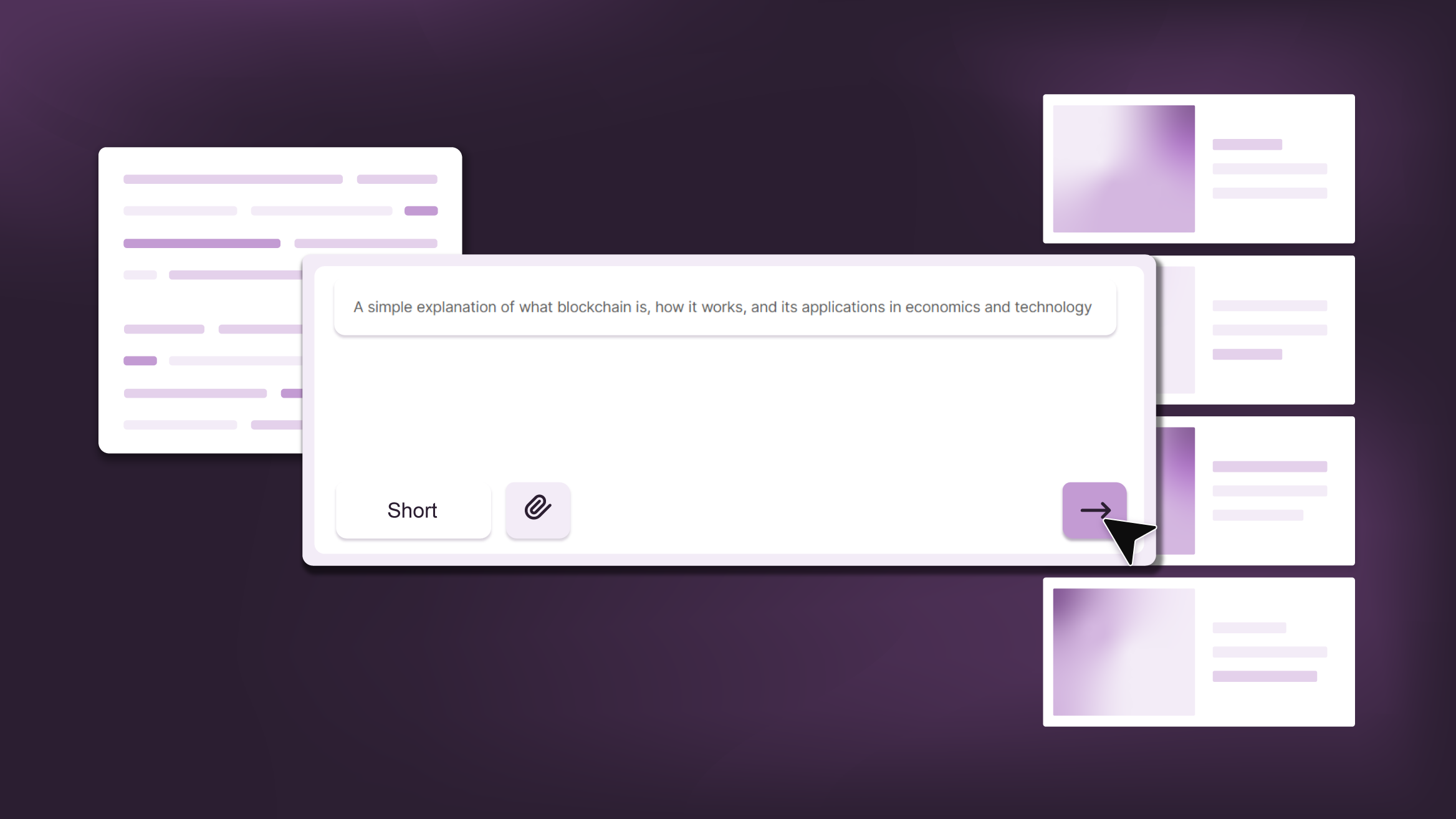
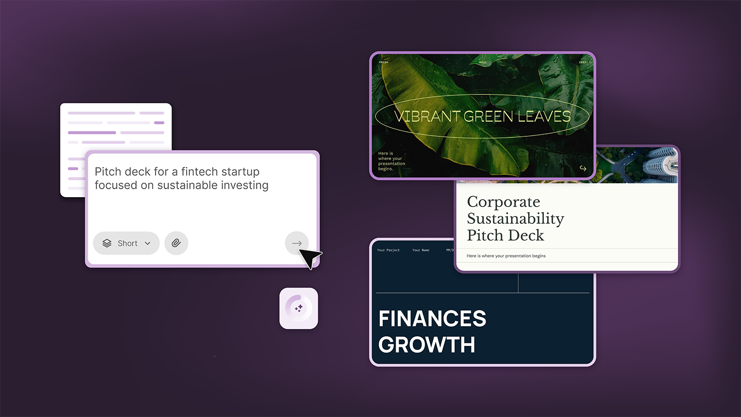
Smart Guide: Best AI Prompts for Powerful Presentations
Ever stared at a blank slide, knowing your message matters but not sure how to bring it to life? You’re not alone. With the rise of AI Presentation Maker, more creators, educators, and professionals are asking: What are the best AI prompts for presentations?This guide shows you exactly how to...
How Teachers Are Really Using AI in the Classroom: Voices from the Field
“I hope that AI can ensure students are still doing the planning, writing, and critical thinking needed. Students can't lose these skills.” -6th grade Science Teacher, FloridaFull disclosure: I interviewed my mom for this blog post.My mom, a retired 25+ year veteran educator who recently returned to the classroom, told me...