
How to Insert Infographics in Google Slides

Does the word “infographics” ring a bell? Those are diagrams that work as visual aids. You can present difficult concepts, processes, steps and the like in a very simple way. They can include texts, numbers or icons. Likewise, they can have different shapes and designs.
Of course, there are different types of infographics: mind maps, funnels, puzzles, calendars… If you are willing to create an effective presentation, it can be great to add some diagrams to your slides.
In this tutorial, we’re going to teach you more about these diagrams: where to find, how to add or how to work with infographics. Let’s get the party started!
How to find free Google Slides Infographics
If you own a company, you are a teacher, a physician, a student or someone who is thinking about establishing a startup, there is a perfect diagram for you.
Let’s focus on your needs. Are you a student and do you want some help to study a chapter about the Solar System? In this case, a mind map can be useful to you.
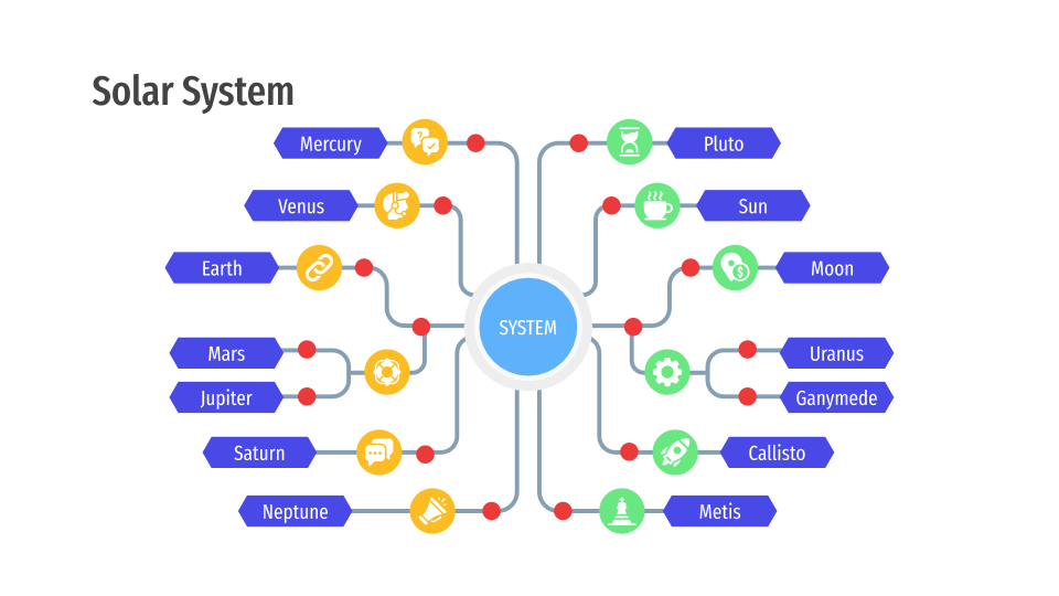
A mind map also helps if you are trying to define the buyer persona for a startup:

You can talk about the hobbies or interests of the person, for example.
We recommend you to have a look at our infographic templates. We add new ones each week!
→ Do you think that these Mind Maps could help you? Download them now and try new ways of displaying your data.
Inserting infographics in a Google Slides theme
Have you chosen a diagram already? Cool! Let’s get started.
Let’s imagine for a moment that you are a marketeer and you want to add infographics to your template. You can use it to talk about your marketing strategy.
What do you need to do?
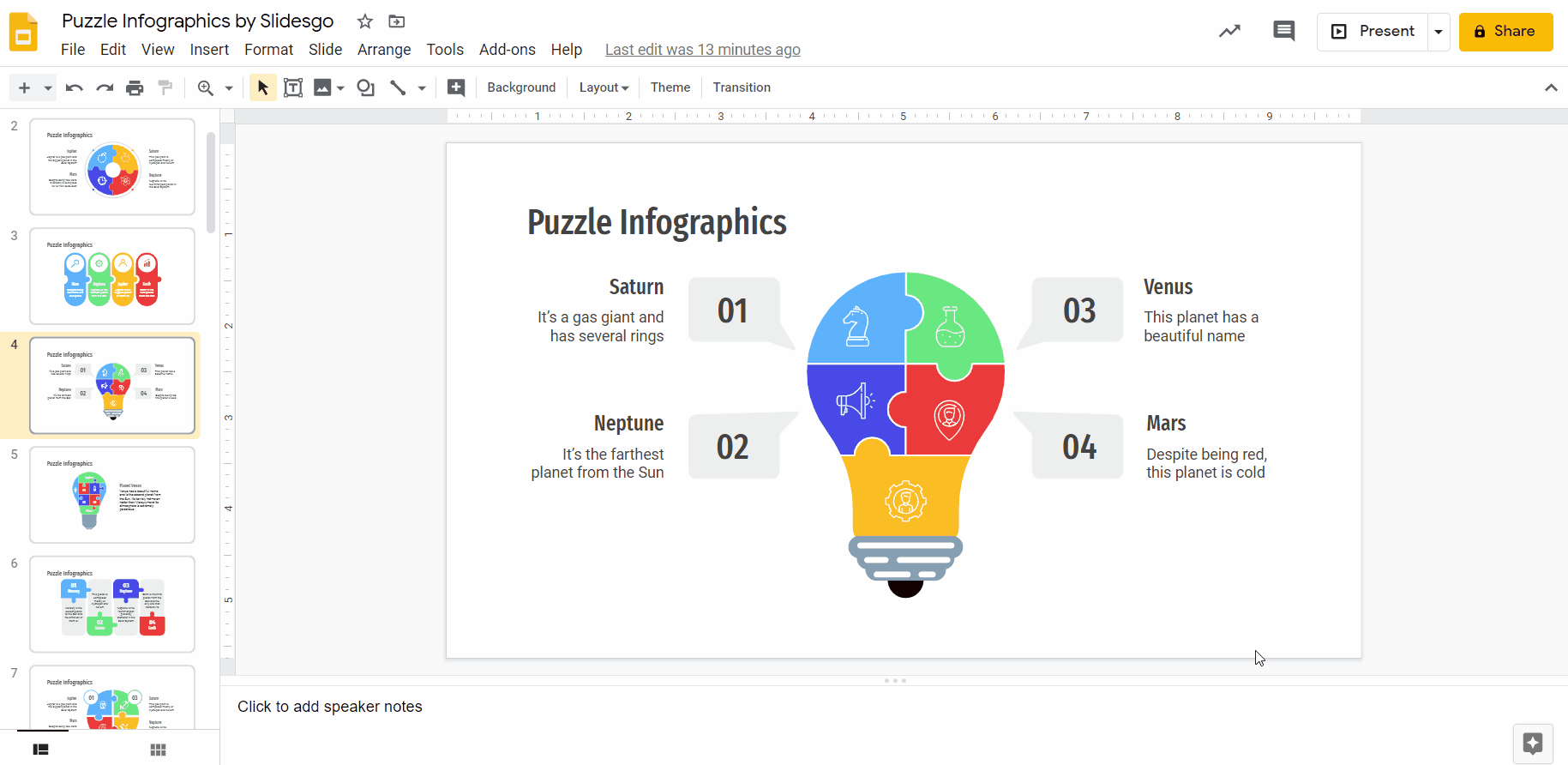
- Open a copy of the presentation you want to work with. Open your preferred infographic template as well. In this case, we are going to work with puzzle diagrams.
- Create a new slide.
- Go to the puzzle infographic you like the most.
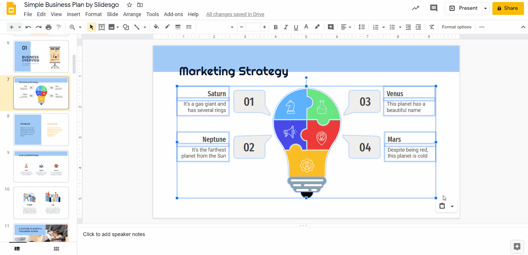
- Click outside the diagram while dragging, until you select the design together with the text boxes if you want to. Press Ctrl + C (or Cmd + C if using Mac) to copy it.
- Go to the slide in which you want to add the infographic.
Press Ctrl + V or Cmd + V if you are using Mac. You have just pasted it!
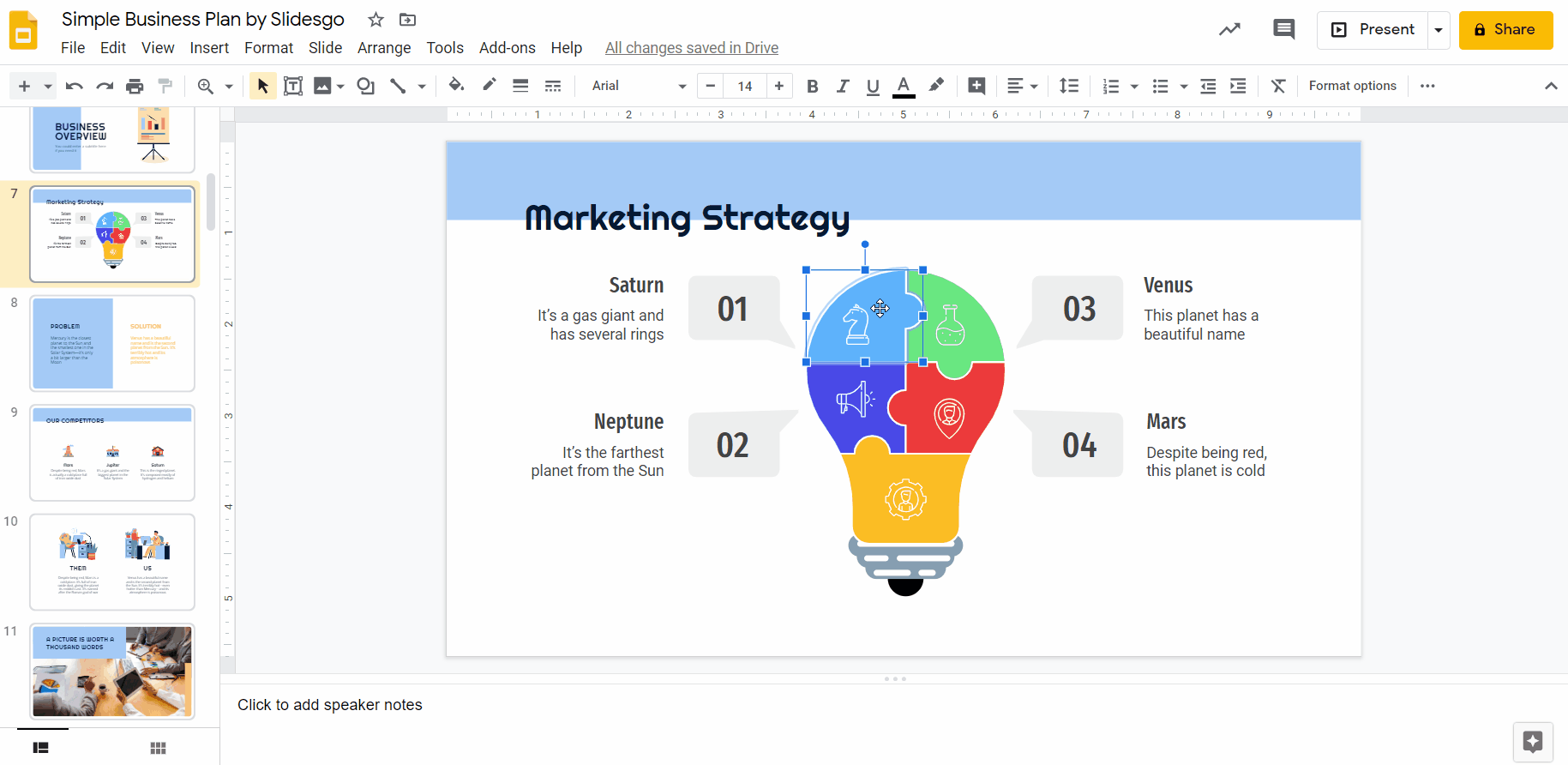
- On the bottom right corner there is a little icon. If you click on it, it will display two options: Match destination formatting and Keep source formatting. The first one will adapt the colors and the fonts to those of the theme.
- To make it simpler, choose the Match destination formatting. Still, we will show you how to change the colors and fonts manually below, as it requires a little bit more work.
Changing the colors of a diagram
If you like the infographic but you prefer to change its colors manually, there is a way of doing so.
- Double click on the element you want to change.
- Go to the toolbar → Fill color.
- Choose a color of the theme so the infographic matches the rest of the slides.
- You can also change the Border color.
Inserting texts in infographics
- Most of our diagrams already have texts that you can edit. To do so, you simply need to click on it, delete the text and begin typing.
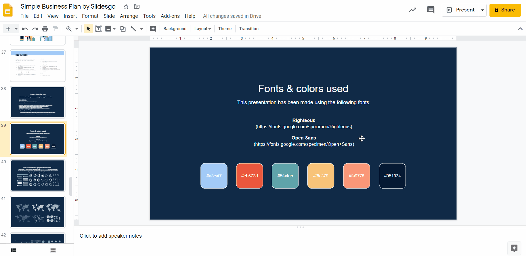
- Remember that it is always a good idea to use the fonts of the template. If you want to know the ones that we have used, go to the last slides of the template until you read the “Fonts & colors used” there. Those are the typefaces you should use.
- Go to the infographic once again.
- To change all the text boxes at once, click on all of them while pressing Ctrl or Cmd.
- In case you want to change the color, click on Text color and choose a theme hue.
- You can also use other font features: Bold, Italics or Underline.
If you need to add another text box, click on Insert. Then, click on the Text box button. - To create the text box, click and drag.
- Edit as needed.
Pro tip: if you want to know more about how to work with text boxes, read our tutorial!
Inserting icons in diagrams
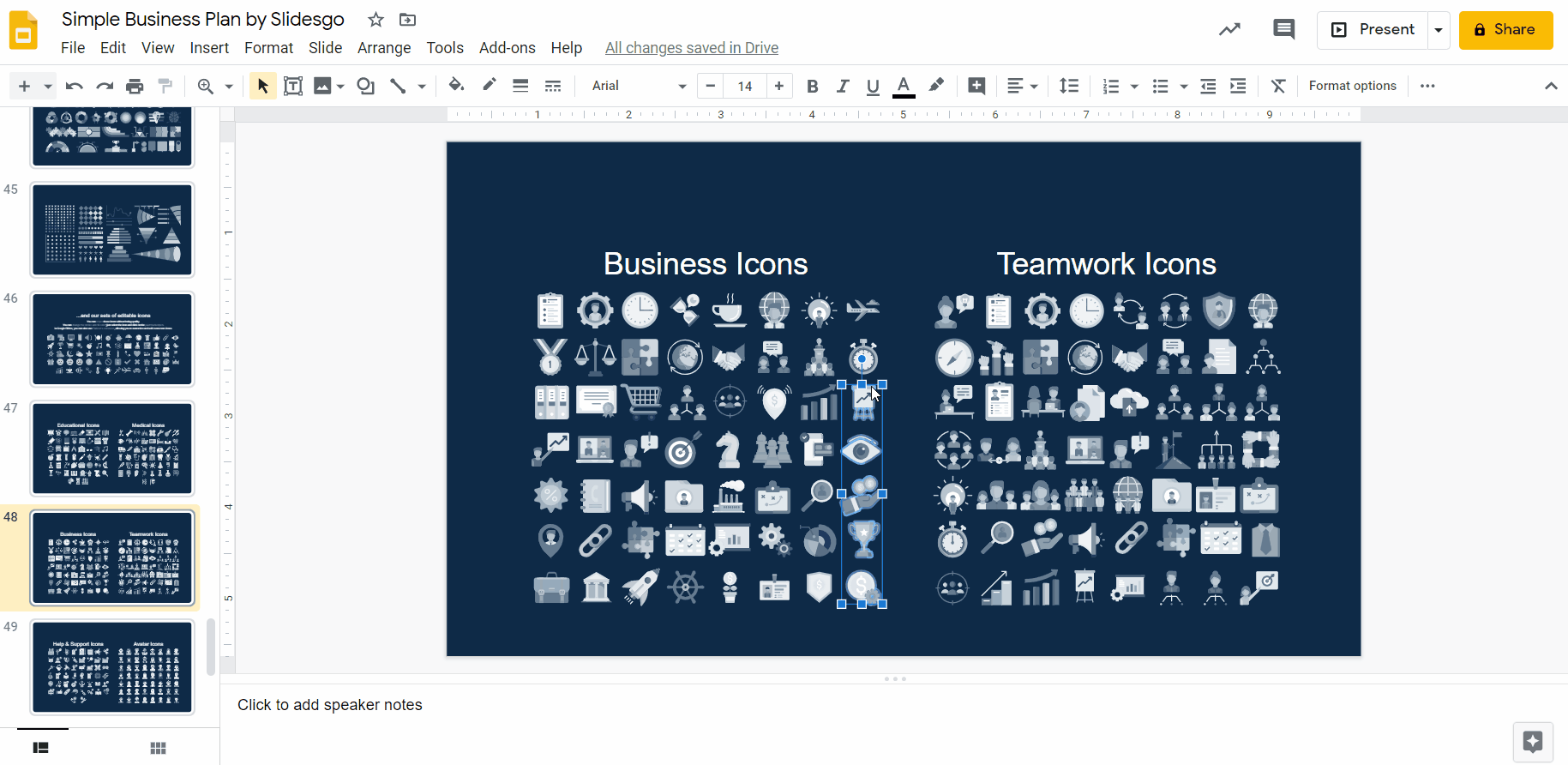
Icons can be helpful to represent your ideas. Although we will explain a little bit about them here, you can find more information on How to Add and Modify Icons in our tutorial.
- Most of our infographics include icons. If you don’t like them, change them. We offer plenty of icons in our resource slides: click on the icon and then press Supr.
- Go to our set of editable icons and choose the ones you like.
- Click on them (if you are selecting more than one, press Ctrl or Cmd if you are using Mac). Press Ctrl + C or Cmd + C in Mac.
- Go to the slide with the infographic and press Ctrl + V or Cmd + V in Mac.
- If you want to modify the colors of an icon: right click → Ungroup.
- Use the Fill color and Border color tools. Remember to use the hues of the theme.
- Click regroup when you are done.
You have just inserted an infographic on your presentation! Thanks to this diagram, your listeners will understand quite easily all your data, plans, processes and the like.
If you want to know more about how infographics improve your presentation, you can read our tutorial! In addition, you can find more Infographic Presentation Templates on our website! They are easily adaptable and personalizable to any of your projects.
Do you find this article useful?
Related tutorials

How to present survey results in PowerPoint or Google Slides
A survey is a technique that is applied by conducting a questionnaire to a significant sample of a group of people. When we carry out the survey, we start from a hypothesis and it is this survey activity that will allow us to confirm the hypothesis or to see where the problem and solution of what we are investigating lies.We know: fieldwork is hard work. Many hours collecting data, analyzing and organizing it until we have our survey results.Well, we don't want to discourage you (at Slidesgo we stand for positivism) but this is only 50% of the survey work....

How to Create a Venn Diagram in Google Slides
If you wish to give an awesome presentation, using diagrams is great because they make your data look nicer and help your audience understand your points.In this Slidesgo School article, we’ll teach you how to create Venn diagrams in Google Slides so you can have them in your bag of resources!
How to Create a Venn Diagram in PowerPoint
How many times did you have to explain your data with a PowerPoint presentation and you weren’t able to find the most visual way to do it? To help you with this matter easily and quickly, in this Slidesgo School post we will explain how to insert or create a Venn diagram in PowerPoint, as well as its history and components.

How to add and edit maps in Google Slides
Map infographics are very useful for any presentation, as they allow you to transmit data quickly and easily. In this post we are going to explain how to include and edit maps in your Google Slides presentations.