
How to Create a Venn Diagram in PowerPoint
How many times did you have to explain your data with a PowerPoint presentation and you weren’t able to find the most visual way to do it? To help you with this matter easily and quickly, in this Slidesgo School post we will explain how to insert or create a Venn diagram in PowerPoint, as well as its history and components.
What a Venn diagram is and what it’s for
Venn diagrams are graphical representations used mainly in set theory. They visually show how two or more elements are arranged into groups, where each of these is usually represented by a geometric shape, mainly a circle or an oval.
They are commonly used to show the logic and relationship between various elements of fields such as mathematics, linguistics, computer science, business and other areas of education.
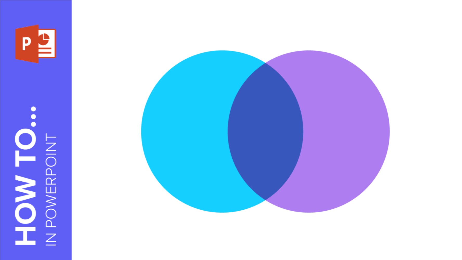
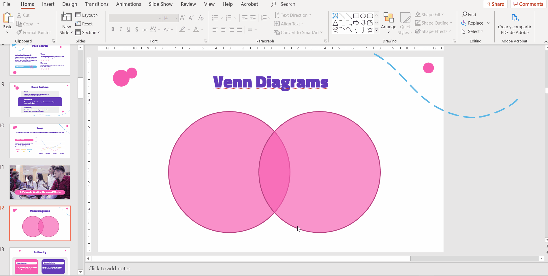
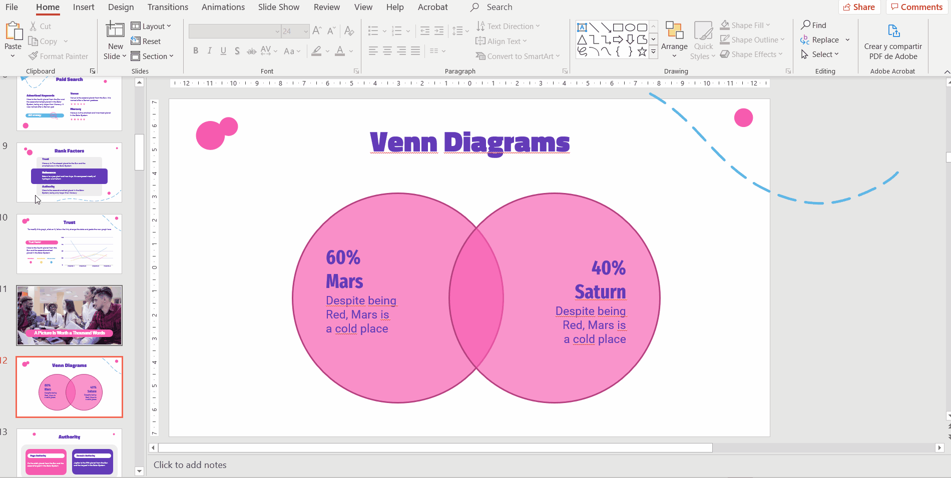
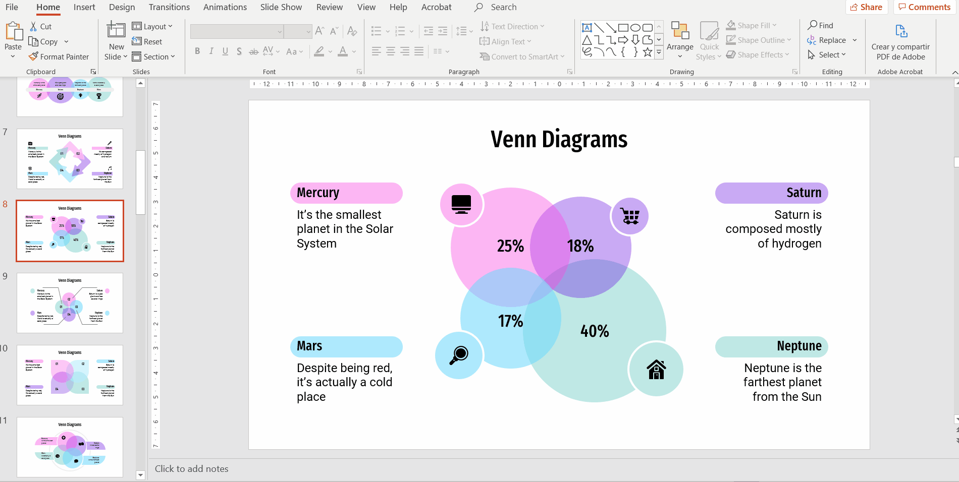
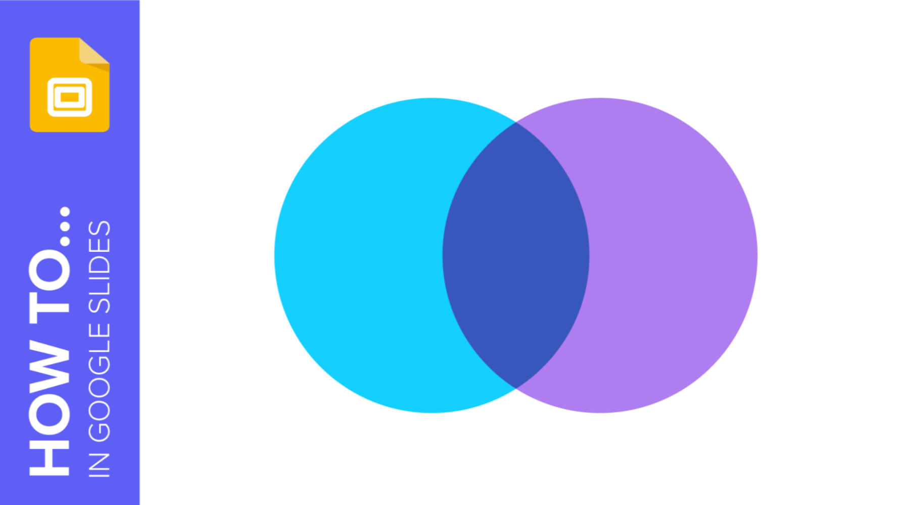
Here is an example of a Venn diagram:
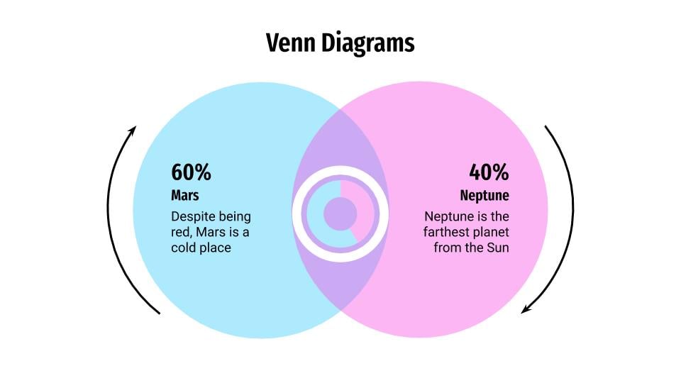
As we have previously stated, each circle represents different categories of information, which are blown in an area called "intersection". The overlapping part of the Venn diagram points out those points in common between the two categories.
The history of Venn Diagrams
We have to go back to the 11th century AD to know the origins of the Venn diagram. According to several historians, it was Ramon Llull, a Majorcan philosopher, and logician, who first used a diagram with a similar structure.
However, the concept of the Venn diagram as we know it today is the result of a publication in the Philosophical Magazine and Journal of Science, called "On the Mechanical and Diagrammatic Representation of Propositions and Reasoning", by the logician John Venn in 1880.
Was it John Venn who first coined this term? Venn referred to these diagrams as "Euler circles", the predecessor to the Venn diagram, as he was inspired by the diagrams of the Swiss mathematician Leonard Euler. The first time the name "Venn diagrams" was used was in the book "A Survey of Symbolic Logic" published in 1918 by the philosopher Clarence Irving Lewis.
Thus, over the decades, the concept was developed and simplified by other experts in the field, such as David W. Henderson, Jerrold Grids, Charles E. "Chip" Killian, Cara D. Savage and Peter Hamburguer.
Components of Venn diagrams
When explaining a Venn diagram, it is important that you know the different components of its structure:
- Union. This is the combination of all the circles in the diagram.
- Set. Each of the elements that you want to represent in the Venn diagram.
- Intersection. Refers to the elements that overlap between the different circles. They are also called "subsets".
- Symmetric difference. It is everything but the intersection between the sets.
- Relative complement. It is the difference between a set A and a set B or in other words, the individual section of one of the shapes that does not fall into the intersection.
- Absolute complement. Everything that is not part of a set, including the area surrounding the circumferences.
- Universal set. The area surrounding the sets.
Creating a Venn diagram from scratch
Now we’re going to see how to make your own Venn diagram from beginning to end. You just need to follow these steps. You’ll have your own infographics in no time!
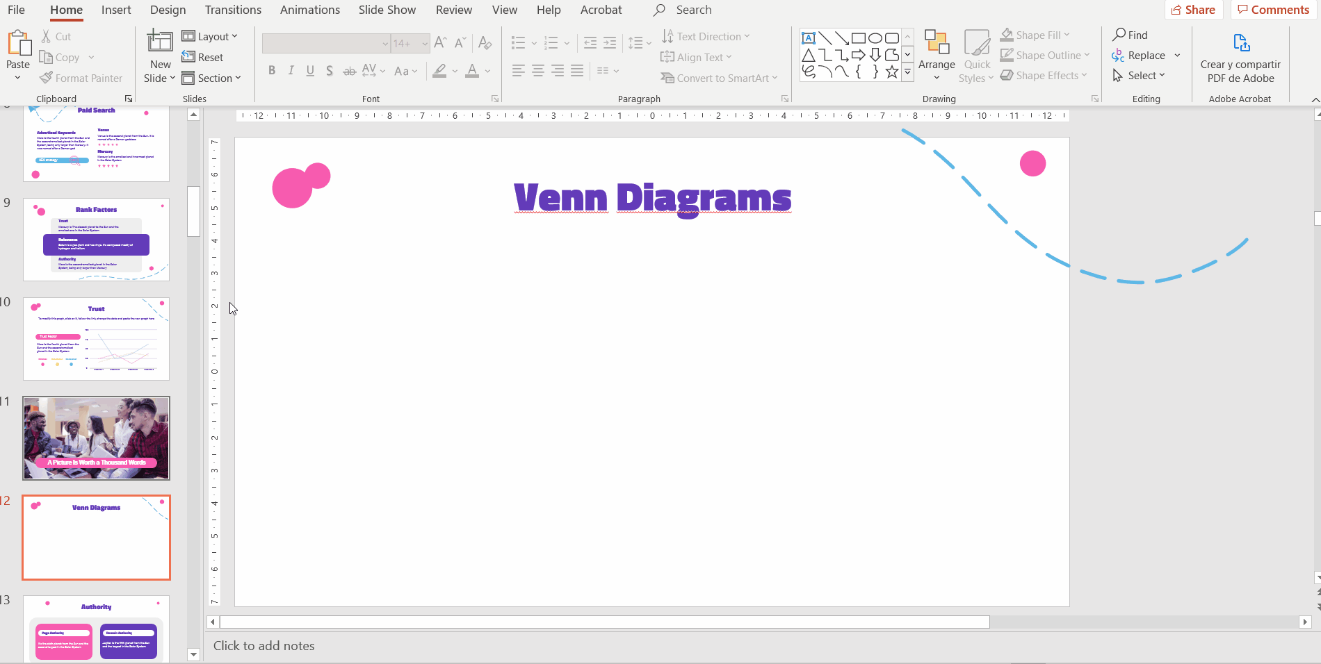
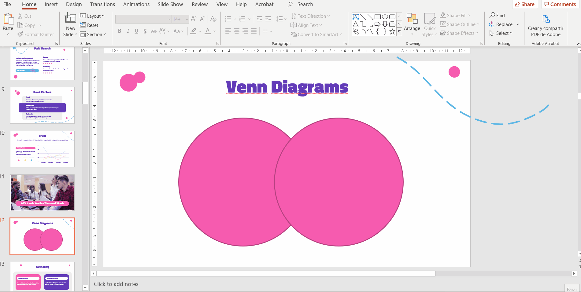
First, click Insert > Shape, and then select “Circle”. Now, click and drag to create a circle. Try to place it on a side (not in the center of the slide). Then, copy this shape and paste it to have two circles. Place the second one slightly overlapping the first:
To color a circle, select it, go to Format > Shape Fill, and then choose the color that you prefer. In our example, we’ve opted for pink.
Once done, we need them to be a little bit transparent so that the sector that they share in common is highlighted. You’ll find the “Transparency” option in Shape Fill > More Fill Colors. Do the same with both circles.
To make your data more noticeable for your audience, you may use text or icons, either inside or outside the shapes. To insert a text, just click Insert > Text Box. Now click and drag to draw the text box. Finally, just type the text. Once done, you can change the font or the color, just like in the following example:
As we mentioned before, you might want to insert icons instead, since these elements are much more visual. All our templates contain slides with alternative resources and theme icons that you can freely use in your presentations.
It’s very easy. Just select the element that you want to copy, press Ctrl + C (or Cmd + C) and then go to your presentation and press Ctrl + V (or Cmd + V) to paste it:
Inserting a Venn diagram in PowerPoint
Do you want to save time? In Slidesgo, we have a template containing editable infographics of this type of diagrams, which you just need to edit and then insert into your own presentation. Of course, they’re all 100% customizable, so you can change the colors, text, icons and other elements as you wish. Let’s see how to insert a Venn diagram in PowerPoint!
First, go to Slidesgo’s homepage and access the Infographics section. Then, find the “Venn Diagrams” template or type its name in the search bar. Lastly, download it by clicking the PowerPoint button under “Download this template”.

Your download will start automatically. After it’s finished, locate the .pptx file, open it and choose the diagram that you like the most. There’s a nice variety!
After choosing your preferred one, select it and copy it by pressing Ctrl + C (or Cmd + C). Then, go to your presentation and paste it by pressing Ctrl + V (or Cmd + V). Now you’re ready to start adding your data!
With this lesson about Venn diagrams, you will be able to correctly organize and explain the relationship between various elements of your next presentation. If you want to make your presentation on one of these templates and wow your audience, visit Slidesgo and choose from hundreds of free PowerPoint and Google Slides templates.
Do you find this article useful?
Related tutorials

How to present survey results in PowerPoint or Google Slides
A survey is a technique that is applied by conducting a questionnaire to a significant sample of a group of people. When we carry out the survey, we start from a hypothesis and it is this survey activity that will allow us to confirm the hypothesis or to see where the problem and solution of what we are investigating lies.We know: fieldwork is hard work. Many hours collecting data, analyzing and organizing it until we have our survey results.Well, we don't want to discourage you (at Slidesgo we stand for positivism) but this is only 50% of the survey work....
How to Create a Venn Diagram in Google Slides
If you wish to give an awesome presentation, using diagrams is great because they make your data look nicer and help your audience understand your points.In this Slidesgo School article, we’ll teach you how to create Venn diagrams in Google Slides so you can have them in your bag of resources!

How to add and edit maps in Google Slides
Map infographics are very useful for any presentation, as they allow you to transmit data quickly and easily. In this post we are going to explain how to include and edit maps in your Google Slides presentations.

How to create and format maps in PowerPoint
One of the biggest challenges when making a presentation is talking about data. To make it as less tedious as possible and easy to understand, it is preferable to use visual resources instead of text. Map infographics are representations that, at a glance, help us assimilate data better and faster.