
How to add and edit maps in Google Slides
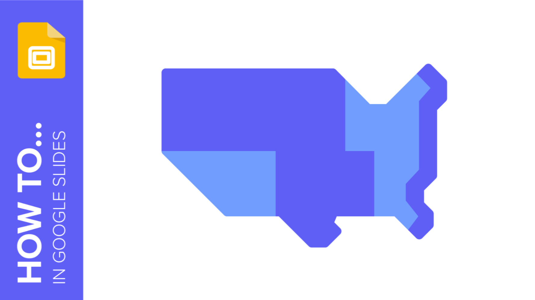
Map infographics are very useful for any presentation, as they allow you to transmit data quickly and easily.
In this post we are going to explain how to include and edit maps in your Google Slides presentations.
When and why use map infographics?
Maps are very versatile and you can use them in various contexts, such as showing travel routes.
They are of great help in business presentations that refer to different geographical areas, multinationals with headquarters in different countries or geography and history teachers who want to give a visual reinforcement to their classes.
They are the best resource to geolocate data in your presentations on international issues and territorial policies.
As for the advantages they provide, we can summarise them as:
· Clearer information that we assimilate faster, as we need less text.
· More attractive exhibitions that capture attention better.
· More accessible presentations, thanks to the use of icons that are internationally known.
Pro tip: at Slidesgo we offer you a wide variety of free templates with infographic maps. Feel free to use them to complete your presentations with a professional touch. They include different styles and a variety of graphic and textual resources that will help you reinforce the message of your exhibition.
How to insert a map into your presentation
Google Slides gives you the option of inserting a map directly into your presentation. To do this, you just have to copy the map you need and paste it on the slide of your presentation. Let's see how:
How to change the map colors
A very useful tool is to change the color of the map or of one specific area. This will allow you to choose the one that best suits your corporate tone and is a good way to highlight certain areas that you refer to. Remember to always use the theme colors to maintain the harmony of the template.
To change the color you just have to select the area of the map with the mouse. Go to the tools menu and click on the paint bucket icon (Fill color). Select the color you want et voila!
You can also customise the tone of the background. Select the slide you want to modify and follow the same procedure as before. Click on the paint pot and choose the color that you like.
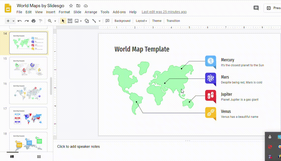
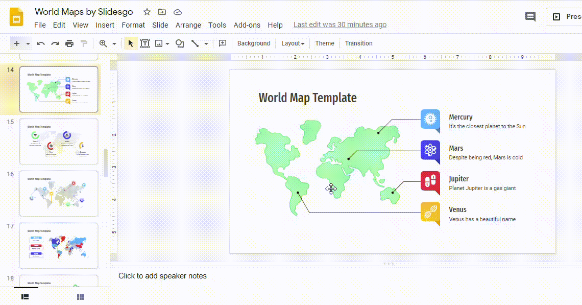
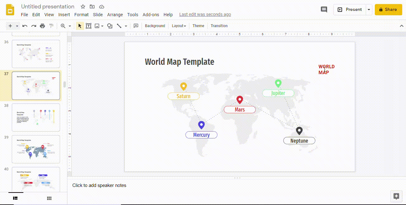
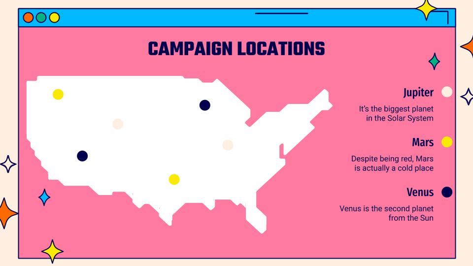
Add and change text on the map
Sometimes you need to include not only the map, but also data to contextualize your presentation. For this you can insert short texts that serve as a guide.
Click on the Text Box tool and create the box in the area of the map that interests you. Now you can write your text and customize the size, font, etc.
Another interesting option is to include links in the text blocks, to complete your presentation. You can use it in geography class presentations to include additional training resources for your students.
You can also link to other parts of your presentation, in case you need to expand the information on other slides. It's a quick and easy way to go to them.
All you have to do is select the text you want to link and click on Insert Link in the toolbar. Choose the slide to which you want it to redirect and click Apply.
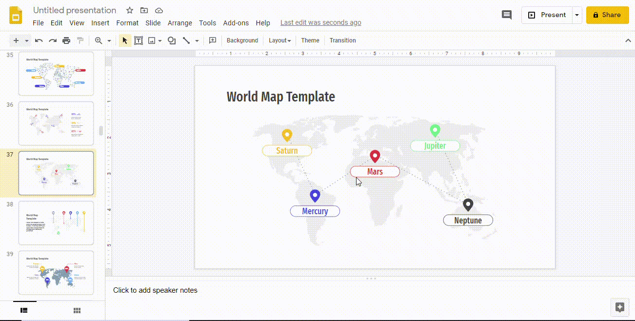
How to add and change map icons
An alternative to include information is the use of icons. These are so widespread that just by looking at them they can visually convey information.
To add them, go to the final part of the Google Slides templates, where you will find several slides with extra resources that you can use freely, choose the icon you want and copy it. Go back to the slide where you need to insert it. And in the area where you want it to appear press Ctrl + V.
Now you can move it to the exact area you want and change the color to suit your presentation. Simply select the icon, click on Fill color and choose the one you like.
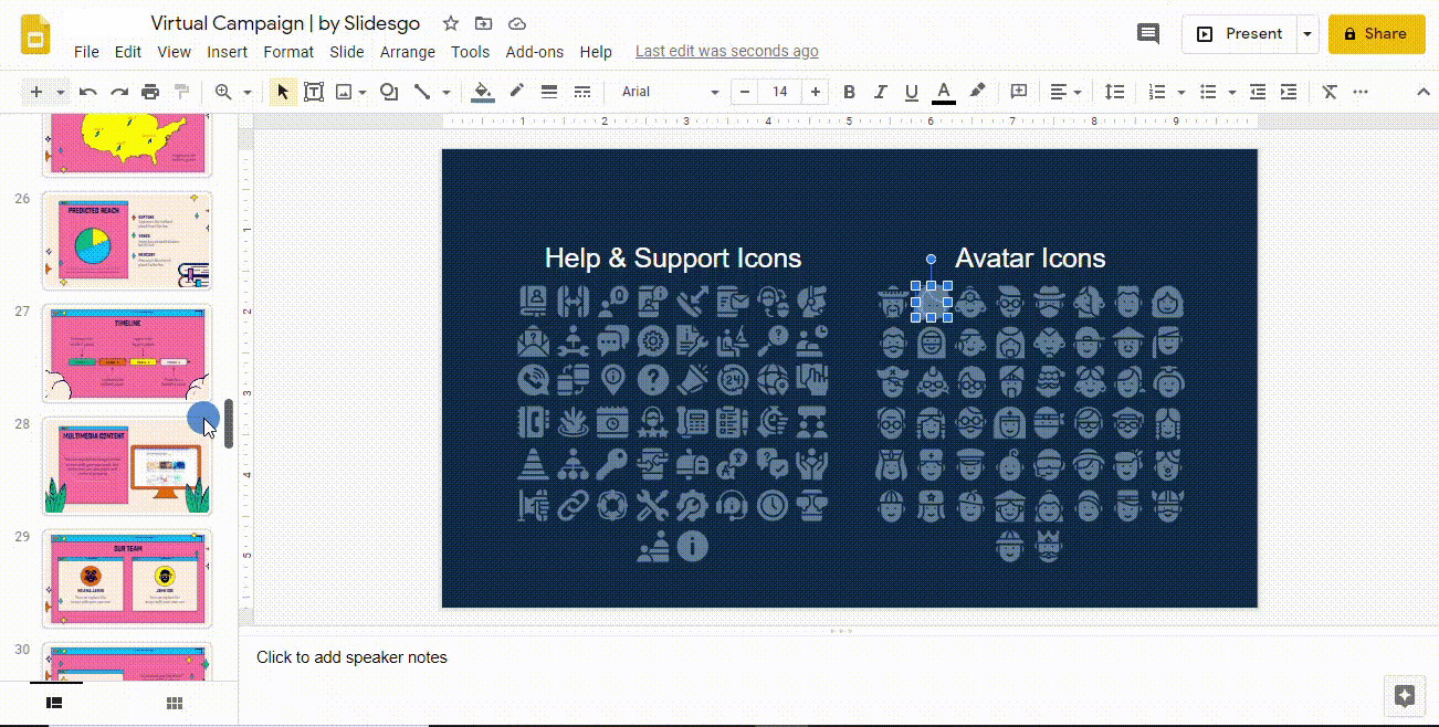
On certain occasions, you may need to include several icons on the same slide. In this case, we recommend including a legend on one of the sides to explain its meaning. Try not to include too much text so as not to detract from the map.
Congratulations!! You are already an expert in the use of map infographics. Make the most out of it with Slidesgo's free templates by inserting infographics that help you better convey your ideas.
Do you find this article useful?
Related tutorials

How to present survey results in PowerPoint or Google Slides
A survey is a technique that is applied by conducting a questionnaire to a significant sample of a group of people. When we carry out the survey, we start from a hypothesis and it is this survey activity that will allow us to confirm the hypothesis or to see where the problem and solution of what we are investigating lies.We know: fieldwork is hard work. Many hours collecting data, analyzing and organizing it until we have our survey results.Well, we don't want to discourage you (at Slidesgo we stand for positivism) but this is only 50% of the survey work....
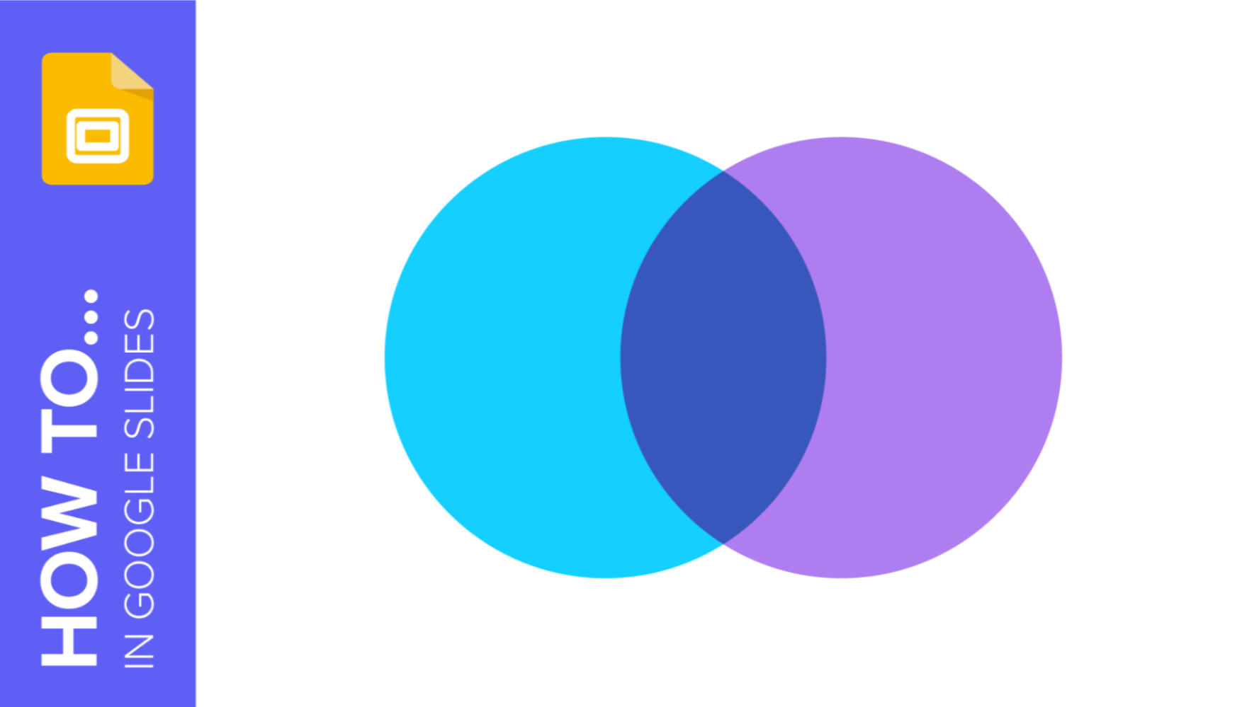
How to Create a Venn Diagram in Google Slides
If you wish to give an awesome presentation, using diagrams is great because they make your data look nicer and help your audience understand your points.In this Slidesgo School article, we’ll teach you how to create Venn diagrams in Google Slides so you can have them in your bag of resources!
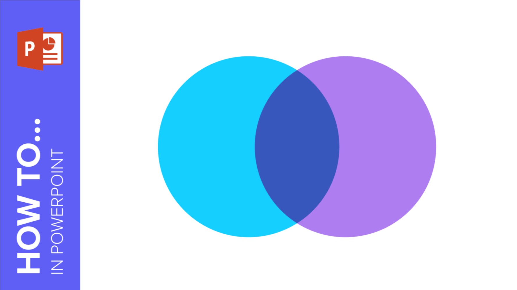
How to Create a Venn Diagram in PowerPoint
How many times did you have to explain your data with a PowerPoint presentation and you weren’t able to find the most visual way to do it? To help you with this matter easily and quickly, in this Slidesgo School post we will explain how to insert or create a Venn diagram in PowerPoint, as well as its history and components.
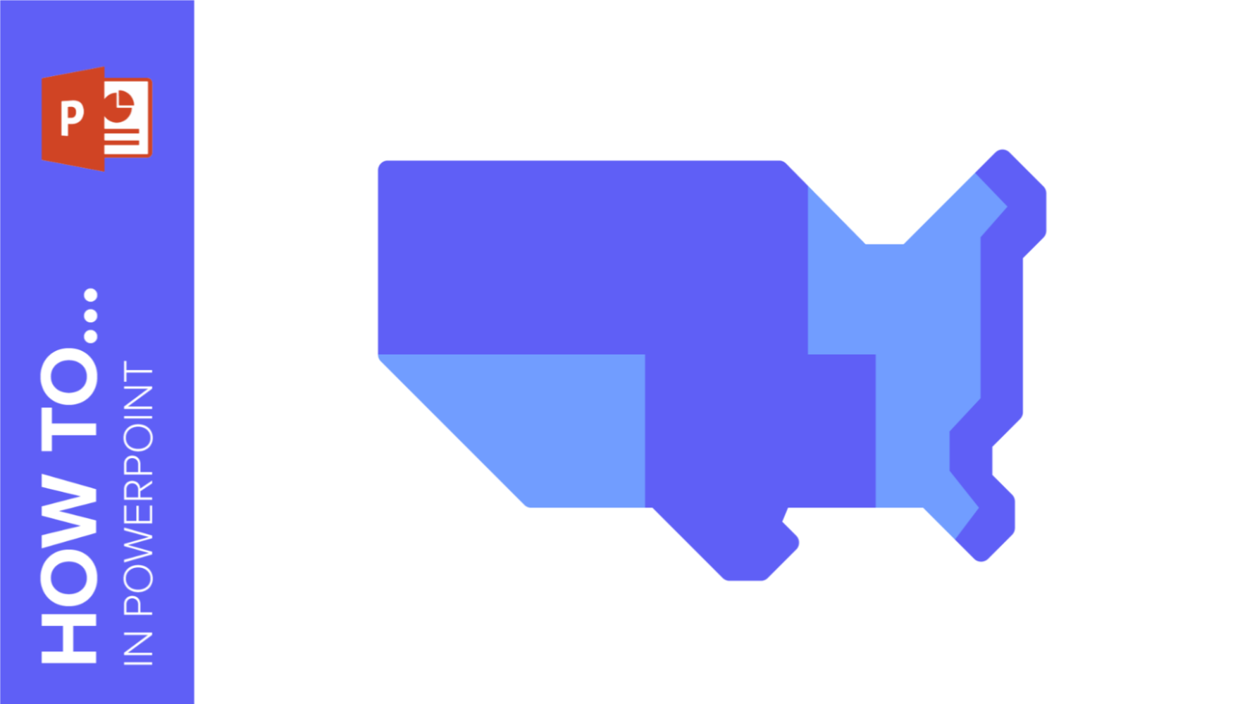
How to create and format maps in PowerPoint
One of the biggest challenges when making a presentation is talking about data. To make it as less tedious as possible and easy to understand, it is preferable to use visual resources instead of text. Map infographics are representations that, at a glance, help us assimilate data better and faster.