
How to Create a Venn Diagram in Google Slides
If you wish to give an awesome presentation, using diagrams is great because they make your data look nicer and help your audience understand your points.
In this Slidesgo School article, we’ll teach you how to create Venn diagrams in Google Slides so you can have them in your bag of resources!
Venn Diagrams: What they are and what they’re for
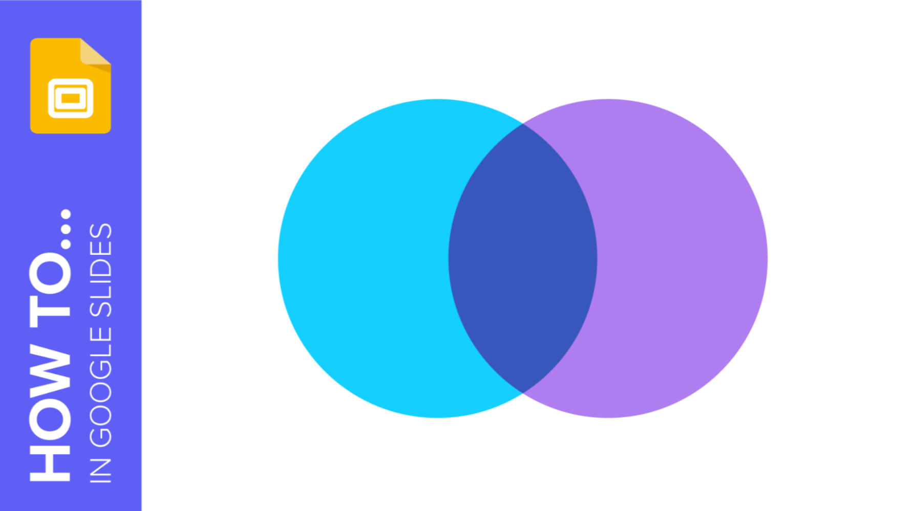
Venn Diagrams are infographics used mainly to represent set theory, in other words, they are used to show in a graphic way how would be the combination of one or several elements delimited by closed lines, in such a way that the elements of each group remain inside them.
For this representation, circles or ovals are used, which converge in an area called "intersection" that represents the elements that overlap between two or more elements within the same "universe".
Therefore, they are used to visually explain the logic between various elements, which is quite useful in business presentations or presentations related to the fields of mathematics, computer science, or statistics.
The history of Venn diagrams
Venn diagrams are named after a publication by the British mathematician John Venn in 1880. His work was entitled "On the diagrammatic and mechanical representation of propositions and reasonings", in which he presented the representation system we use to this day.
John Venn was able to create a method that simplified the representation systems previously used for set theory. His theory took as its starting point the "Eulerian circles", diagrams that were postulated by the mathematician Leonard Euler.
During the following decades, various mathematicians developed the concept further. After Clarence Irving Lewis' book "A Survey of Symbolic Logic", published in 1918, the term "Venn diagrams" began to be used in academic circles.
Components of Venn diagrams
To correctly understand Venn diagrams, you must know the name of each of the components that make up the diagram:
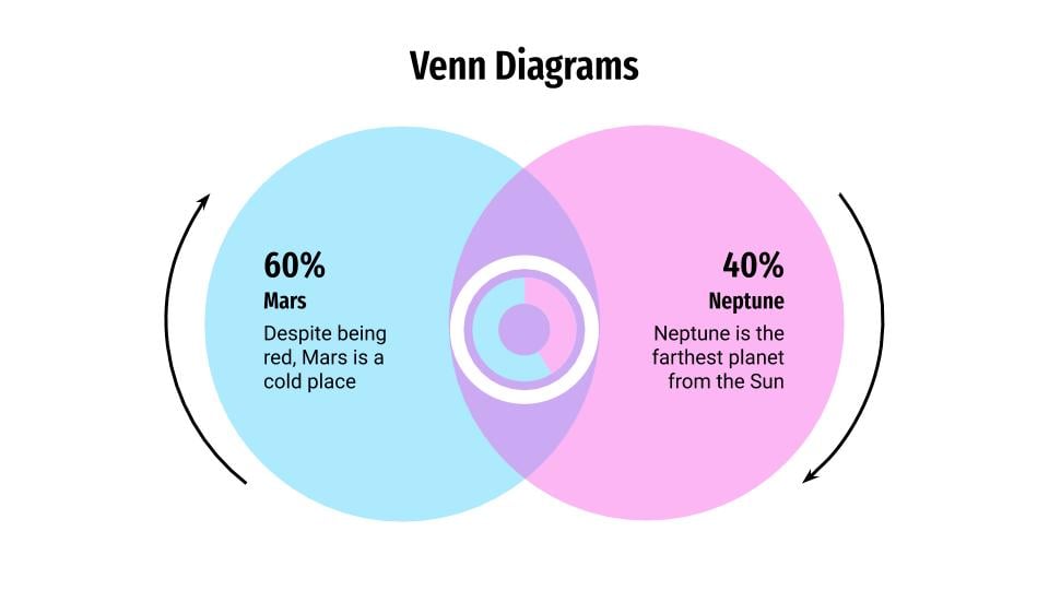
- Union. These are the sets of information or elements that you represent in the Venn diagram, which are usually in the shape of a circle or oval.
- Set. The union of all the sets or circles of the Venn diagram.
- Intersection. These are those areas in which the different sets overlap and thus show what various elements have in common. They are also called "subsets".
- Symmetric difference. It is the result of the difference of several sets or expressed in another way, it is everything except the intersection formed between several circles.
- Relative complement. The individual part of a subset that does not fall within the intersection is called the relative complement.
- Absolute complement. That area that is not part of a set, which also includes the surface surrounding the ovals.
- Universal set. The area enclosing the sets that form the Venn diagram.
Creating a Venn diagram from scratch
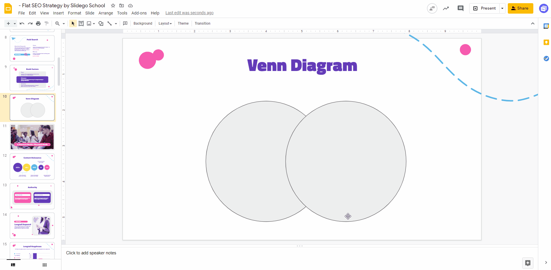
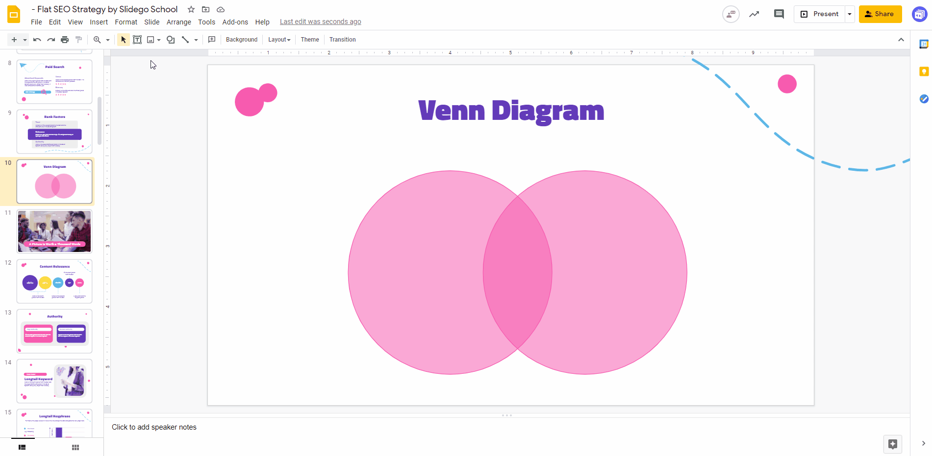
Making your own Venn diagram is quite easy and it takes only just a few minutes. To start, click Insert > Shape > Shapes, and select “Oval”. Now click and drag to create the shape. Then, create a second one and place it slightly on top of the second one.
PRO TIP: If you hold Shift while dragging, you’ll create a perfect circle.
Now you can change the fill color and border color by using their respective options on the top bar. We recommend that you use tones already included in the palette of your presentation.
Once done, apply some transparency to the circles so that their overlapping part is highlighted. To access the Transparency slider, click “Fill color”, then the “+” button under “Custom”.
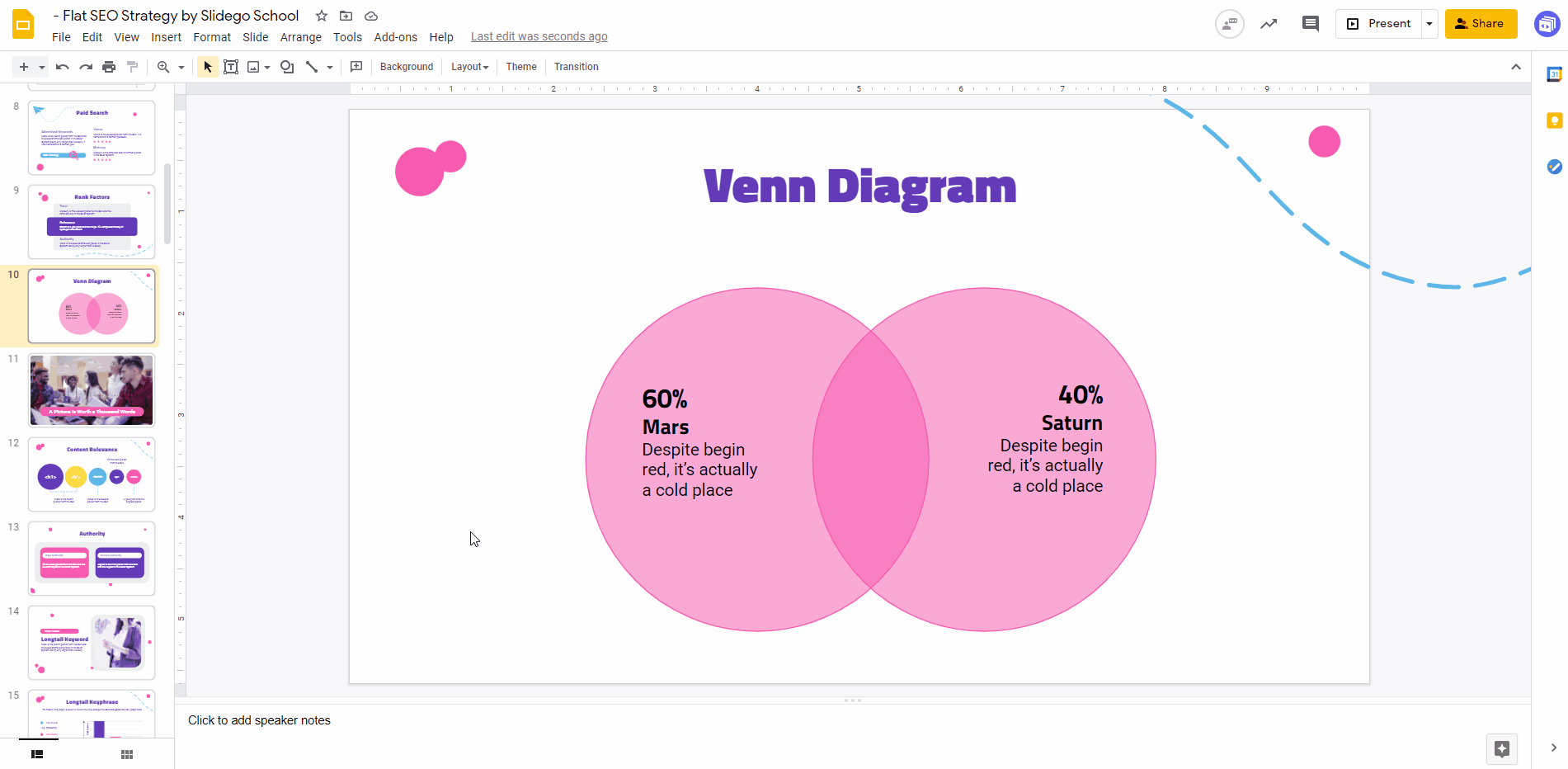
Now insert a couple of text boxes by clicking Insert > Text Box. Then, click and drag where you want it to be and, finally, type the text. You can change the font, size and color afterwards:
As an alternative, you might want to use icons, since they are more visual. Slidesgo’s templates contain slides full of extra resources and icons that you can freely use in your presentations. Just select the icon that you want to use, copy it by pressing Ctrl + C (or Cmd + C), then go to the slide where the diagram is and press Ctrl + V (or Cmd + V) to paste it. Here’s an example:
Now that you know how to show your data in the form of a Venn diagram, have a look at our catalog of free templates for Google Slides. Download the one that you like the most and start editing it!
Inserting a Venn diagram in Google Slides
If you have your presentation pretty much ready and only the data part is missing, you can try inserting an already designed Venn diagram and then edit the information on it.
To do so, download the Venn Diagrams template from Slidesgo. Once done, open it in Google Slides, copy the design that you like the most by presing Ctrl + C (or Cmd + C) and then return to your presentation and press Ctrl + V (or Cmd + V) to paste it.

Now that you have the diagram on your presentation, you just have to modify the data. Success is guaranteed!
Now that you know how to show your data in the form of a Venn diagram, have a look at our catalog of free templates for Google Slides. Download the one that you like the most and start editing it!
Do you find this article useful?
Related tutorials

How to present survey results in PowerPoint or Google Slides
A survey is a technique that is applied by conducting a questionnaire to a significant sample of a group of people. When we carry out the survey, we start from a hypothesis and it is this survey activity that will allow us to confirm the hypothesis or to see where the problem and solution of what we are investigating lies.We know: fieldwork is hard work. Many hours collecting data, analyzing and organizing it until we have our survey results.Well, we don't want to discourage you (at Slidesgo we stand for positivism) but this is only 50% of the survey work....
How to Create a Venn Diagram in PowerPoint
How many times did you have to explain your data with a PowerPoint presentation and you weren’t able to find the most visual way to do it? To help you with this matter easily and quickly, in this Slidesgo School post we will explain how to insert or create a Venn diagram in PowerPoint, as well as its history and components.

How to add and edit maps in Google Slides
Map infographics are very useful for any presentation, as they allow you to transmit data quickly and easily. In this post we are going to explain how to include and edit maps in your Google Slides presentations.

How to create and format maps in PowerPoint
One of the biggest challenges when making a presentation is talking about data. To make it as less tedious as possible and easy to understand, it is preferable to use visual resources instead of text. Map infographics are representations that, at a glance, help us assimilate data better and faster.