
The best tips for using fonts in presentations

Each design element in a presentation has a crucial role to play. The choice of fonts to use and the way they are employed cannot be a matter of chance.
Learn, below, the best tips for using fonts in your Google Slides or PowerPoint presentations. With these simple tips, it will be easier for you to know which font to use on your slides, how to combine different types, and what tricks you should follow to make your text stand out.
Choose easy-to-read fonts
Which typography is the most suitable for a presentation? One that is 100% legible for your audience. Always prioritize the use of fonts that are easy to read from a certain distance, as it is essential that everyone can see the main content of your presentation without much effort.
.png)
Minimalist Korean Aesthetic Pitch Deck
When you are editing a Google Slides or PowerPoint presentation, try to put yourself in the shoes of your audience. Ask yourself, "Will this font look right when I put the projector on?”. If you have doubts, discard it and look for another alternative.
.png)
Minimalist Korean Aesthetic Pitch Deck
Always use common sense. If you are going to present in class or at work, this is not the time to be creative by using fonts with unusual strokes, which are designed for other uses.
.png)
Minimalist Korean Aesthetic Pitch Deck
Limit the number of typographies selected
In order to give coherence to your design, don’t incorporate more than three different fonts in the same presentation! Using too many different fonts will distract the listener, who will not know how you are organizing the content and which parts you want to emphasize.
.png)
Read Across America Day
With your favorite presentation editor already open, during the design process, assign each font a specific use. For example, if you like three different styles, you can use one for titles, one for subtitles, and one for body text.
.png)
Read Across America Day
Avoid using similar fonts
Typographies generate a great visual impact. They have the power to highlight the most valuable content, which means that they give strength to one message over another.
When we look at a slide, our eyes scan the information following the order and coherence that has been previously established through the use of different font combinations. For a cleaner design, you shouldn't use fonts that are too similar to each other, but rather combinations that contrast and at the same time complement each other.
Apply the combination of Sans Serif + Serif
Japanese Culture Day
Don't know which typographies generate a good balance? There is a combination of typographic styles that is a hit: a Sans Serif font with a Serif font.
Serif typographies are characterized by being more formal and elegant. You can recognize serif fonts by the small endings at the ends of each letter. Some examples of this type of font are Times New Roman or Georgia.
.png)
Japanese Culture Day
On the other hand, we have the opposite side: Sans Serif typographies. They are casual, informal, and more modern. These fonts have simpler lines, which makes them more legible. Within this category, we would highlight Helvetica, Optima, or Futura fonts, as they are more widely used.
Although these two styles are very different from each other, they go great together! Try the contrast generated by introducing them in the same slide.
.png)
Japanese Culture Day
Create a visual hierarchy
Does all the content of a presentation have the same importance? Of course not! In a single slide, you can find many types of text according to their function, such as section headings, subheadings, numerical data, definitions, clarifying data, results, reflections, quotations, and many other options.
Pohang Steel Art Festival Minitheme
Make use of different font sizes to make some text extracts more emphasized by making their size larger. A skillful application of varied font sizes can draw attention to important text elements, guiding readers through your content hierarchy. However, it's not just about size – the spacing between letters, known as kerning, also plays a vital role in optimizing legibility and visual appeal. Discover more about the art of kerning and its impact on typography in our comprehensive guide: What is kerning and how to apply to typography.
.png)
Pohang Steel Art Festival Minitheme
If you want to learn more about visual hierarchy, here is a post about composition tips to design your slides.
Be careful when choosing colors
What is the point of using the perfect typographies if you use a color that cannot be seen in the background? As we have previously indicated, a presentation must be seen at a reasonable distance and under the expected level of illumination.
Foreign Languages Subject for Middle School: French
The different colors applied must meet the following requirements:
- They must be in line with the design of the template. Apply colors that match your brand or that fit with the basic structure of your presentation. If the template is minimalist and has darker tones, it would not make much sense to use very vivid and colorful tones and in the opposite case, where the design is more colorful, we should not go out of the pre-established schemes.
.png)
Foreign Languages Subject for Middle School: French
- Contrast is necessary. What color is the text written on? The content must have a color that stands out from afar. On a grey background, it is not a good idea to use white text. However, don't overdo it with shades that are too different, either, as they can be quite jarring.
.png)
Foreign Languages Subject for Middle School: French
- Keep in mind where you will be presenting. The lighting, the location of the projector or the size of the room can work against you. Try to reduce risks by opting for clear color combinations.
Combine different text weights
Both PowerPoint and Google Slides have many tools to set the perfect text format to use. We recommend you modify the weight of your text to highlight keywords or concepts.
Holographic Gradients Consulting Toolkit
Remember that all information is not essential. You must be able to synthesize your content to avoid overloading the slides with a lot of text. Show the essential points and point out the concepts you want your listeners to retain.

Fundraising Business Consulting Toolkit
Basic Customizable Company Profile
Maintain harmony with the design, theme, and audience
Before you start designing your presentation or choosing a template, ask yourself several questions: Who am I speaking to? What is the central theme of my presentation? These two ideas will help you focus on the design as a whole.
All the elements of a presentation must be adapted to the target audience. If your main target is a university class, your choice of fonts and colors will be different than if you are giving a lesson in front of elementary school children.
Science Subject for Pre-K: Identify Basic Colors and Explore Color Mixing

Investment Business Plan
In addition, the main topic of your presentation already limits the fonts to be used, as you would not use some combinations, for example, for a formal presentation in front of investors for your company.
With practice, you will internalize the tips of this post to show the best side of your work in your next presentation. As time is short, we invite you to explore Slidesgo's collection of free Google Slides and PowerPoint templates, where you will find hundreds of templates with different font combinations.
Tags
Edit & FormatDo you find this article useful?
Related tutorials
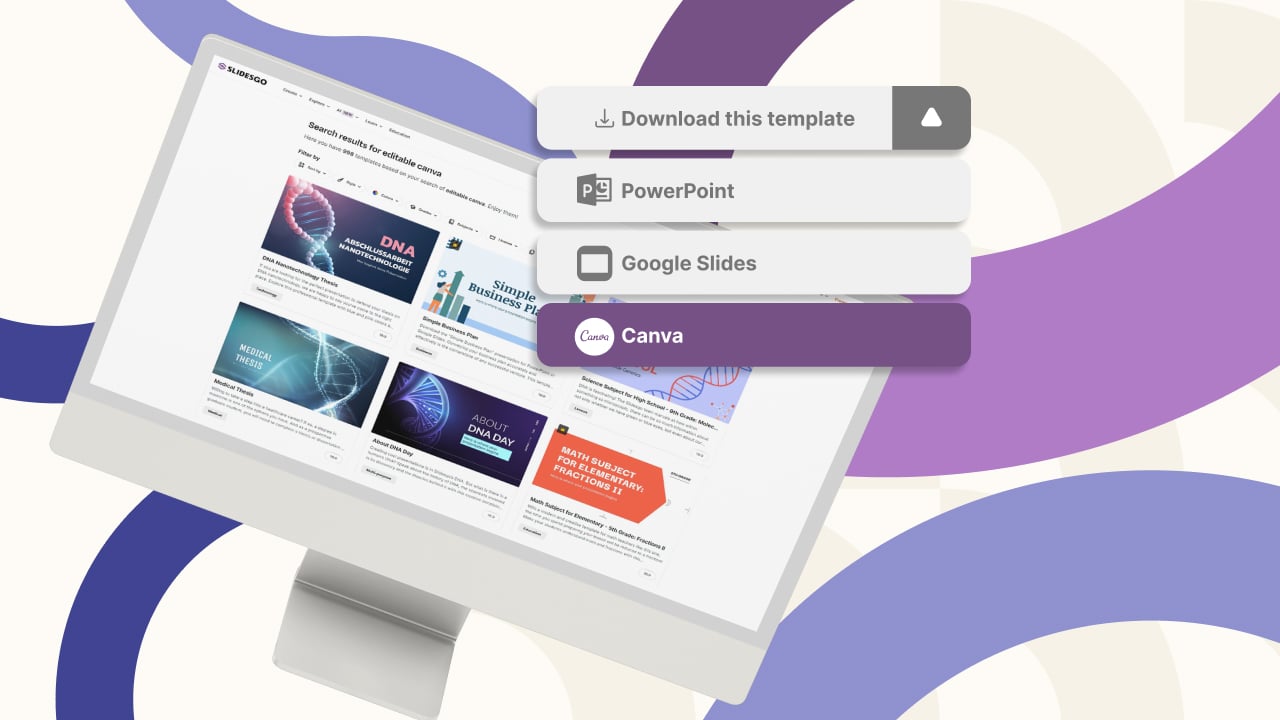
New feature available: edit our templates with Canva
Whenever you need to create, Slidesgo is there. We’re continually enhancing your presentation design process with templates that are primed to impress for any occasion. And in order to let your ideas flow best, comfort is key. How could Slidesgo help you with this? By making you feel right at home with our resources, no matter your preferred platform.You spoke, and we listened. Now, your favorite slides can be accessed on a new platform: Canva! This new format adds to our existing options (PowerPoint and Google Slides), expanding your ways to utilize our first-rate presentation content. We’ve started with a selection of Canva-ready...
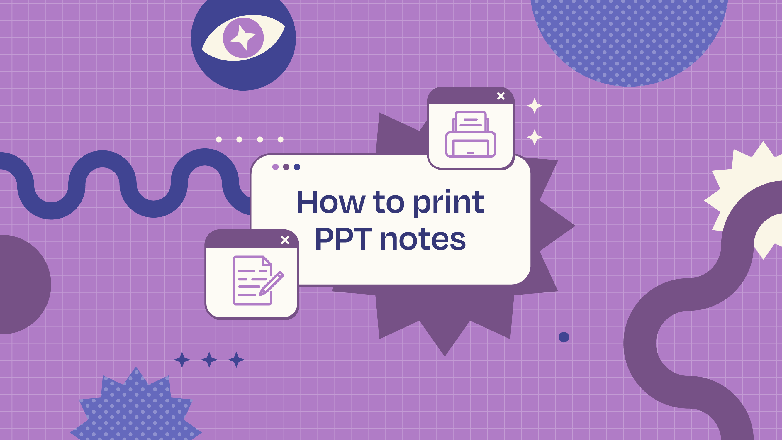
How to print PowerPoint notes
Crafting an impactful PowerPoint slideshow and delivering a captivating presentation are distinct skills. The first focuses on designing appealing visuals to convey a clear message, while the second involves employing effective presentation techniques to ensure the audience grasps the idea. The content of this article will help you with the latter part of this process, guiding future presenters on how to print PowerPoint with speaker notes to enhance your presentations success and effectiveness.

Discover Our Online Presentation Software for Free
We have great news for you today! If you’ve been a Slidesgo fan for years (or months, or weeks, or days, or mere hours, we welcome everyone!), you’ll probably know for now that our templates are available mostly in two formats: for use in Google Slides and PowerPoint.Google Slides is a free tool, since you only need a Google account in order to use it. PowerPoint, on the other hand, is part of the Microsoft Office suite, so it’s not a free program, but that didn’t stop it from being one of the most popular options in the world!What if we...

Webinar: Presentation Audit
With more than 15,000 templates released on Slidesgo and a user base composed of millions of people, we estimate that the total number of presentations created adds up to… um, a lot! Our team of professional designers work very hard to provide you with editable slides so that the only thing you need to do is, well, customize the elements to your liking. Starting from any given template, the results may vary a lot depending on the person who edited the contents.Have you ever wondered “Is my presentation good enough?” and wished that an expert on presentations looked at your template...