Create great design faster and express the power of your ideas – behind the scenes of our rebranding
Imagine the following scenario. Two people, who are different, from different countries, and speak completely different languages. What would be the bridge that would unite them and allow communication? Visual language. That language that does not know about countries, borders, origins, or ages. Visual connects the world and people.
Thanks to visual language, we can take the creativity of human beings and express the power of their ideas so that the message reaches all corners of the world and is heard (or rather, seen) by all the people who are part of our planet.
At Slidesgo, we follow a motto that you can find in some of our slides: A picture is worth a thousand words. Let's reinvent the phrase by focusing on what we do best (templates): A Google Slides and PowerPoint presentation template is worth a thousand words. Without a doubt, we are sure that our designs allow you to express the power of your ideas, making your complicated concepts more visual, and, consequently, raising your voice and reaching everyone.
And while we're on the subject of reinventing ourselves... Freepik, the home from which Slidesgo was born, recently presented its new look, a professional and fresh image that seeks to reflect the company's passion and vocation for design. And since we are a family... that new image has arrived at Slidesgo!
Why have we made a rebranding?
Like any big decision, behind our new image, there are many, many hours of analysis, meetings, effort of many teams... An image that has represented a product for so long requires a lot of reflection when making changes. However, we felt we had to do it. Freepik has matured and it was necessary to show in our identity what our objectives are.
Earlier we talked about home and family. Slidesgo would be nothing without Freepik and vice versa. Returning to the family metaphor, in families, everyone can have their own goal or take different paths, but, in the end, we are all on the same page.
If Freepik was doing a rebranding, we had to do it! The goal of the company's brands is to create a unified whole, offering different resources to create great design, faster.
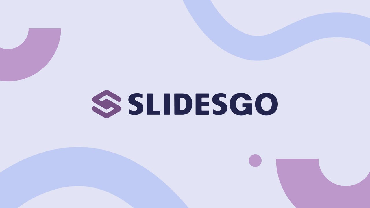
The new logo, as explained in this Freepik post, "encompasses the fluidity and freedom of the creative process". This is what we wanted for the rest of the company's logos.
But, keep calm everyone! The Slidesgo logo will still have the essence of the previous one, only it will be in line with the rest of Freepik's logos so that they all have that modern and current feel.
With an isometric perspective, the lines that will form the Slidesgo logo from now on, create an "s", but keep the concept of "a set of slides" of the previous logo.
Wait, wait...there's more!
Hues and shades
The new color palette that Freepik has selected is based on its significant Piki blue, completing it with a range of colors that go from intense and dark tones to bright and striking shades. Among this rainbow of color is the color of Slidesgo's logo, Aubergine Tint 1, which manages to adapt to the company's new image without losing Slidesgo's own identity.
The right type
As expressed in Freepik, the two new fonts have been chosen with the aim of providing adequate legibility for our content and communications. And since our main purpose is to be a unified brand, we have followed their lead!
The winning combination has been the primary font Degular and the secondary font Inter. These two typefaces combine perfectly and fit with our corporate image.
The Degular typeface is ideal for headings, as its characters are designed to create a striking image and make a difference. 
In turn, the Inter font, designed exclusively for computer screens, makes reading easier and is optimal for text bodies with a lot of content.
If you don't try, you can never know what would have happened.
You know what they say, "Fortune favors the brave" and so it is. We have decided to follow the movement of progress that advances by leaps and bounds and the result has been this spectacular makeover. We know the power of your ideas and, in this case, from Slidesgo, we want to help you express yourself through greater and faster presentation designs.
Do you find this article useful?
Related tutorials
Why do you need Slidesgo if you are a student?
Being a student can be a bit tough— juggling deadlines to absorbing heaps of new information, students face many challenges on a daily basis.Fortunately, technology has tackled some of the most time-consuming aspects of learning, giving students room to develop complex skills. Even if traditional education is still catching up...

Entrepreneurship and Personal Development Hackathon: The magic of learning by doing
The new generations show us that the way of learning has completely changed. Now more than ever, it is key to encourage and support the development of social and entrepreneurial skills in children so that they can become more actively involved in their learning. Participating in creative projects and collaborative activities...
New feature available: edit our templates with Canva
Whenever you need to create, Slidesgo is there. We’re continually enhancing your presentation design process with templates that are primed to impress for any occasion. And in order to let your ideas flow best, comfort is key. How could Slidesgo help you with this? By making you feel right at home with...
Smartick, now available on Slidesgo
In the few years since its launch, Slidesgo has become one of the most popular sources of Google Slides and PowerPoint templates for creative presentations. Educators from all levels have experienced the ease of creating visually striking presentations using Slidesgo’s templates.However, great-looking templates are not the only things on our...
