
How to combine colors in your presentations

Presentations have a multitude of uses and are ideal, mainly, to transmit knowledge or to show concepts in a visual way so that the audience can better understand what you are telling them.
Besides, they are also capable of conveying sensations. Are you wondering how? Well, the key lies in colors, since they are able to instill a certain mood just by looking at them. Sounds fanciful, but it's true!
In this article we are going to tell you a little more about colors and the "magic" they can work on your slides. Do you want to know which shades to choose, how to combine them, and what are the current trends? Read on and you will find the answers!
The color palette
Before going into more detail, let's first talk about the color palette. To define it concisely, it is nothing more than the set of colors you are going to use. Depending on how many you use (and which ones), these palettes have various names (also known as color schemes) depending on the location of those tones on the chromatic circle. Let's look at the most common ones:

Monochromatic color scheme
A monochromatic palette has a single color along with its various shades. You'll achieve a lot of consistency in exchange for variety. You will need to use it for a certain purpose, as it can become monotonous. Here’s an example of the Slidesgo template called

Complementary color scheme
This type of palette uses colors that are on opposite sides of the color wheel. To put it simply, red is the opposite of green, blue is the opposite of orange and yellow is the opposite of purple. This gives you a noticeable contrast on your slides, allowing you to highlight certain parts of your presentation. Here is an example of the Spring Equinox
template, which uses blue and orange as complementary colors.

Analogous color scheme
A palette with analogous colors uses shades that are contiguous on the color wheel. For example, orange, yellow and red are analogous colors. This type of scheme has the advantage of offering a consistency similar to that of the monochromatic scheme, without being as monotonous. Look at this example of the Malcolm X Biography template, which uses yellow and orange as analogous colors.

Triadic color scheme
This palette uses three tones whose position in the color wheel form an equilateral triangle. It does not provide such a marked contrast as the monochromatic color scheme, but it allows you to find a balance between the tones more easily. We show you an example of the template
Psychology Office for Therapy Sessions, in which red, blue and yellow have been used.

Color harmony
It’s best for you if the colors work well together. This means that you shouldn’t choose them randomly. Instead, they need to serve a purpose.
For starters, you can look at one of the schemes mentioned above and follow it, or you can make your choice based on the three main properties of color: hue, brightness or saturation.
- Hue is what differentiates one color from another and allows us to tell them apart. For example, red and blue are different hues.
- Brightness defines how light or dark the color is. It can be defined as the ability of a color to reflect white light.
- Saturation is the degree of purity of a color. This defines its “position” on a scale, leaning more towards white or black. A more saturated color will be bolder, while a less saturated color will look more faded.
If you need more information about color harmony or you’re just looking for inspiration, you can check out this other
Contrast between colors
Just as choosing similar colors helps to create uniformity, contrast makes two or more tones together "mark their own territory" within a slide.
This, as we have already said, makes it easier for you to highlight any given element that you want the audience to notice.
The recommended scheme to achieve contrast is the complementary, since it uses tones that are opposite in the color wheel.
In fact, a warm color has a cool color as its opposite. What are warm and cool colors, you’re asking? Let us show you!
Cool colors
Cool colors range from green and blue to purple. These tones tend to convey a sense of tranquility and relaxation. If you want the audience to be calm while watching your presentation, these are the most appropriate.
In Slidesgo there are templates that focus on cool colors. Let's look at a couple of examples from the presentation
Borderline Personality Disorder.

Since these are medical slides, it is always good to soften the tone so that all the people that watch your presentation will have a better predisposition. In this introductory slide, it would be enough to introduce a brief text summarizing what you are going to talk about. Colors will do the rest in terms of determining the appropriate atmosphere.

As this is a presentation on borderline personality disorder, it may be useful for your audience to indicate a series of symptoms or details that help identify possible cases. In addition to this, using an infographic makes it easy for you to represent several concepts at the same time (in this example, six different symptoms).
Warm colors
Warm colors are able to awaken latent emotions in the audience. They evoke passion and energy; they are the best to keep everyone from falling asleep. Warm tones include red, orange and yellow.
As expected, Slidesgo features presentations where warm colors are the protagonists. Let's show you some examples of the template Tricky Questions Card Game.

This template has several slides with games. Do you want to get the audience involved and make them participate? Attract their gaze to the screen thanks to the warm colors. Opting for various different shades of orange can be a great idea.

Want to introduce a new section? Use a slide like this one, which combines a large illustration with a big title and a big number. And, thanks to the colors, the viewer will look forward to more content from you!
Color trends
If there's one thing that characterizes the Slidesgo team, it's their attention to detail and the fact that they're always on the cutting edge of design. To keep up to date with the latest templates available for download, you can visit the Recent page. There's new content every day, so be sure to check back regularly to make sure you don't miss anything!
Since Slidesgo is part of the Freepik Company family, you will find lots of extra resources for presentations, from images and icons to photos or backgrounds.
Do you find this article useful?
Related tutorials

Why do you need Slidesgo if you are a student?
Being a student can be a bit tough— juggling deadlines to absorbing heaps of new information, students face many challenges on a daily basis.Fortunately, technology has tackled some of the most time-consuming aspects of learning, giving students room to develop complex skills. Even if traditional education is still catching up...

Entrepreneurship and Personal Development Hackathon: The magic of learning by doing
The new generations show us that the way of learning has completely changed. Now more than ever, it is key to encourage and support the development of social and entrepreneurial skills in children so that they can become more actively involved in their learning. Participating in creative projects and collaborative activities...
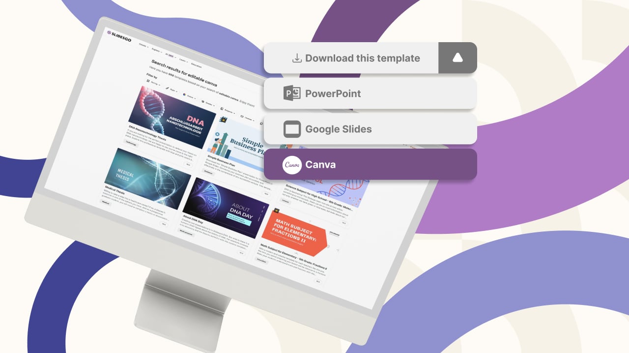
New feature available: edit our templates with Canva
Whenever you need to create, Slidesgo is there. We’re continually enhancing your presentation design process with templates that are primed to impress for any occasion. And in order to let your ideas flow best, comfort is key. How could Slidesgo help you with this? By making you feel right at home with...
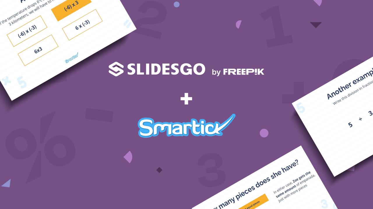
Smartick, now available on Slidesgo
In the few years since its launch, Slidesgo has become one of the most popular sources of Google Slides and PowerPoint templates for creative presentations. Educators from all levels have experienced the ease of creating visually striking presentations using Slidesgo’s templates.However, great-looking templates are not the only things on our...