
How to Make a Radial Chart in Google Slides
Presenting data on Google presentations can be done in many different ways. There are basic bar charts and pie charts. But if you want to take things a step further, radial charts are a great way to add visual effects to a presentation and simplify more complex data.
This is extremely practical for everything from business plans and project proposals to medical breakthrough presentations and marketing strategies. In this tutorial, we'll teach you how to make a radial chart in Google Slides for your presentations.
Creating the outer body of your radial chart
- In your presentation, select the slide you want to add a radial chart to.
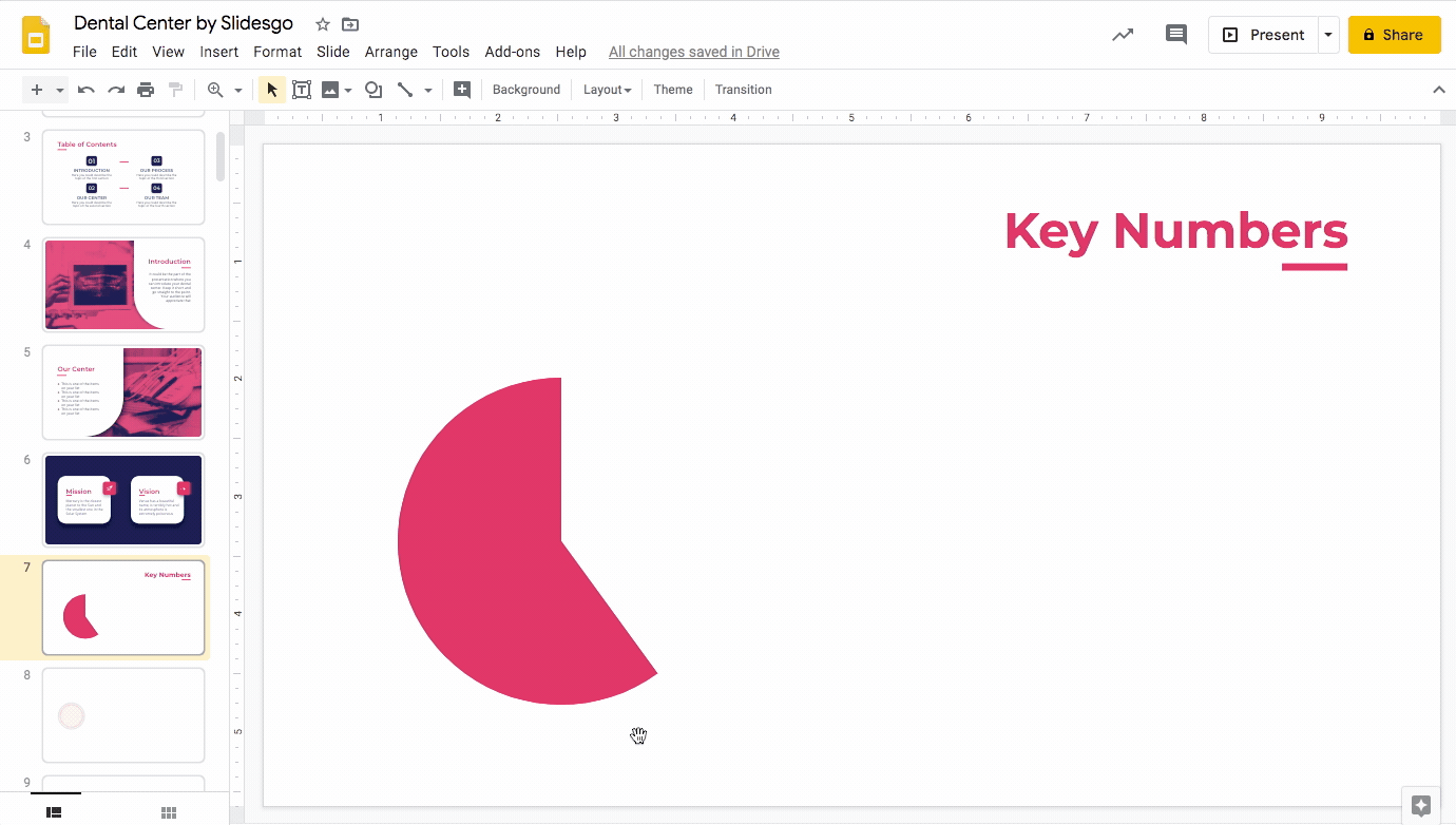
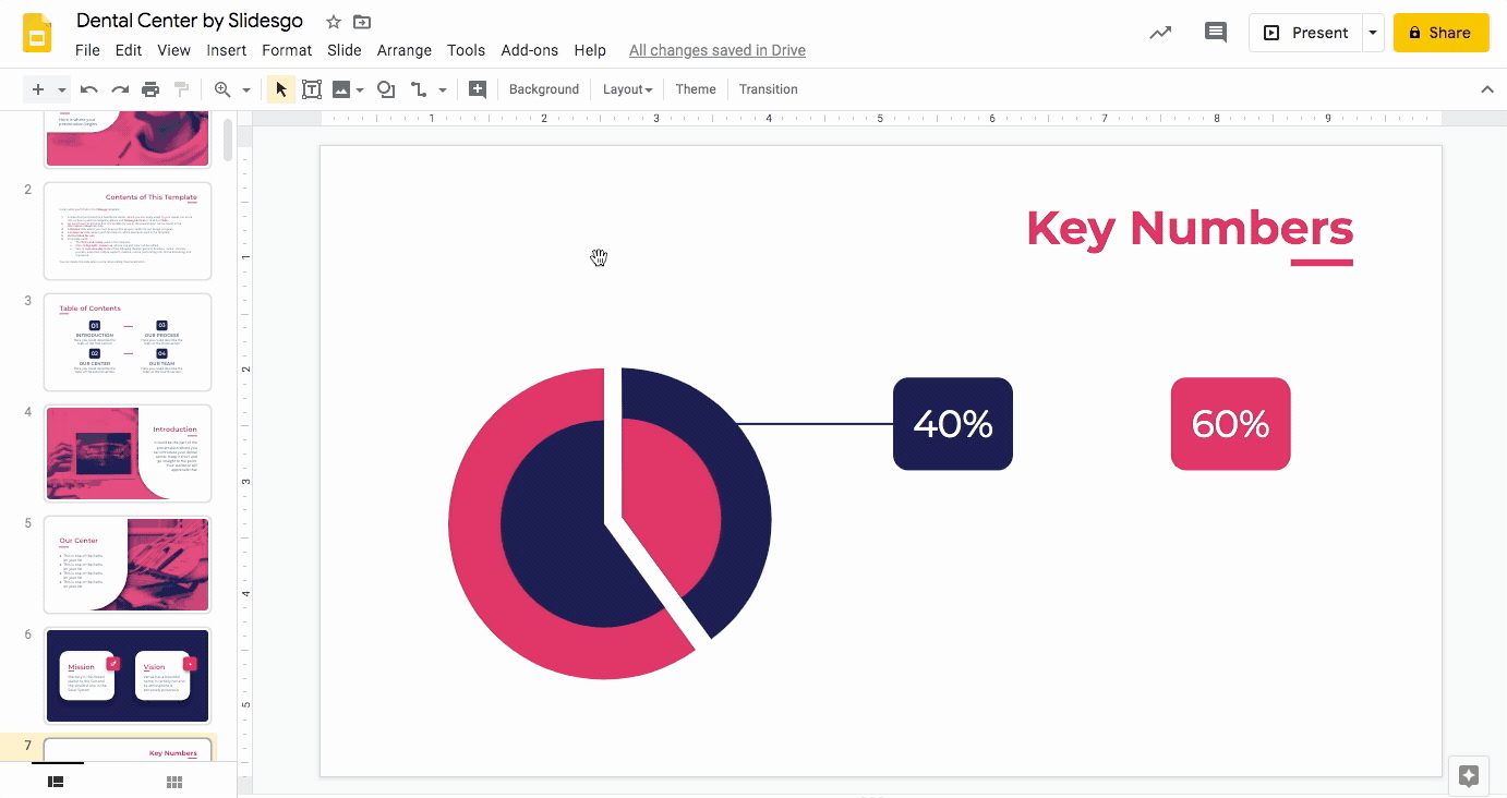
- Then select Shape → Shapes → Pie.
- Click and drag to create the pie while holding down Shift. This is to maintain its proportion.
- To style it, use the option Fill color and fill it with the template’s main color themes (always the best way to go!) and make its borders transparent for a sleeker look with Border color.

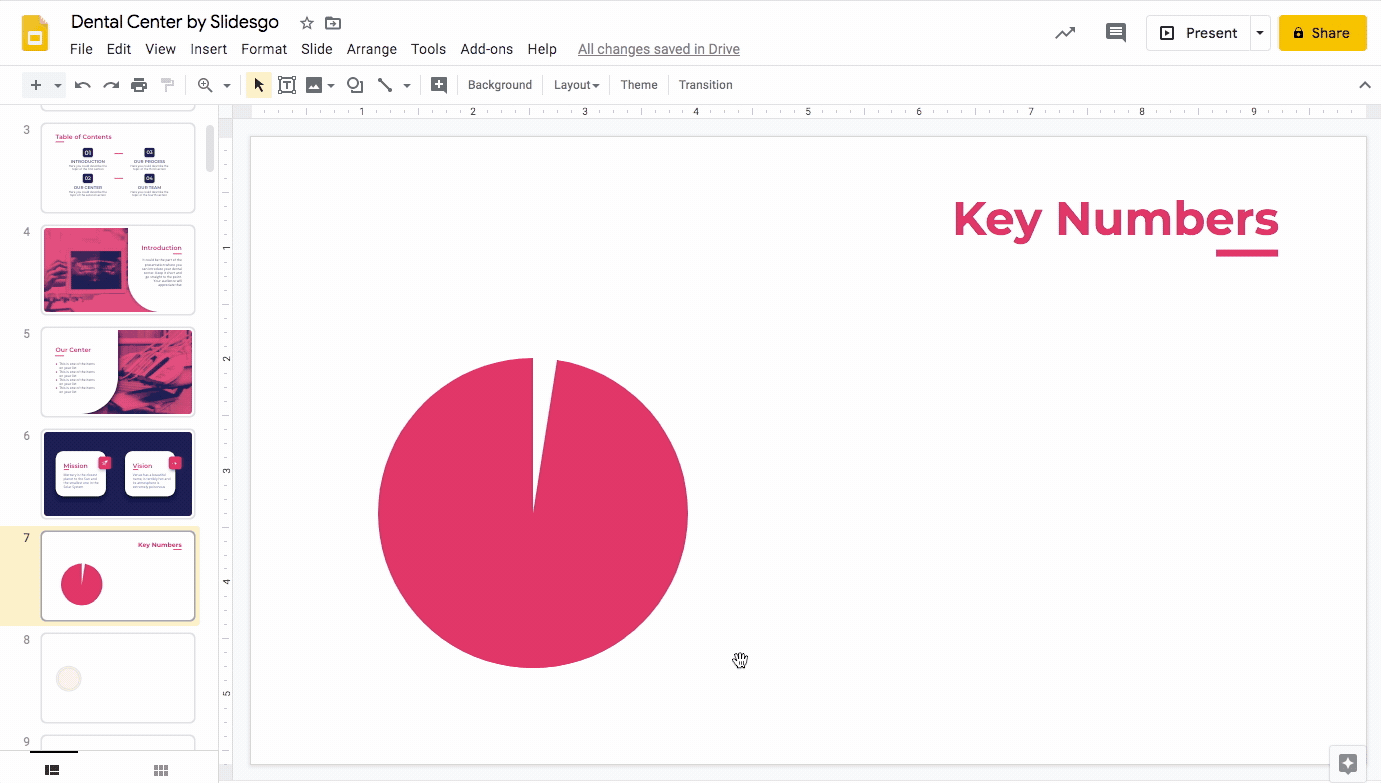
- Click on the pie to select it.
- You’ll see a selection square with blue and yellow dots. Hover your cursor over any of the yellow dots and the cursor becomes a cross. Now, click and drag to resize the area of the pie.

- Nice work! You have created the main outer body of your radial chart. Now, copy and paste it (Ctrl C + Ctrl V or Cmd C + Cmd V in Mac) to duplicate this pie. We will use this as a base to build a secondary piece of the outer body of the radial chart.
- Place the duplicated pie right over the original one. There should be no protruding areas and it should appear as one single pie. Use Google Slides’ visual guidelines (the red lines that appear as you move the duplicated pie) to help with proper positioning.

- Now, rotate this second pie so that it is visible. To do this, click on it to bring up its selection square. Click and drag its rotation axis (the blue round dot to the north of the pie upon selecting it).
Pro tip: Hold down Shift while dragging to rotate it in 15º increments.
- To resize it, select it to bring up the selection square. Now as you did with the first, simply click on the yellow dot and drag it to resize its area.
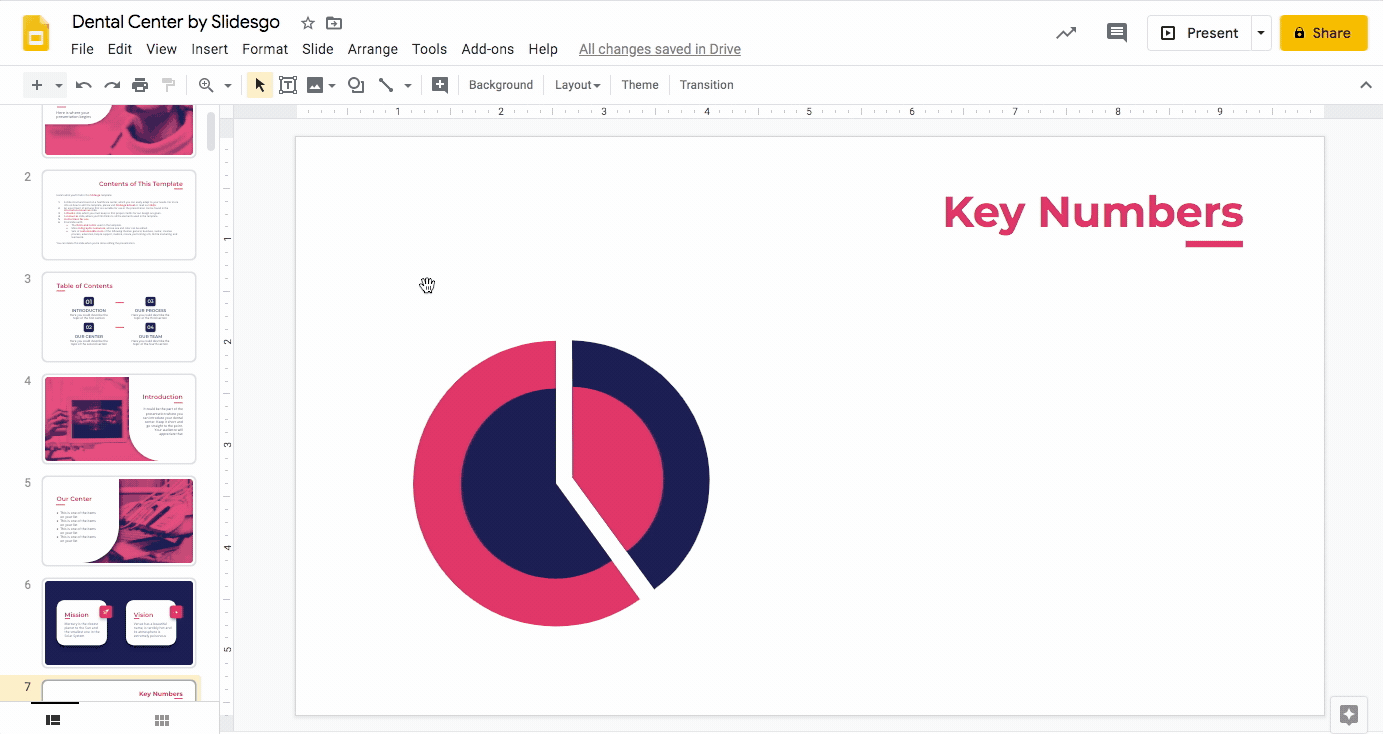
- We will now make this secondary piece smaller. You may do so by selecting it, clicking on any of the blue dots that appear, and dragging it inwards.
- We want to put some space between the two pieces. Shift the secondary piece away and resize it until it aligns with the main piece enough so that their combined outlines resemble a circle as much as possible.

- Adjust the area of the second (smaller) piece by dragging the yellow dot until its radial lines are parallel to that of the first (larger) piece.
- You may need to continue adjusting its position so that it is properly aligned with the main piece.

Creating an inner body and styling it
- Copy and paste the first piece (Ctrl C + Ctrl V or Cmd C + Cmd V in Mac) and place the duplicate over the original. This will be the inner body of the radial chart.
- To resize it, click on a blue dot and drag it inwards to make it smaller (remember to hold down Shift) and position it until the center points of both pieces are aligned. Continue to resize and align until the result is as desired.
- Use Fill color to change its style. Select a color from the template’s main color themes that creates visual contrast.

- Repeat the same process to create a secondary inner body of your radial chart: Copy and paste the secondary outer body and resize it to make it smaller.
- Adjust it until its radial lines are aligned with that of the larger piece over which it is placed.
- Apply a new color to the secondary outer body to provide even more contrast.

Adding data labels to the radial chart
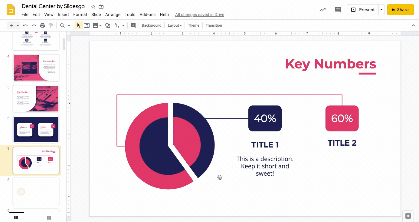
- Select Shape → Shapes → Rounded Rectangle.
- Click and drag out the rounded rectangle. This will be the first label of the radial chart in which you will fill its proportion.
- From Fill color, select and apply the radial chart’s secondary color (the color of the inner body of the larger piece) to the label and make its outline transparent using Border color.
- Copy and paste the label (Ctrl C + Ctrl V or Cmd C + Cmd V in Mac) to create a second label.
- Place it on the same horizontal plane as the first label but at a distance. Use Google Slides’ visual guidelines (red lines) to help with positioning.
- Using Fill color, apply the other color used in the radial chart.
Related tutorial: How to Arrange and Align Objects in Google Slides

- Double click on the label to bring up a text box Write the value of the corresponding pieces of your radial chart. Do this for both labels.
- Select the text and style it with the Font, Font size, Text color and Align options. We recommend sticking to the typefaces and colors used in the template and centralize your text.

Connecting the labels to the radial chart
- Click on Select line → Line. Click and drag to create a line to connect the first label to its corresponding piece of radial chart. Hold down Shift to create a perfectly horizontal line.
- Style the line using Line color and Line weight (Don’t forget our mantra: maintain theme colors!)

- We will now connect the second label to the radial chart. To do this, we’ll need a different kind of line. Click on Select line → Elbow Connector. This will help to bypass the first line we created earlier and avoid confusion.
- Hover your cursor above the second label to bring up an outline with four violet dots.
- Click on any of them and drag until you reach the point of your radial chart you want to connect the label to. Remember to edit the line weight so that it’s consistent with the same line and apply the color of the second label to it.
Adding titles and descriptive texts
- Click on Insert → Text box. In the text box, type in the titles. Just as we did before, maintain the template’s typefaces and color and make sure the elements are centrally aligned in relation to one another. In this case, the title should be centrally aligned with its corresponding label.

- Select the text box and duplicate it by using Ctrl C + Ctrl V or Cmd C + Cmd V in Mac.
- Place it beneath the second label. Use the visual guidelines to align the second text box with the first one and with its corresponding label.
- Edit the text as desired.

- Select Insert → Text box again. Now that we have the titles, let’s add descriptions for context!
- Click and drag to create a text box under the title and write your description.
- Style it as desired. As we did with the titles and the label texts, centralize the descriptions within the text boxes and in relation to the title.
Related tutorial: How to Format the Text in Google Slides

- Copy and paste (Ctrl C + Ctrl V or Cmd C + Cmd V in Mac) to duplicate the description.
- Make sure it’s horizontally aligned with the first description and vertically with its corresponding title. Use Google Slides’ visual guidelines to help you.
- Give yourself a pat on the back. You’ve just created a beautiful radial chart in Google Slides!
Slidesgo has a wide range of gorgeous templates that you can use and customize. Take a look at our free Google slides themes now!
Do you find this article useful?
Related tutorials

How to present survey results in PowerPoint or Google Slides
A survey is a technique that is applied by conducting a questionnaire to a significant sample of a group of people. When we carry out the survey, we start from a hypothesis and it is this survey activity that will allow us to confirm the hypothesis or to see where the problem and solution of what we are investigating lies.We know: fieldwork is hard work. Many hours collecting data, analyzing and organizing it until we have our survey results.Well, we don't want to discourage you (at Slidesgo we stand for positivism) but this is only 50% of the survey work....
How to Create a Venn Diagram in Google Slides
If you wish to give an awesome presentation, using diagrams is great because they make your data look nicer and help your audience understand your points.In this Slidesgo School article, we’ll teach you how to create Venn diagrams in Google Slides so you can have them in your bag of resources!
How to Create a Venn Diagram in PowerPoint
How many times did you have to explain your data with a PowerPoint presentation and you weren’t able to find the most visual way to do it? To help you with this matter easily and quickly, in this Slidesgo School post we will explain how to insert or create a Venn diagram in PowerPoint, as well as its history and components.

How to add and edit maps in Google Slides
Map infographics are very useful for any presentation, as they allow you to transmit data quickly and easily. In this post we are going to explain how to include and edit maps in your Google Slides presentations.