
How to Insert Charts in PowerPoint

Including a chart in your presentation is always a good way to display your numerical or statistical data in a visual manner. In this tutorial, you’ll learn how to create charts in PowerPoint and how to insert an already existing chart from an Excel document. You’ll also learn how to work with the ones included in our templates.
How to Create Charts
- Select the slide where you want to include the chart.
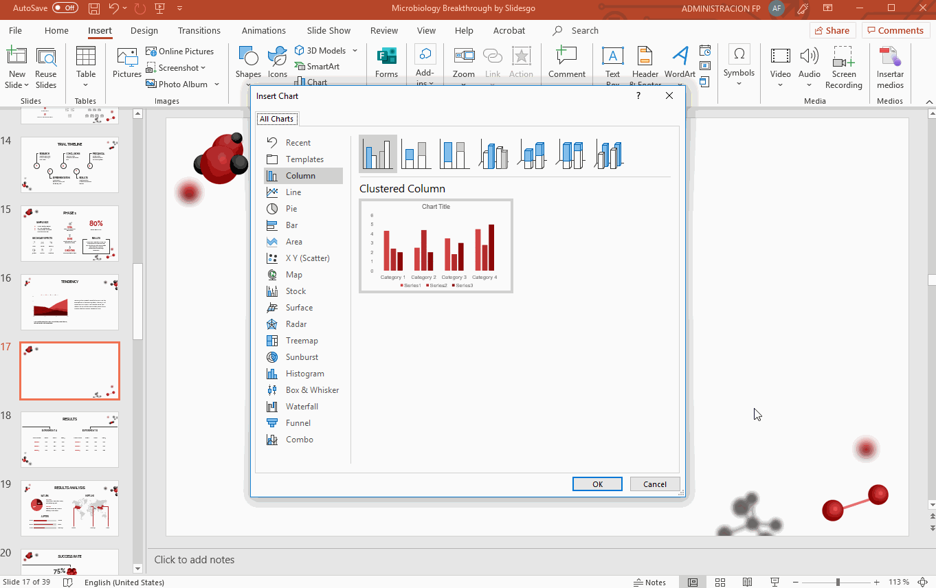
- Go to the Insert tab and, in the Illustrations group, click Chart. A new window will open.
- Select the type of chart you want and click OK.
- A chart will be generated, along with a new worksheet containing the data, which you can modify.
- Once you’ve modified the data, close the worksheet. If you need to open it again, right-click → Edit data → Edit data.

How to Edit Your Charts
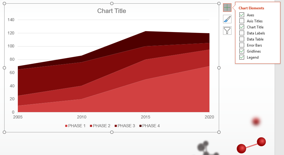
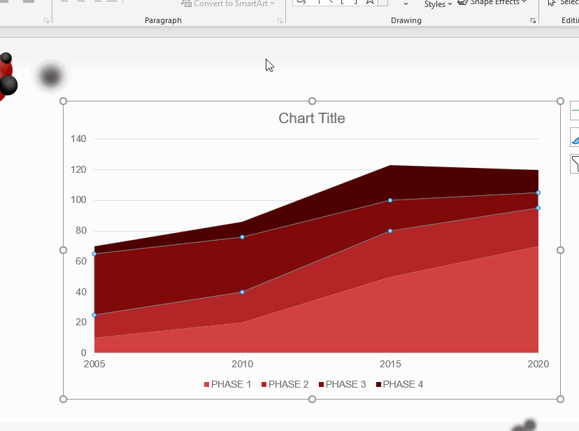
- Once you’ve inserted the chart, click the “+” button, located in the top right corner. You’ll be able to add elements, such as titles, data labels or error bars, among others.
- As an alternative, go to the Design tab and, in the Chart Layouts group, click the Add Chart Element drop-down arrow.
- To apply different presets for the elements of the chart (color palette, layout, legend…), go to the Design tab and, in the Chart Layouts group, click the Quick Layout drop-down arrow.
- If you want to change the chart type, right-click → Change Series Chart Type.
- To modify the color palette, select the chart and, on the Design tab, in the Chart Styles group, click the Change Colors drop-down arrow.
- Remember that the colors of the charts are adapted to the color palette of our template. If you want to apply a different color, select the desired object from the chart and go to the Format tab. Then click Shape Fill or Shape Outline and choose the color you want.
How to Insert the Data from an Excel Worksheet into PowerPoint
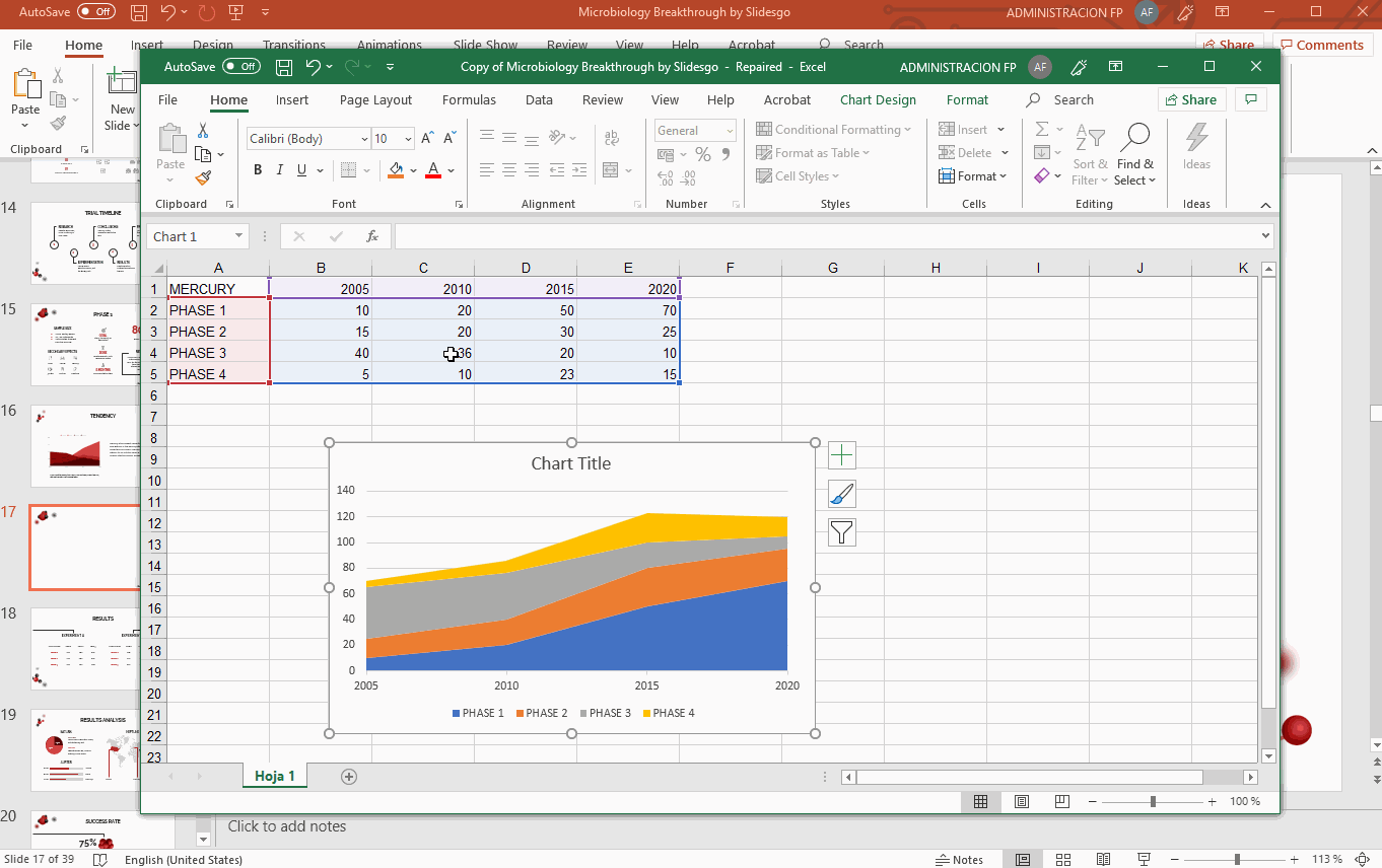
- Open the Excel document where you have the chart that you want to insert into PowerPoint.

- Right-click the chart that you want to use and select Copy. You can also select it and press Ctrl/Cmd + C.
- Return to PowerPoint, select the slide where you want to paste the chart into and press Ctrl/Cmd + V.
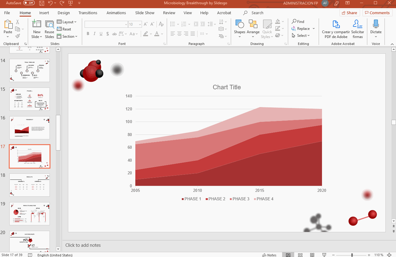
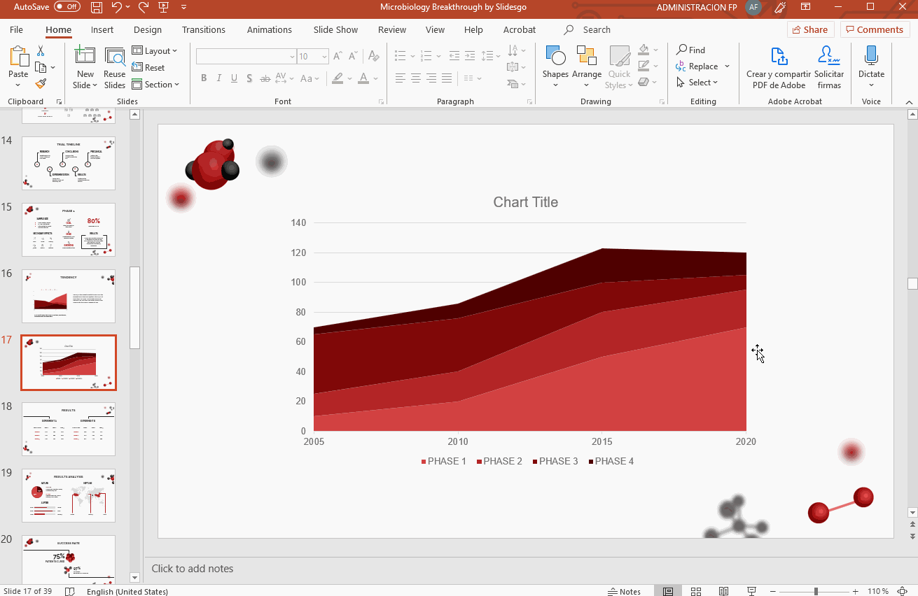
How to Work with the Charts of Our Templates
- Download one of our templates and open it in PowerPoint. Select the slide where the chart is.

- Right-click the chart and choose Open Link.

- A browser window will open. Click “Make a copy” to create a Google Sheets file in your Google Drive account.

- Click File → Download → Microsoft Excel (.xlsx).

- Once you’ve downloaded this file, follow the steps under “How to Insert the Data from an Excel Worksheet into PowerPoint”.
Do you find this article useful?
Related tutorials

How to present survey results in PowerPoint or Google Slides
A survey is a technique that is applied by conducting a questionnaire to a significant sample of a group of people. When we carry out the survey, we start from a hypothesis and it is this survey activity that will allow us to confirm the hypothesis or to see where the problem and solution of what we are investigating lies.We know: fieldwork is hard work. Many hours collecting data, analyzing and organizing it until we have our survey results.Well, we don't want to discourage you (at Slidesgo we stand for positivism) but this is only 50% of the survey work....

How to Create a Venn Diagram in Google Slides
If you wish to give an awesome presentation, using diagrams is great because they make your data look nicer and help your audience understand your points.In this Slidesgo School article, we’ll teach you how to create Venn diagrams in Google Slides so you can have them in your bag of resources!

How to Create a Venn Diagram in PowerPoint
How many times did you have to explain your data with a PowerPoint presentation and you weren’t able to find the most visual way to do it? To help you with this matter easily and quickly, in this Slidesgo School post we will explain how to insert or create a Venn diagram in PowerPoint, as well as its history and components.

How to add and edit maps in Google Slides
Map infographics are very useful for any presentation, as they allow you to transmit data quickly and easily. In this post we are going to explain how to include and edit maps in your Google Slides presentations.