
How to Create Flowcharts in Google Slides

Diagrams help you visualize all the steps of a process. In these graphic elements, each step of the process is represented with a shape, and these are connected by arrows. In this Slidesgo School tutorial, you’ll learn how to create flowcharts in Google Slides.
Creating a Flowchart from Scratch
- Open your presentation in Google Slides.
- Insert a shape by clicking Insert → Shape → Shapes.
Flowcharts use certain shapes to represent different things:
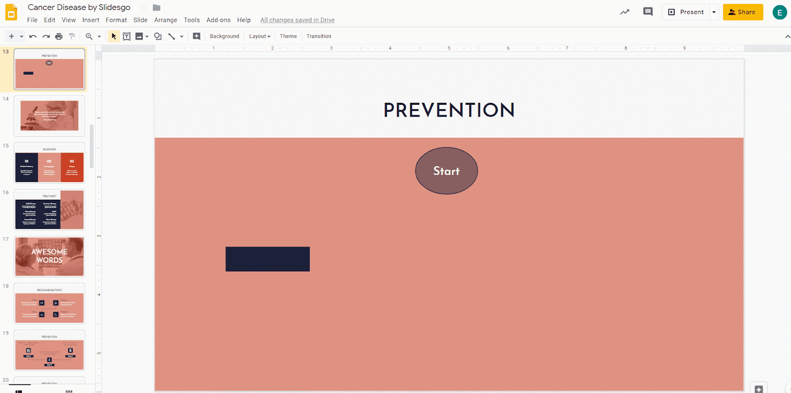
- A rectangle indicates a process and is used to represent the main steps.
- A diamond indicates a decision and thus is used to represent such elements.
- An oval indicates a terminal point and is used to represent the beginning or the ending of the process.
For this tutorial, we’re going to insert an oval:

- Click Fill color (the button resembles a paint bucket) to modify the color of this shape. Try to use colors from the palette that you’ve chosen for your presentation.
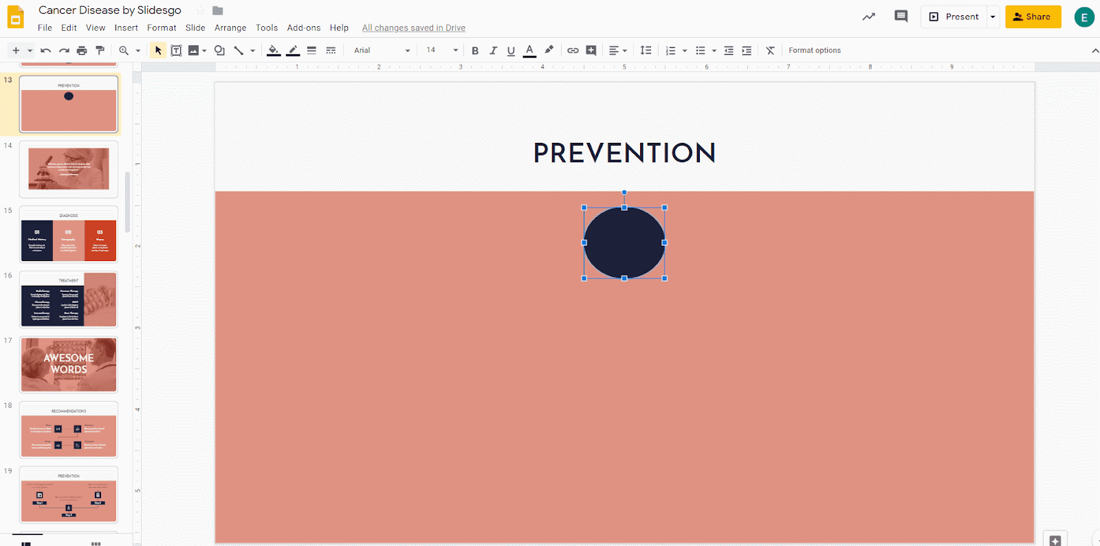
- To insert text, double-click on the shape. We suggest that you choose a center alignment, which looks better.

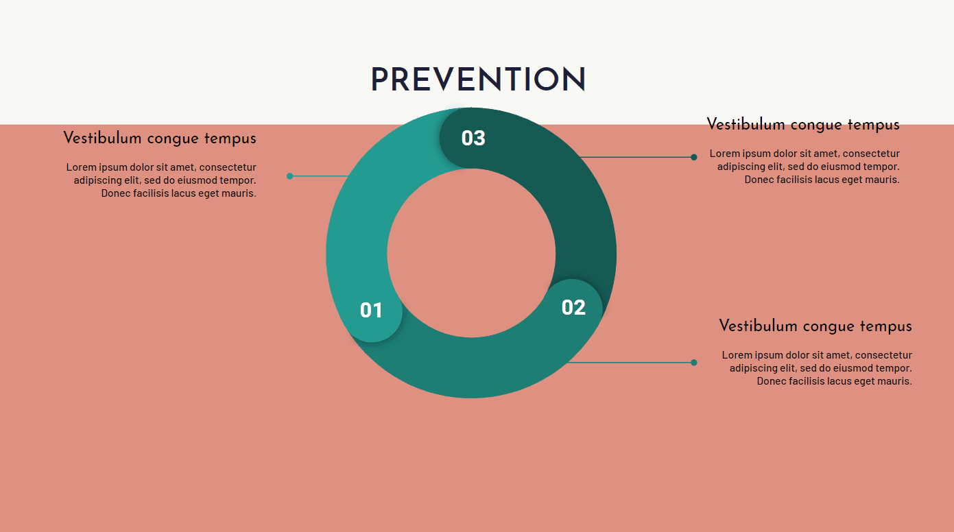
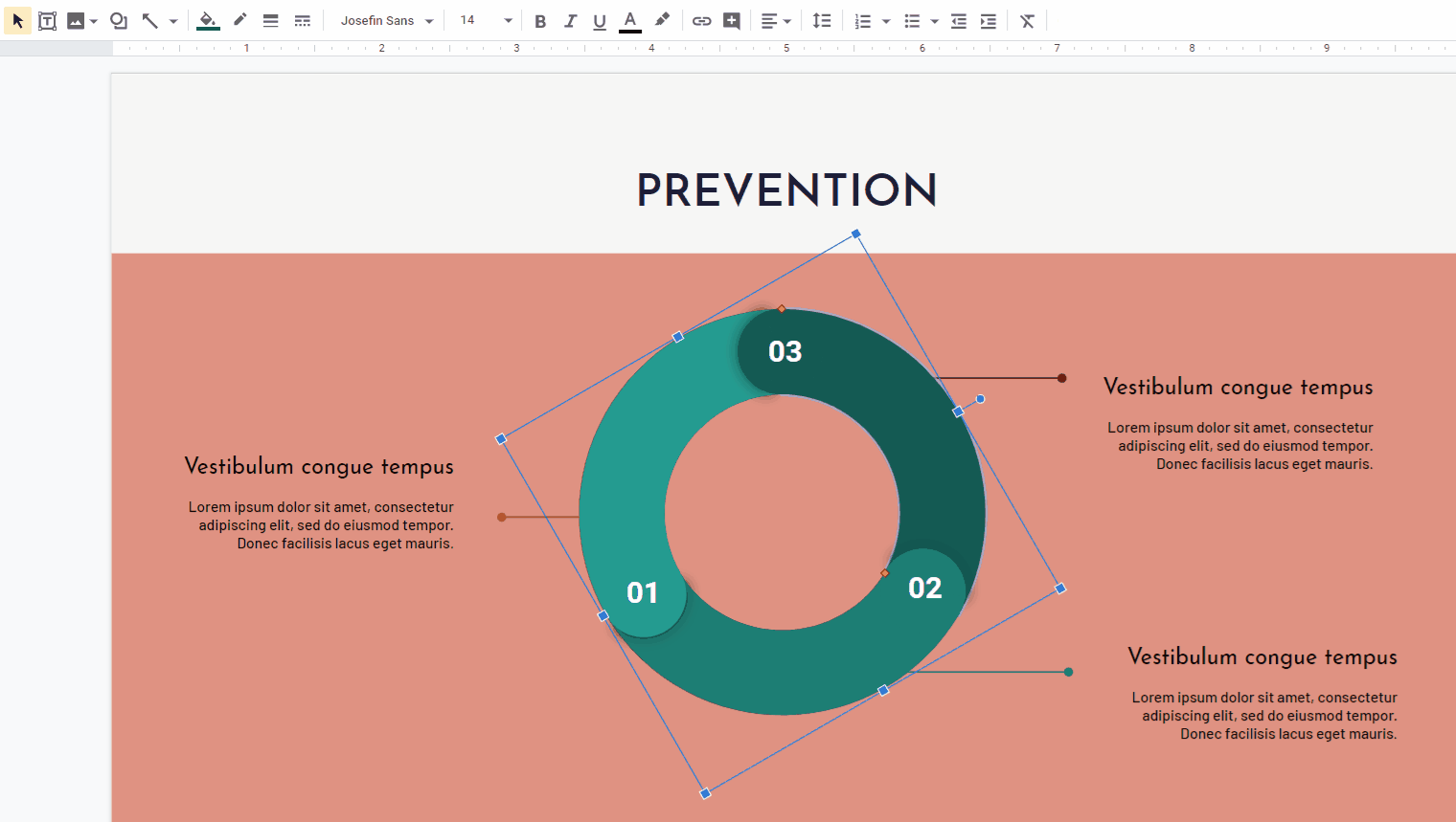
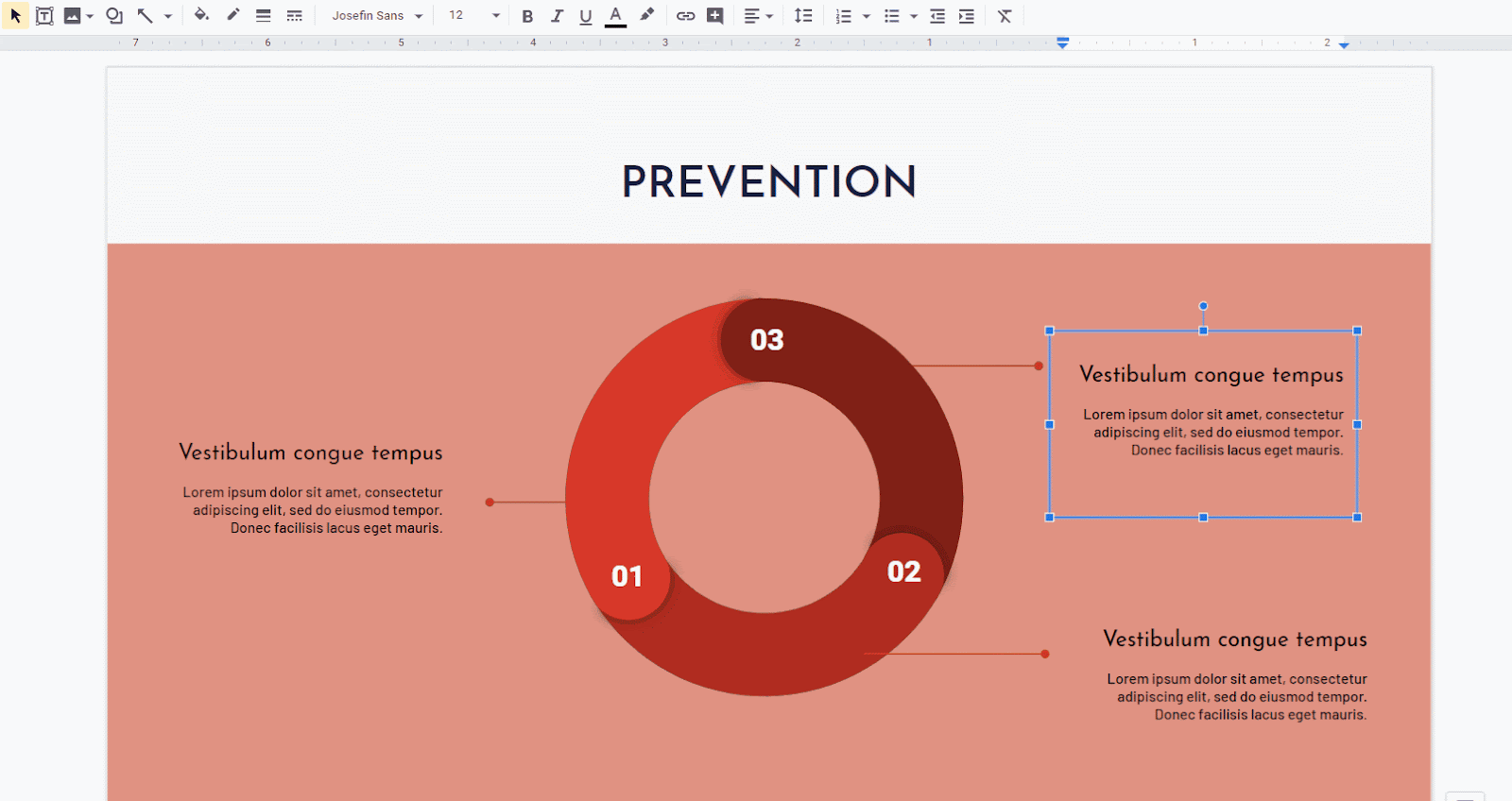
Create as many shapes as you need to represent your process. Use the guides to align them properly. As an example, we’ve created two ovals, two rectangles and a diamond.
- You’ll need to use arrows in order to connect the shapes. To add one, click Insert → Shape → Arrows.
- To change the color of the arrow, click Fill color (the button resembles a paint bucket). Again, we recommend that you use a color that fits the theme and the chosen palette.

- You can also insert arrows by clicking Insert → Line → Arrow.
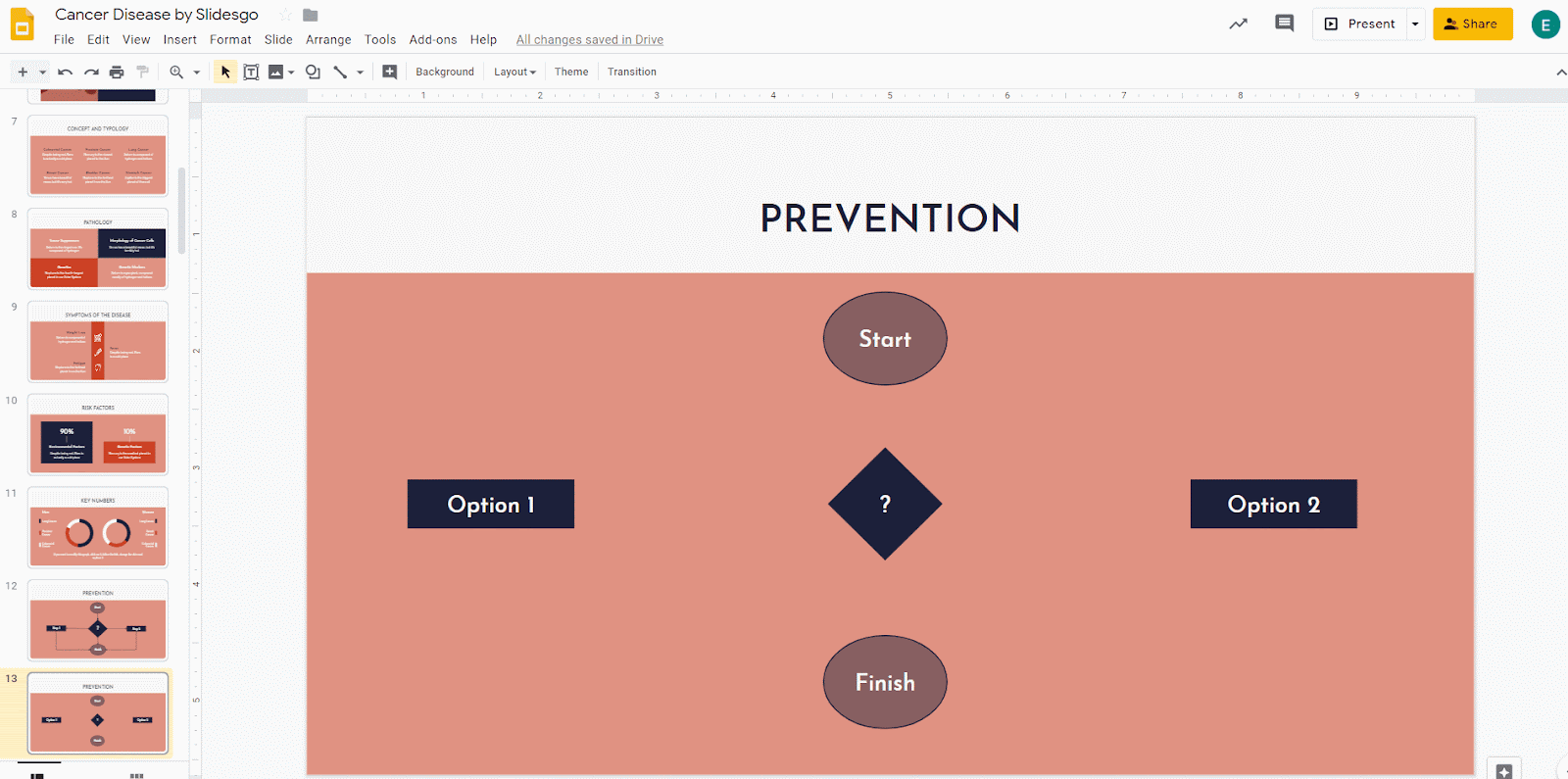
- To complete your flowchart, it must have a beginning and an ending point, and all the elements must be connected.
Inserting a Preset Diagram
- Open your Google Slides presentation.
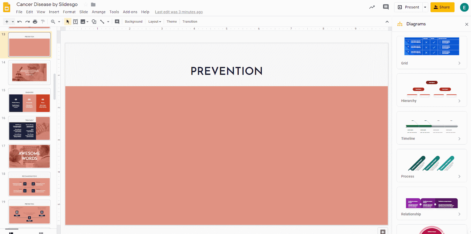
- Click Insert → Diagram. The Diagrams panel will open on the right side of the screen.

- Select the type of diagram you need. Then choose the amount of levels and the color you want to use.
- Select all the elements of the diagram and center them on the slide. If you need more information, please refer to the “How to Arrange and Align Objects in Google Slides” tutorial.
- To change the color of an individual element of the diagram, select it and click Fill color (the button resembles a paint bucket). Remember to use colors from your palette so the design looks better.
- To modify the text, double-click on the one you want to change. You can also adjust the size, the font or the color, among other things, by using the options found on the toolbar. Try to use the same font in the entire presentation and keep an eye on the size and the arrangement of the text.
If you need to add more elements to the diagram, just insert new shapes and/or arrows. To do so, follow the steps found in the "Creating a Flowchart from Scratch" section of this tutorial.
Do you find this article useful?
Related tutorials

How to present survey results in PowerPoint or Google Slides
A survey is a technique that is applied by conducting a questionnaire to a significant sample of a group of people. When we carry out the survey, we start from a hypothesis and it is this survey activity that will allow us to confirm the hypothesis or to see where the problem and solution of what we are investigating lies.We know: fieldwork is hard work. Many hours collecting data, analyzing and organizing it until we have our survey results.Well, we don't want to discourage you (at Slidesgo we stand for positivism) but this is only 50% of the survey work....
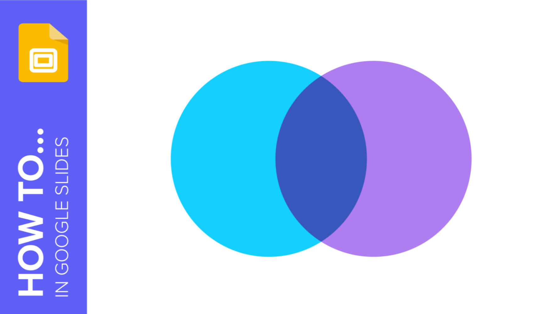
How to Create a Venn Diagram in Google Slides
If you wish to give an awesome presentation, using diagrams is great because they make your data look nicer and help your audience understand your points.In this Slidesgo School article, we’ll teach you how to create Venn diagrams in Google Slides so you can have them in your bag of resources!
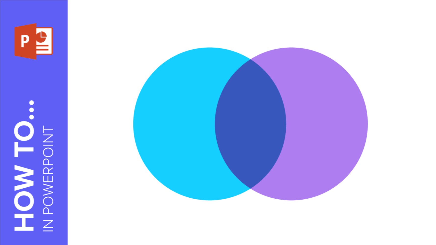
How to Create a Venn Diagram in PowerPoint
How many times did you have to explain your data with a PowerPoint presentation and you weren’t able to find the most visual way to do it? To help you with this matter easily and quickly, in this Slidesgo School post we will explain how to insert or create a Venn diagram in PowerPoint, as well as its history and components.

How to add and edit maps in Google Slides
Map infographics are very useful for any presentation, as they allow you to transmit data quickly and easily. In this post we are going to explain how to include and edit maps in your Google Slides presentations.