
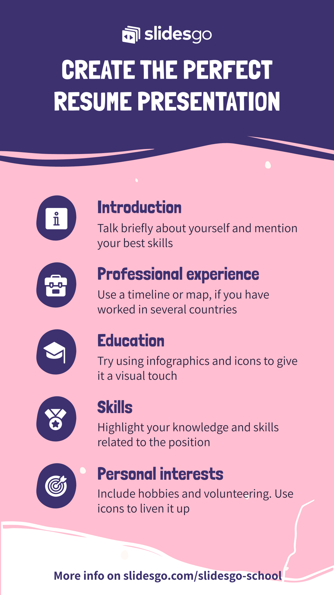
Tips To Create the Perfect Resume Presentation

First impressions count. If you’re looking to advance past that initial step and get that job you’ve always dreamed of, then use our resume presentations.
With recruiters spending mere seconds looking at a CV, you need to make yours stand out with not only an impressive background to boast of but also a stunning design and layout.
In this post, we’ll take you through the mandatory sections of a resume presentation and what you can do in each to boost your hiring chances.
Introduction
Begin with an overview of who you are.
As the unwritten rule of presentations goes, too much text will kill a design. So keep this section concise; three to four sentences with a maximum of 35 words should suffice.
Start with a good impression by taking this opportunity to outline your best qualifications and skills.

You can include a photo of yourself if you wish. Feel free to get creative with it as we have with this About Me slide from our Doodle CV template by “pointing” to the text.
You’ll also want to give it enough white space so the attention is on it.
If a short summary isn’t enough to highlight your suitability, include a second slide to list your most important and relevant knowledge areas.
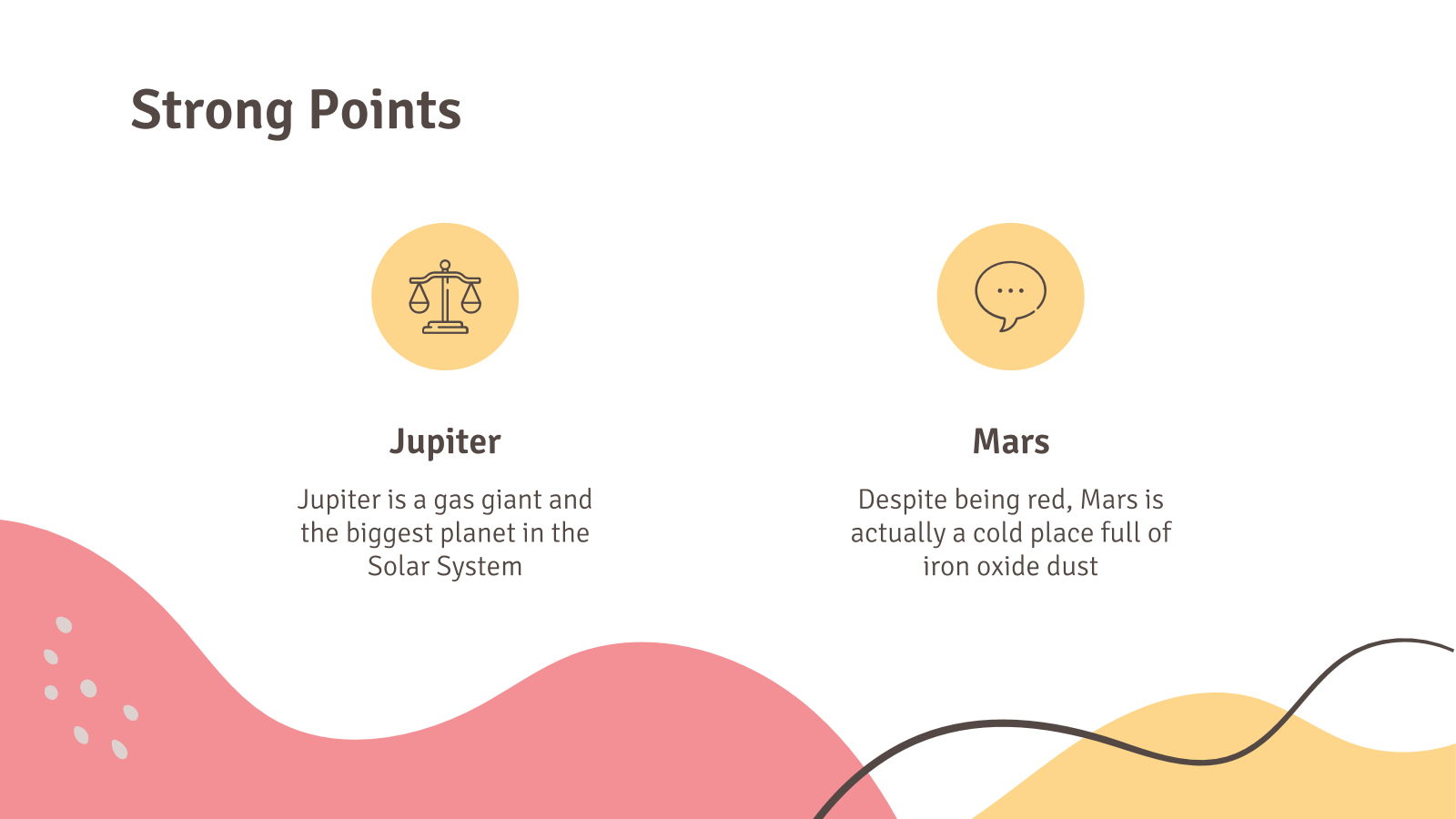
In this example, we’ve included two strong points, each with its own icon, title, and one-sentence summary, but you’re welcome to expand it a little to three.
To avoid repetition, make sure the information here hasn’t already been mentioned.
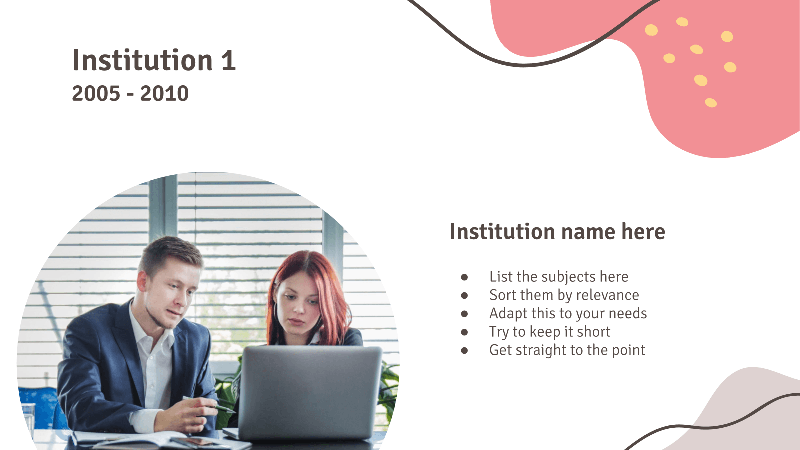
Professional Experience
Work history is a mandatory section in any CV and resume presentations are no exception.
And there are plenty of ways to spice this up to visually stimulate your audience.
Instead of listing them in bullet points as is usually done with A4 formats, why not use infographics like timelines?
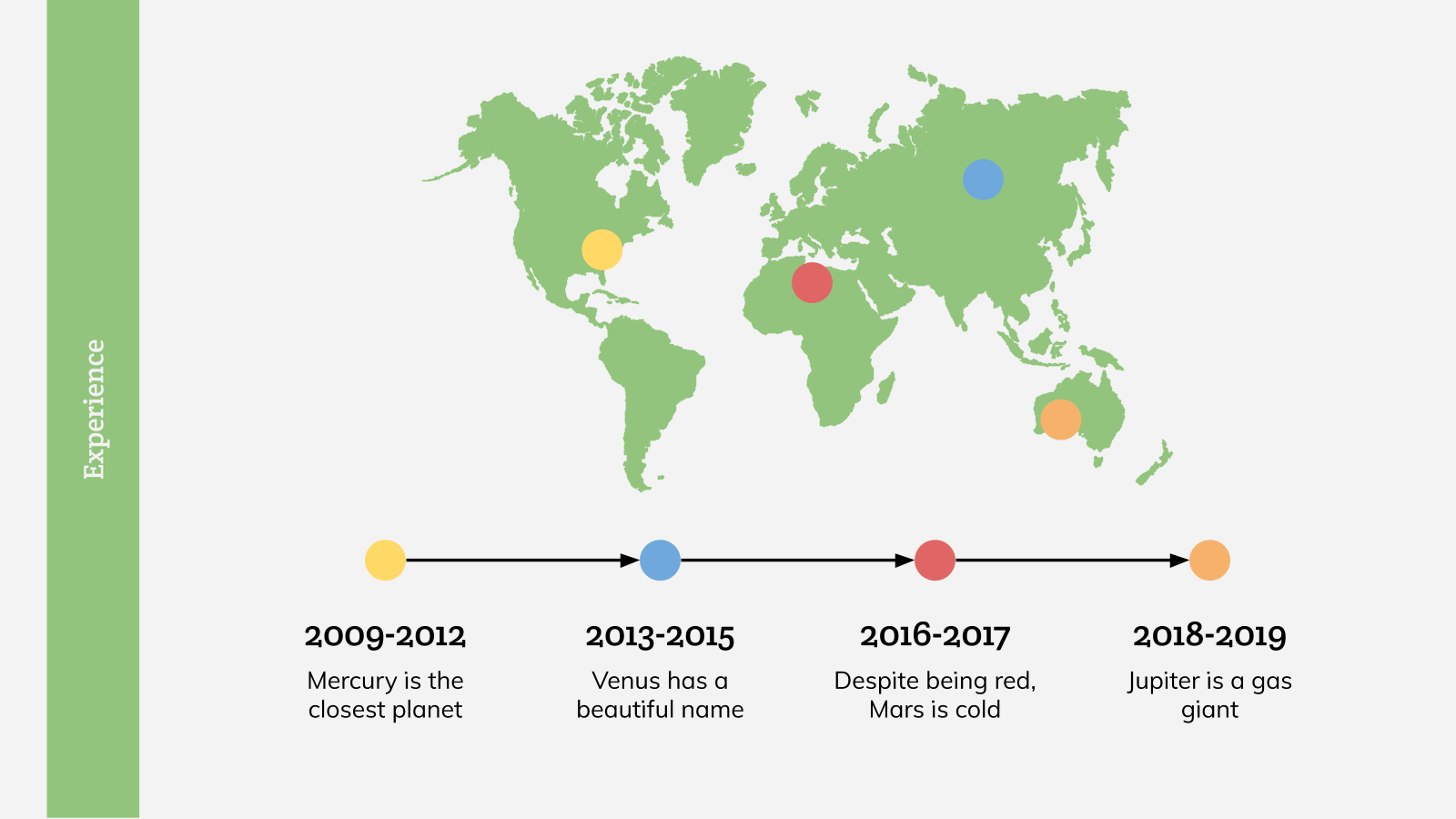
The left-to-right arrangement makes it easier to understand the order of your professional experience.
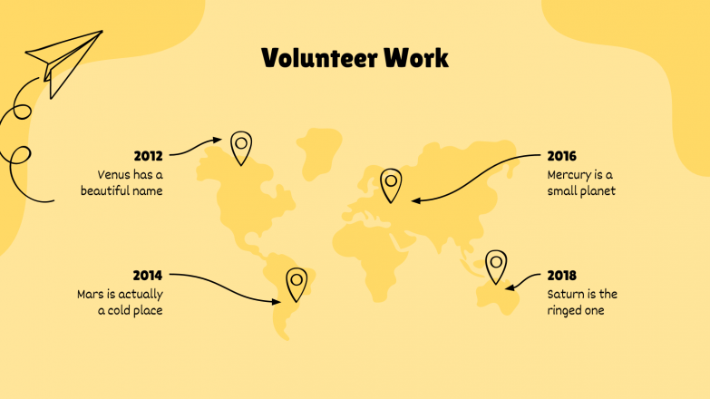
If you’ve worked abroad, you can complement it with a map, which is exactly what we’ve gone for with this Teacher Resume template.
The colored dots representing each experience also correspond with those on the timeline, which further aids comprehension.
If you have multiple past jobs, select a couple whose scope and responsibilities are the most relevant and elaborate on them over one or two slides like we’ve done with this Pop Art Resume deck.
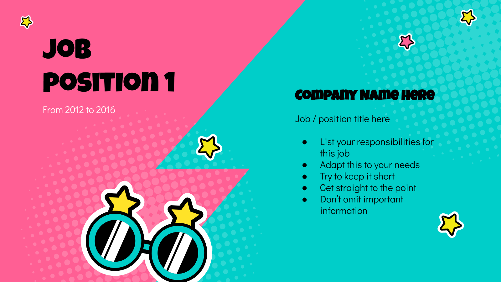
Don’t forget to list your responsibilities in the order that’s the most relevant to the position you’re applying for and any accomplishments and achievements.
Education
The education component is a vital one in resumes. After all, it defines your formation and is, in a way, a precursor to your career.
You can choose to represent this with a roadmap to depict the path you took in your training years.
Instead of having it linear, you could give it a slight twist and make it windy, which allows you to play with the space available to include more information.
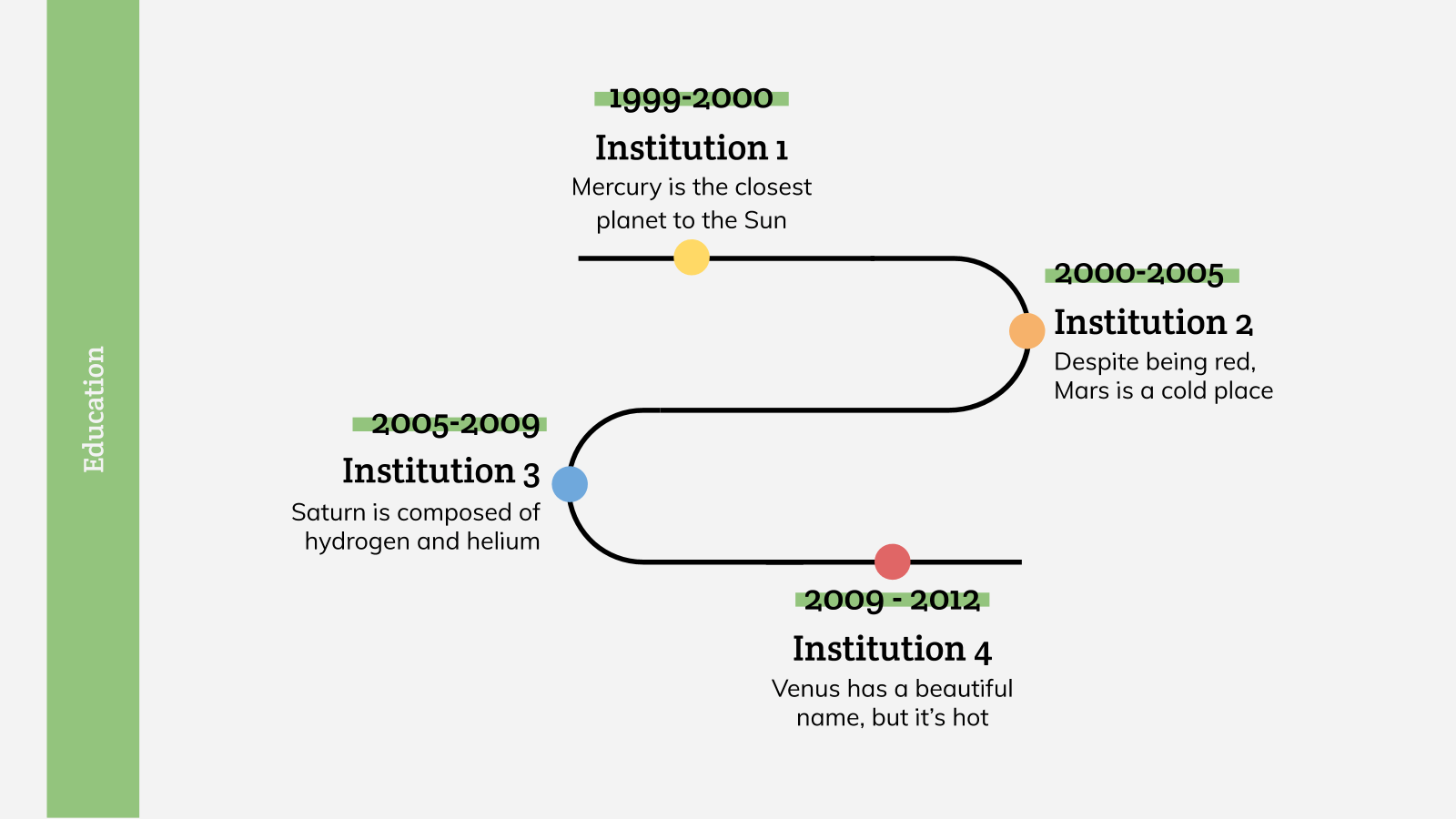
Alternatively, opt for simple icons.
Each should represent a different course with the period over which it was done and a short one-sentence description.
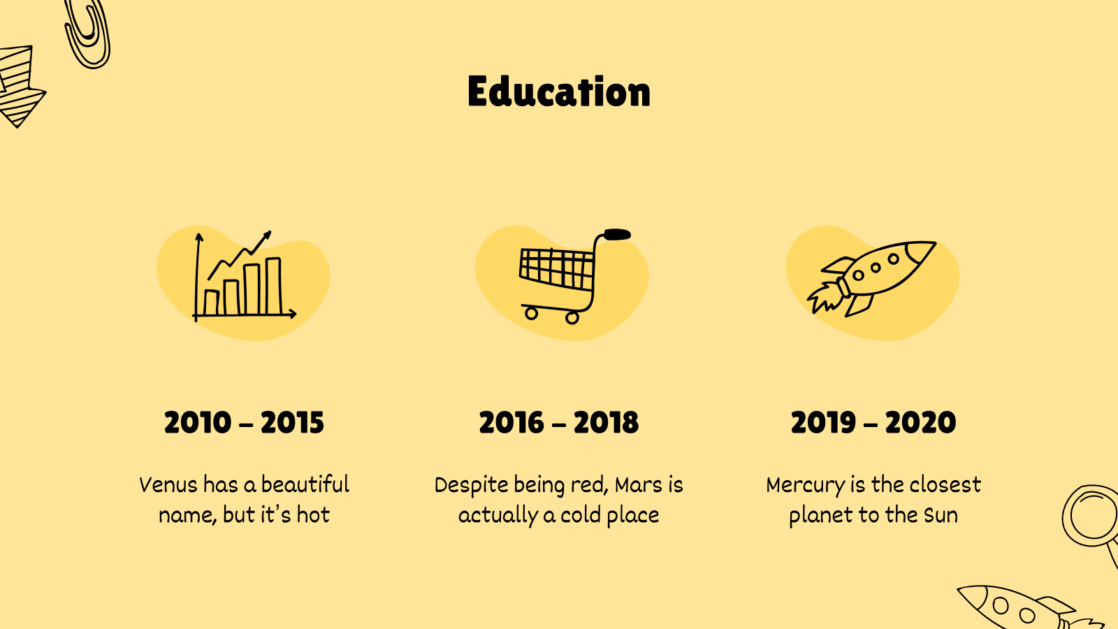
These can be anything from university degrees and post-graduate studies to other relevant coursework or certifications.
If you’re a fresh graduate with not much work experience in your pocket, the education section is where you should flesh out any information to prove your fit.
Consider tagging on one or two slides to talk about what you studied and highlight any specific classes or apprenticeship that may be applicable.
Skills
On top of your work experience and education, employers also look out for pertinent skills and competency, which is what this next segment aims to establish.
The key here is to tailor the information to the role.
For instance, if it’s an IT-related job, a slide on computer skills or the different software you’re familiar with will be particularly crucial.
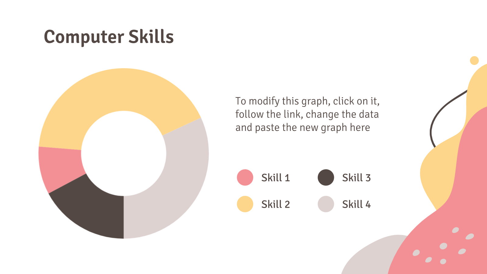
You can present the information with a chart so viewers can better understand and easily compare how your skills rank up.
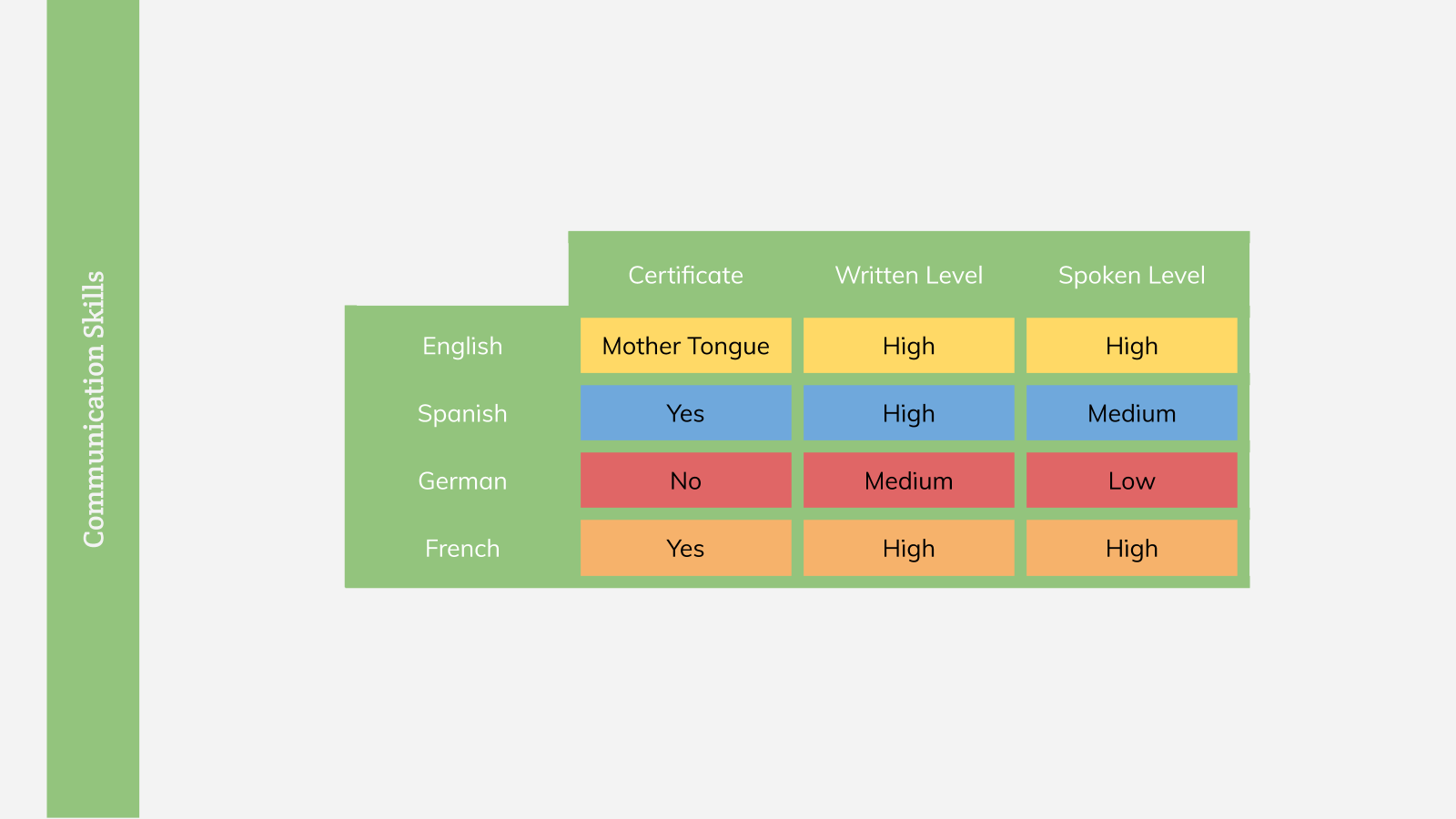
Likewise, if it’s a position like a tour guide or a language teacher, including a table listing your vernacular competencies can help hiring managers gauge your suitability.
Space may be a concern if you’re using an A4 format for your resume presentation.
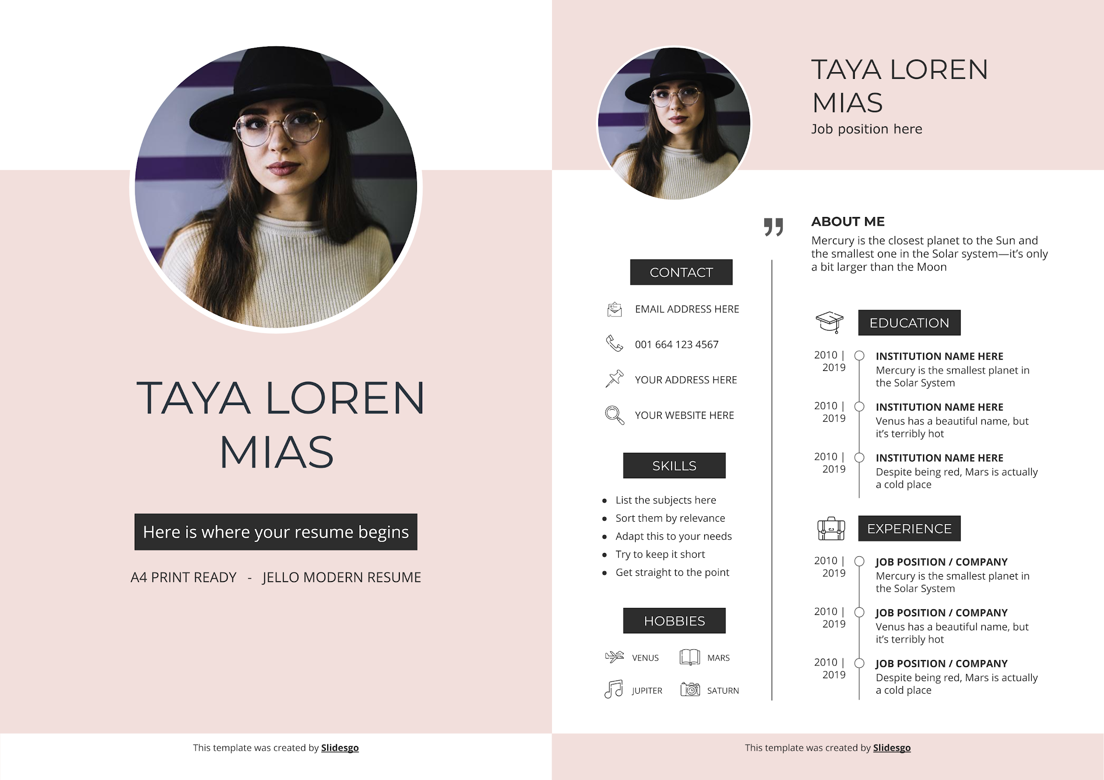
In that case, we recommend listing your skills as bullet points to keep them succinct. As an example, check out our Jello Modern Resume. As always, list the most relevant ones first.
Pro tip: Match the keywords and terms you use in this section to those listed on the job description wherever possible.
Personal Interests
The personal interests and hobbies section in a resume presentation shows how well you’ll fit in with the company culturally.
It’s also a good opportunity to portray yourself as an all-rounder.
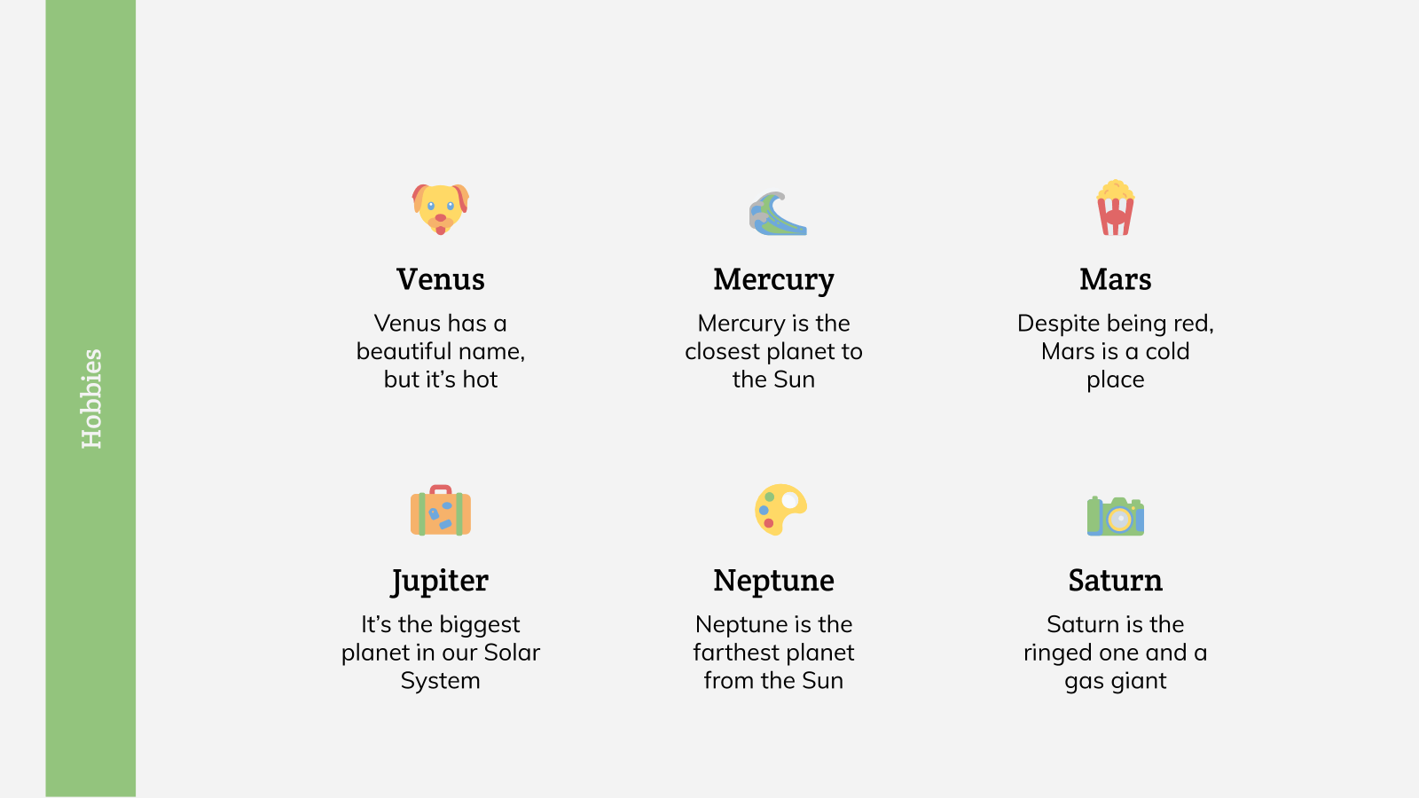
With an A4 resume, the best way to optimize the space is with the use of icons and a one-word description of each one, which is exactly what we’ve done as seen in the example above.
If you’ve done volunteer work, definitely include it, too.
Icons are also a great way to represent hobbies.
You’re free to mention more than a couple. As a recommendation, keep it to six or fewer to avoid cluttering the slide.
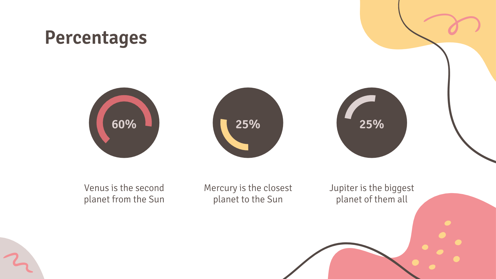
Want to give it a more imaginative look? Consider using charts and graphs like these percentage circle we used in our Abstract CV template to represent the level of passion you have for each hobby.
→ Looking for more slide decks to knock your audience off their feet? Then don’t forget to check out our wide range of stunning free presentation templates that you can download and personalize according to your needs on PowerPoint and Google Slides.
Tags
Communication SkillsDo you find this article useful?
Related tutorials
How to present a business plan (with tips and templates)
The aim of a good business plan is to get an external party interested in a particular business project. Whether it’s an investor or a potential partner, business plans have to be powerful enough to paint a picture and motivate action.For a long time, business projects exist only in the minds of those involved in them. Putting those ideas in a way an external party can fully understand and value them can be a challenging task. However, there are some key aspects that, when considered, will set your business plan apart from the get-go.We’ll review in this article five tips to build...
Lesson plan generator: AI-mazing classes that empower minds
Teaching is an art, but even the most creative educators need a little help streamlining their planning. With just 24 hours in a day, it often feels like we need days with 37 hours to get everything done. That’s where we at Slidesgo come in, tackling this issue head-on and developing a practical, simple, and—most importantly—fast solution for educators.Our brand-new AI lesson plan generator is not just another digital tool; it’s your new teaching assistant that will transform your lesson planning process. With just a few details—your lesson topic, classroom level, and setting—you’ll get within seconds a fully formed lesson plan tailored to engage...

Entrepreneurship and Personal Development Hackathon: The magic of learning by doing
The new generations show us that the way of learning has completely changed. Now more than ever, it is key to encourage and support the development of social and entrepreneurial skills in children so that they can become more actively involved in their learning. Participating in creative projects and collaborative activities allows them to explore and learn on their own about topics that interest them, solve their problems with more autonomy, and work better in teams.This idea was the motivation behind the Junior Entrepreneurship and Personal Development Hackathon organized by Slidesgo in collaboration with Genyus School. At this event, more than 150 children had...

Work faster, teach better: boost your skills with Slidesgo Academy
We truly believe that every educator has what it takes to be a fantastic presenter, but we’re also aware of the time it takes to hone these skills. Enter Slidesgo with a great, fast solution: Slidesgo Academy.At this empowering and encouraging platform, we’ve partnered with veteran classroom educators to compile the best tips that will enable you to create engaging, eye-catching, and top-quality presentations for your students and fellow educators. You’ll surprise yourself with how quickly you can craft lessons that engage and excite. Join us as a student, and become the best teacher you can be!